Barking – Review.

Writing, art, and letters by Lucy Sullivan.

https://lucysullivanuk.com/

Instagram: @lucysullivanuk

Twitter: @LucySullivanUK
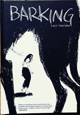
Barking Front Cover

Valentine’s Day, 2020. Looking forward to a pleasant evening with my good lady when, on the train back from Oxford she called to say that a particularly feisty pothole on a dark country road had ripped a hole in her tyre and she was waiting for the RAC to arrive.

An hour later I was sending her home in my car while I settled in for a lengthy contemplation of the rain beating on the window and an obscured view over a darkened Cheltenham.

Not perhaps the evening I had in mind but, the consolation was that I had an Awesome Comics Podcast downloaded and ready to come in my ears. In that particular episode, Lucy Sullivan was the guest talking about her soon to be released book, Barking.

I’ve read enough comics, and especially indy comics, now to know that I can enjoy almost any type of story – not just the superhero books that I used to read back in the day. So, the semi-autobiographical story that Lucy depicted and the insight into her experiences sounded intriguing. Looking it up there and then, I immediately loved the artwork – a real must for me to invest in a book properly.

It took me  awhile to get hold of the book and I kept checking in on the samples of amazing at that Lucy was posting – the slightly frantic scratching of the pieces was evocative of confusion and anger – I later discovered this was exactly the right tone.

When the second printing came along, I ordered a copy and was interested to get an email from Lucy with a playlist to go along with the book – I held off reading it until I had time to sit down with both.

First off, let’s talk about that artwork. I really enjoy an expressive line in comic art – sure the clean-cut stuff can be great, but the art in Barking is so perfectly in keeping with the story – urgent,  challenging, and at times hard to decipher. Despite the fact that anatomy and perspective aren’t at all text book, Lucy’s background in art allows her to convey both movement and tone in a way that says ‘I know this looks a little off kilter, but I know exactly what I’m doing’. And she does.

I just want to dwell on that point about the art being sometimes hard to work out. Lucy is very clear about her struggle with mental health and this is of course a key strand of the story, and although I’ve not suffered in the same way, the sense of being overwhelmed and unable to process everything that’s happening is perhaps something many of us have experienced. So, the fact that we, as readers are challenged to makes sense of the apparently scrawled images which overlap and interact making some more difficult to read seems to be a direct depiction of a sate of mind and one which is handled beautifully.

It’s no spoiler to say that the story opens with the main character, Alix, in crisis – on a bridge and wrestling with the darkest of thoughts. Thoughts which soon take on shape and being and which become an important device in the tale: the ‘Black Dog’ is an age old manifestation of depression but here it takes on a slightly different role and is a constant and brooding presence.

Although the cause of Alix’s crisis seems pretty clear, for me that was called into question towards the end of the book but I’ll let you see what you think and not discuss the resolution here. Perhaps the best way to talk about it is through the soundtrack, which starts loud and brash with music that insists on filling your head, adding to the sense of disturbance and at times making it hard to concentrate on the text – once again, all contributing to the mood and experience of reading Barking. As it progresses, the playlist becomes infused with a melancholic introspection which I really enjoyed (oddly, I suppose) and, about two thirds of the way through everything takes on a more hopeful, uplifting vibe. All in all, it brought a whole new dimension to reading the book for me – fantastic.

There’s a lot more I could say about ‘Barking’, but probably the most useful thing is to recommend that you go get yourself a copy, download the playlist, sit and enjoy every dark, frantic, chaotic page of what is a classic comic.
Beyond

So, I’ve been trying to make progress on my next comic but, frankly, it’s painfully slow. I seem to be working, like, a lot lately and struggling to find time to draw or write. And when there is a little time, once the thirst of the eternal list of the DIY purgatory has been slaked, I’m too knackered to do anything worthwhile.

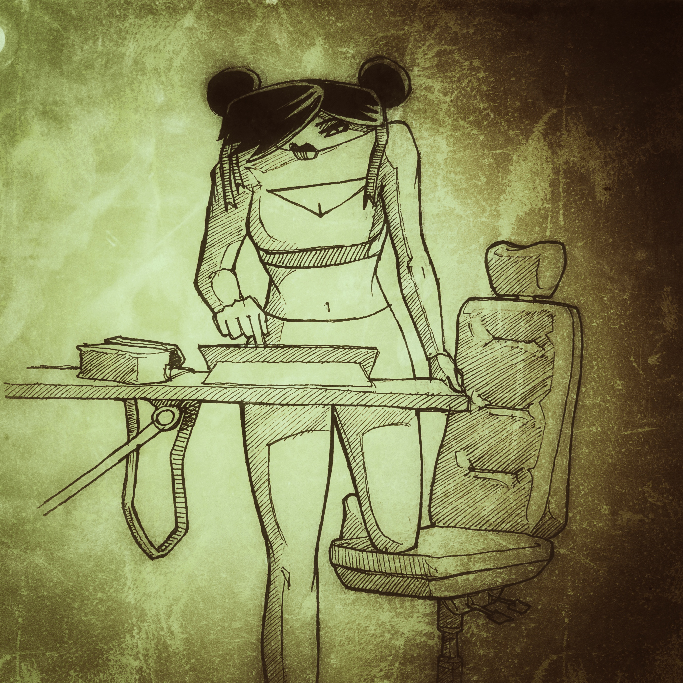
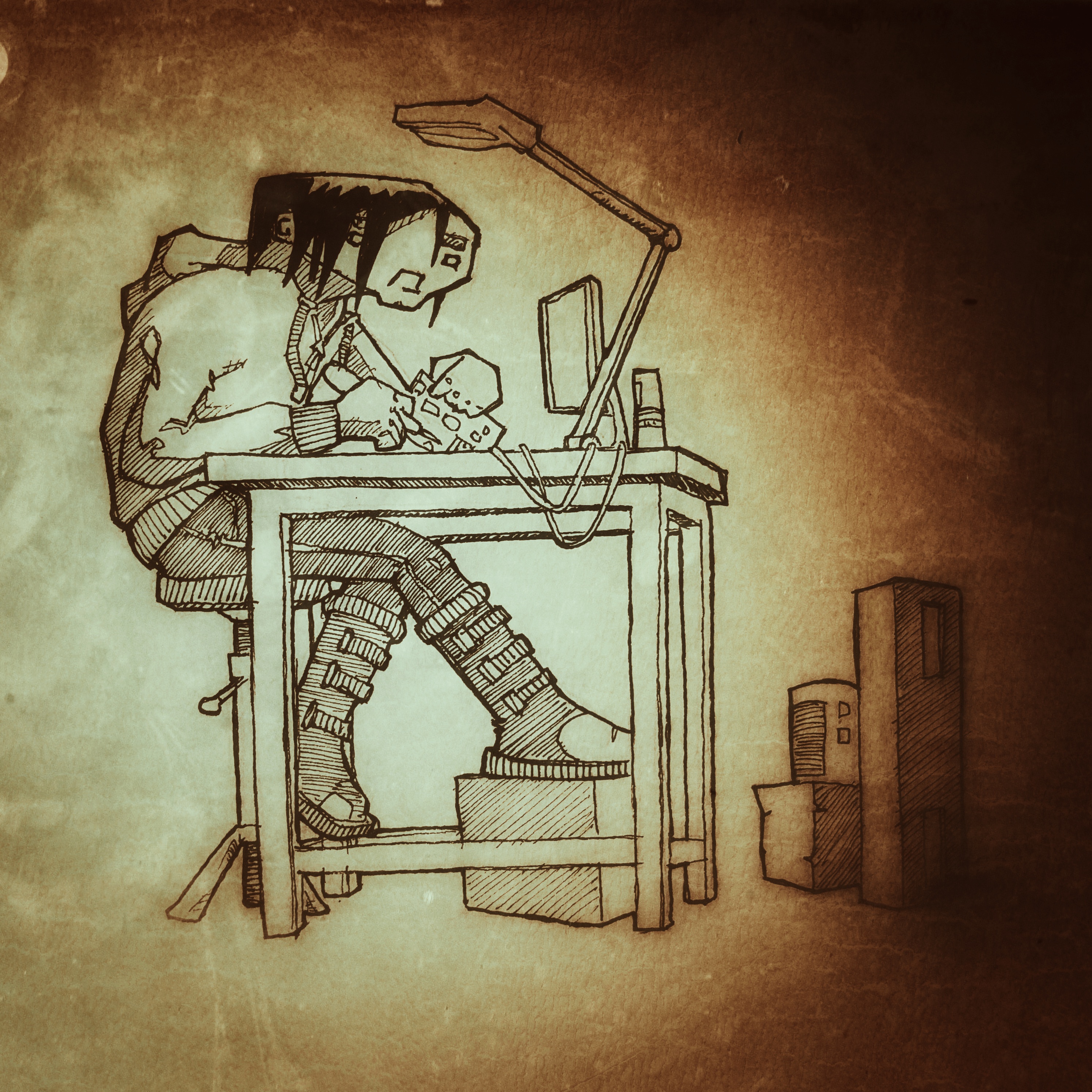
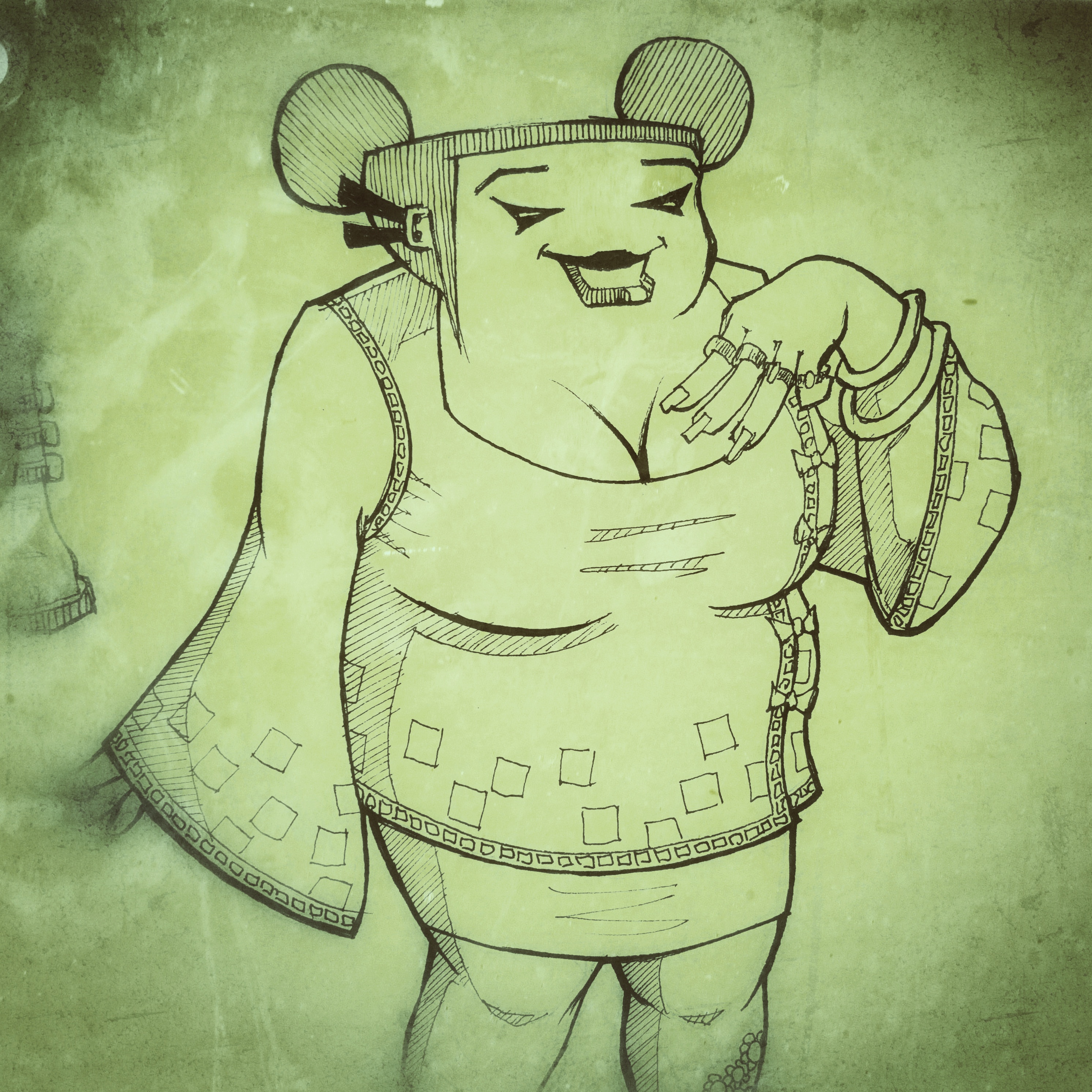
That said, it’s not like I haven’t done anything. There’s been a lot of thinking and that’s good at least. I’ve also been thinking about the art style of the book and creating characters to populate the world; I thought I’d share some here.


I’m thinking black and white. Not really because of the expense, but more because “one thing at a time”! It’s enough to deal with the artwork and the script let alone attempting the pit of despair that is colouring…

Feel free to let me know what you think about any of these btw.


If you’re interested, it’s set in the future. In a world where economics and climate change have forced almost everyone into huge cities, all humanity packed into a tinder box of overcrowded, desperate lives. Where religion used to play the lead role in survival but now has fallen to the decadence of commerce. In this world, the further up the social ladder you are, the further up you live. You have light and air and all things sweet. Below, deep below, there are things that no-one wants to see, but that make the world tick irrespective of people’s preference for not acknowledging they’re there.


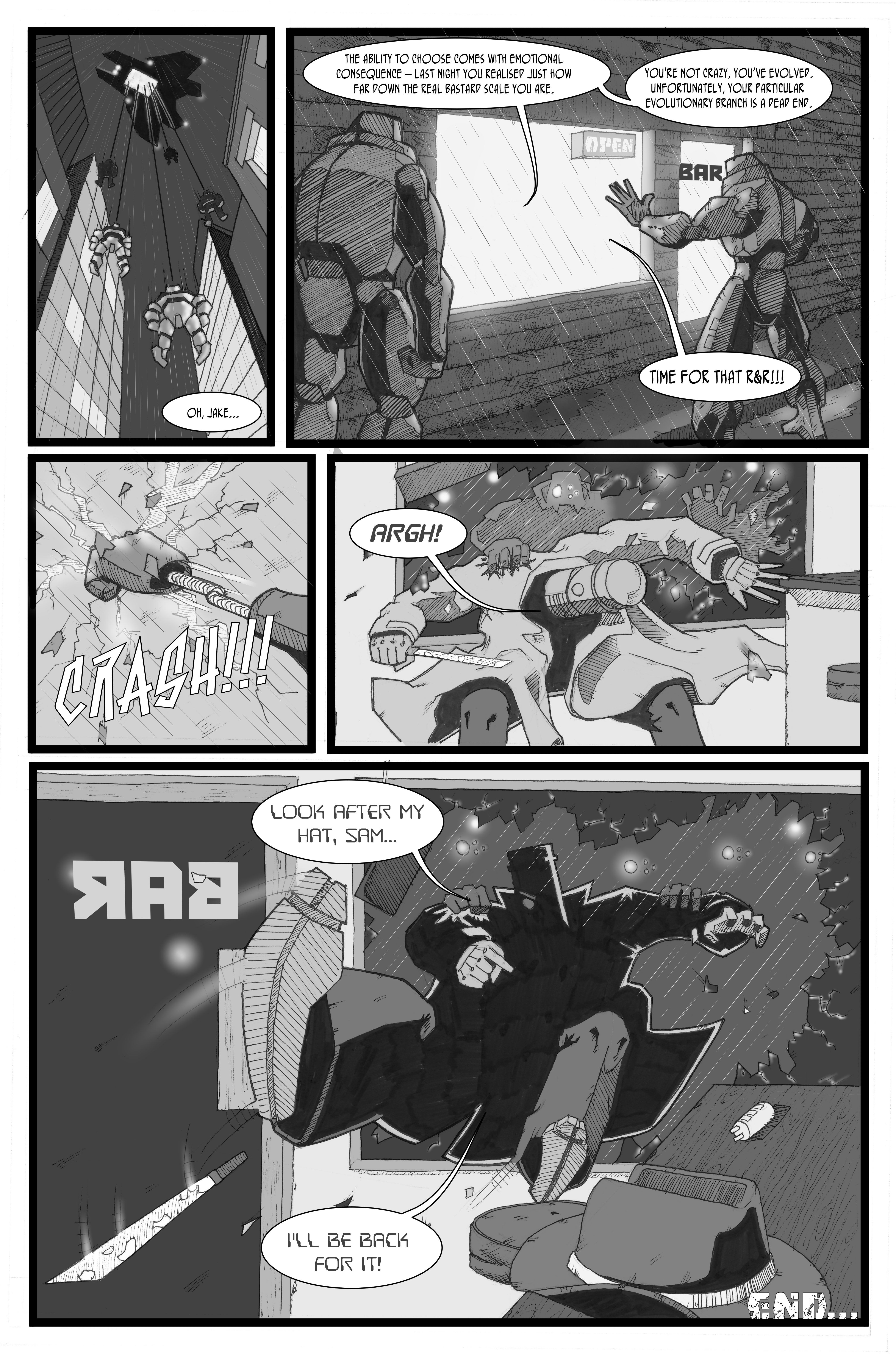
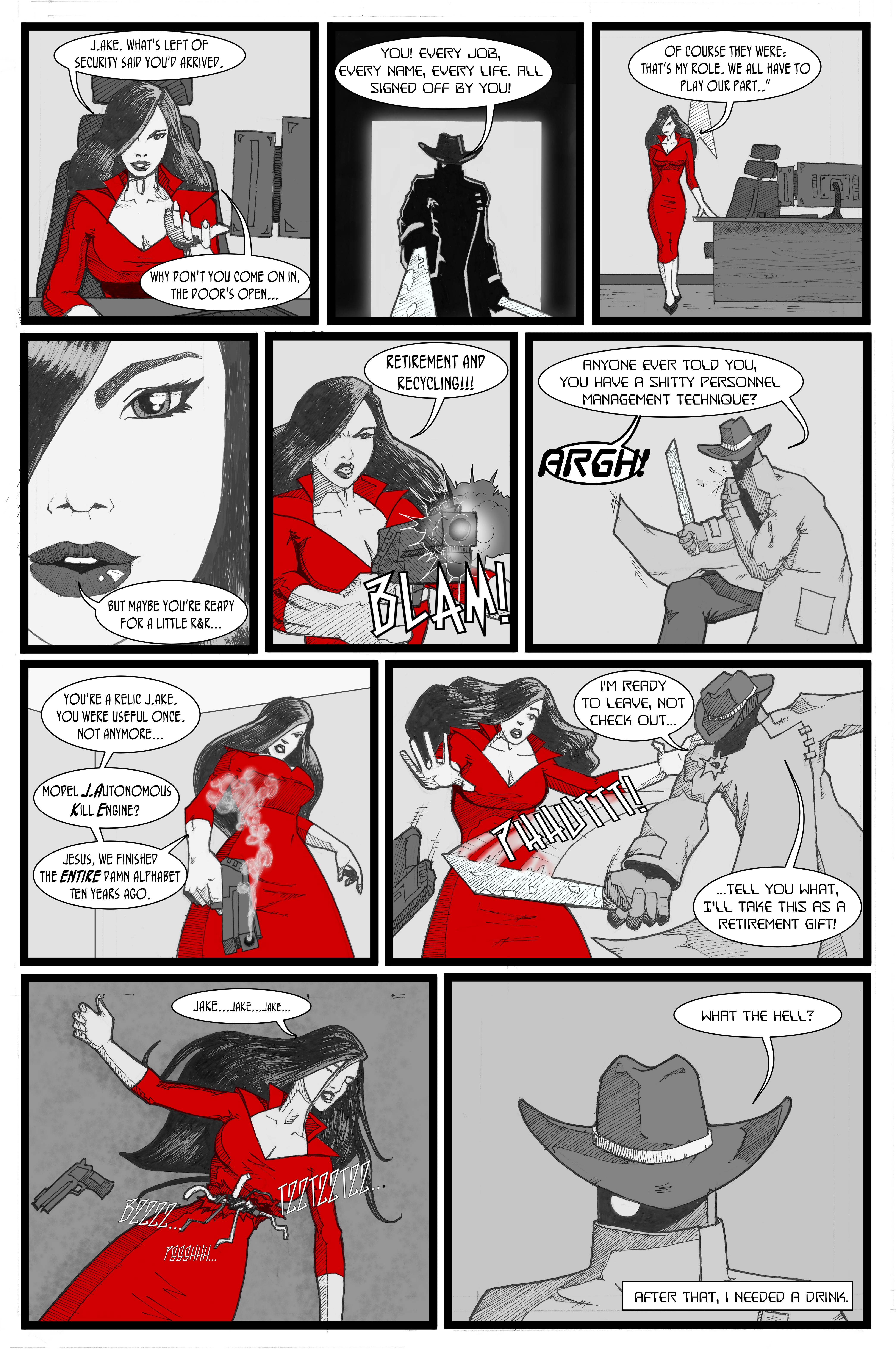
J.AKE – Page 6

Welcome to the final page of J.AKE.

After spending years doing the wetwork of the Department of Justice, our hero has a dream in which he sees the death of innocence. The awakening makes him realise the horror of the work he has carried out with impunity, and he’s pissed. Heading straight for the Director, he visits terrible revenge on the staff of the Department of Justice. The Director decides J.AKE is expendable and, after failing to terminate him, he cuts her down and she is revealed as a cyborg, more sophisticated, but just like J.AKE. Later, she (or maybe a copy) turns up in Sam’s bar and he understands that the Department can’t be stopped so easily. The Director explains that the organic part of his brain has developed what amounts to a conscience as a consequence of being secretly fed stem cells. Let’s see how this mess ends…


Disconnected Press – new book review. I sort of wish I knew what it was called!

Story: Lizzie Boyle @lizzieboylesays

Art: Connor Boyle @pencil_monkey

Letters: Jim Campbell @CampbellLetters

Publisher: Disconnected Press www.disconnectedpress.co.uk

Disconnected PRess

Saturday 3rd Feb found me at the first comic con of the year: True Believers, in Cheltenham. As ever a great event, but that’s not up for discussion right now. Right now, what we need to talk about is the new(ish) book from Disconnected Press which was released at Thought Bubble 2017.

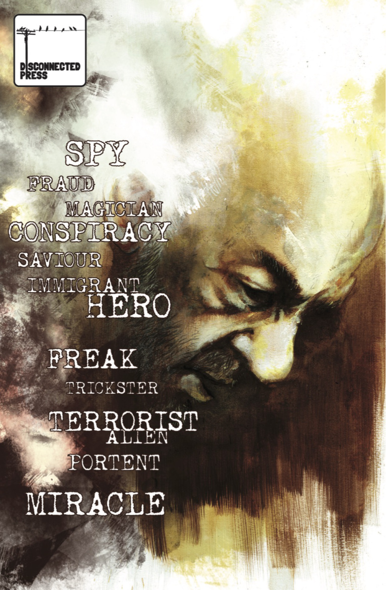
The first thing to say about it is that I have no idea what it’s called. And that’s how it’s supposed to be. The front cover has a whole heap of words on it, any of which could be the title and, as it happens, also used to describe the protagonist: Hero, Feak, Miracle – any of these, or the other ten words on the cover, could fit the bill to describe the central character, depending on the cut of your jib.

The fella we’re talking about here looks to be in his sixties, not exactly in the prime of life or what you expect as the focus of a comic. Don’t let that fool you though; he can do extraordinary things. The central theme the book explores is how an individual displaying what look a lot like ‘super powers’ might be treated; by friends, neighbours, governments. No spoilers, so I won’t say exactly what happens, but this is an awesome piece of work from Disconnected Press.

Lizzie’s writing is sharp – although there’s very little in the way of shouting or the usual confrontational language of a superhero book (and we could certainly slot it into that genre), she manages to create a tension that urges the story on. At the same time, you can imagine the central character’s voice being soft and tinged with loneliness as he makes choices for the sake of others at his own expense. She also manages to help us understand how, despite the maturity of his years, this guy is lost – he doesn’t understand what’s happening to him or have any real control over his situation; creating a fascinating contrast between a man entering old age and a sense of vulnerability more akin to that of a bewildered child. Really great work.

Of course, a comic can live or die by the quality of the artwork, and for me that’s what comics have always been about; if the artwork’s off, I can really struggle to get into the story. I haven’t read as many comics as some, but it’s probably into three figures and I’m hard pushed to remember one where the artwork so brilliantly supports the story. Connor has nailed it with work that fit’s the emotionally raw tone of this book perfectly. Largely monochrome with elements of colour, he told me he used a variety of traditional media to arrive at what is right up there as one of the best-looking books I’ve read. His linework, which sits over the textured paint and crayon, seems to pull the characters out of the obscured fog of a background to become wonderfully rendered, almost ghost like figures. There’s an economy to the art which lets the panels breath throughout the book and plenty of panels with no dialogue – it would be great to hear from Lizzie and Connor how much of that was scripted and how much artistic interpretation. Whatever the answer, this is a fantastic looking book.

Finally, a word for Jim Campbell on letters – the book certainly isn’t dialogue heavy but Jim manages to set out the balloons so that they’re never detrimental to the artwork. Add to that the fact that every panel is wonderfully generous; the white space around the text helping to give the dialogue space which really supports the pacing of the story – another great piece of the jigsaw.

Overall then, this is an outstanding book and if you want something that is thought provoking, emotional and beautiful to look at you could do far worse than this.

Judge Anderson

This year, 2000AD celebrated it’s 40th anniversary – quite a feat for a weekly anthology comic as that’s more than, well, a lot of issues! I was never a really regular reader of the mag but I do recall enjoying  the classic stories of Slaine, Halo Jones, ABC Warriors, Strontium Dog, Rogue Trooper and the rest. One of most prized possessions is the perfect bound series of full colour Slaine graphic novels with art by Simon Bisley and words by Pat Mills – both legends in the sequential art world.

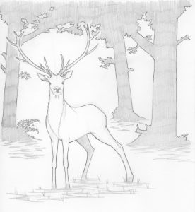
Anyhow, although I couldn’t make it to any 2000AD anniversary events, I wanted to draw something to mark the occasion and settled on a sketch of Judge Anderson, Judge Dredd’s erstwhile psychic colleague. Here it is!

I’m thinking of doing some other characters from 2000AD so if anyone has any requests, let me know!

Learning from J.AKE

So, I finally manged to publish a total of two pages of sequential art – only about 35 years in the making and I’m feeling pretty good about my rate of production! Anyhow, I wanted to say something about the unexpected development of just about every aspect of the process. I guess this is something that must (presumably) happen to every artist when they draw their first few comics – I figured that I’d learn one or two things as I produced the story (I’m talking about J.AKE, The Waves was knocked up entirely traditionally in a couple of hours) but, as it turns out, it feels like I knew jack-s#&t before I started and now I’m at jack+1 – which is still basically bugger all…

It’s not unusual for me to launch into a project (not just art btw, but like, anything) with essentially no planning whatsoever. And, as that method had only let me down entirely on a small, but notable, handful of occasions in the past, I thought it’d do here too. I now realise just how stupid I am.

The list of cock-ups is pretty extensive and I want to talk about them all but this would be a very long and probably intensely boring post if I did so I’ll reign myself in for now. Let’s just say that there are a few things that I’ll be doing differently with the next story which are often about making the final product better but are always about making the process easier.

First up, I’ll be doing more (read ‘some’) storyboarding. Not really thinking about that has caused me more than a few headaches so I’ll definitely be considering the relationship between layout and script more carefully next time.

Next is remembering that each panel isn’t just a piece of artwork but, in the main, has to include space for word balloons. This near catastrophic error was summed up by the face Milmo pulled when I told her that I wasn’t sure I’d left enough space for my letters at the True Believers Summer con earlier this year. “Idiot” it said (in a nice way, natch).

Finally, and this is one for the two pages of J.AKE that are still to be inked – I’ll be doing the inking traditionally. I realised that I wanted to use cross hatching to make the whole thing a bit darker and grittier right at the end of making page 1, and I just couldn’t get it right doing it digitally but had no choice to carry on so I’m ditching the stylus for the pen when I get to that on P3 and 4 (Page 2 is largely already inked – apart from the cross hatching…)

The other thing to say is that it’s taken me an age to finish page 1. Partly due to the random way I’ve been going about the whole project but also because I’m learning with each and every aspect of the process: script, layouts, pencils, inks, colours (kicked those into the long grass in the end ‘cause they just weren’t good enough), using Clip Studio…all of it. Hopefully, I’ll be getting quicker from here on in because I really can’t wait another 35 years for the next page…

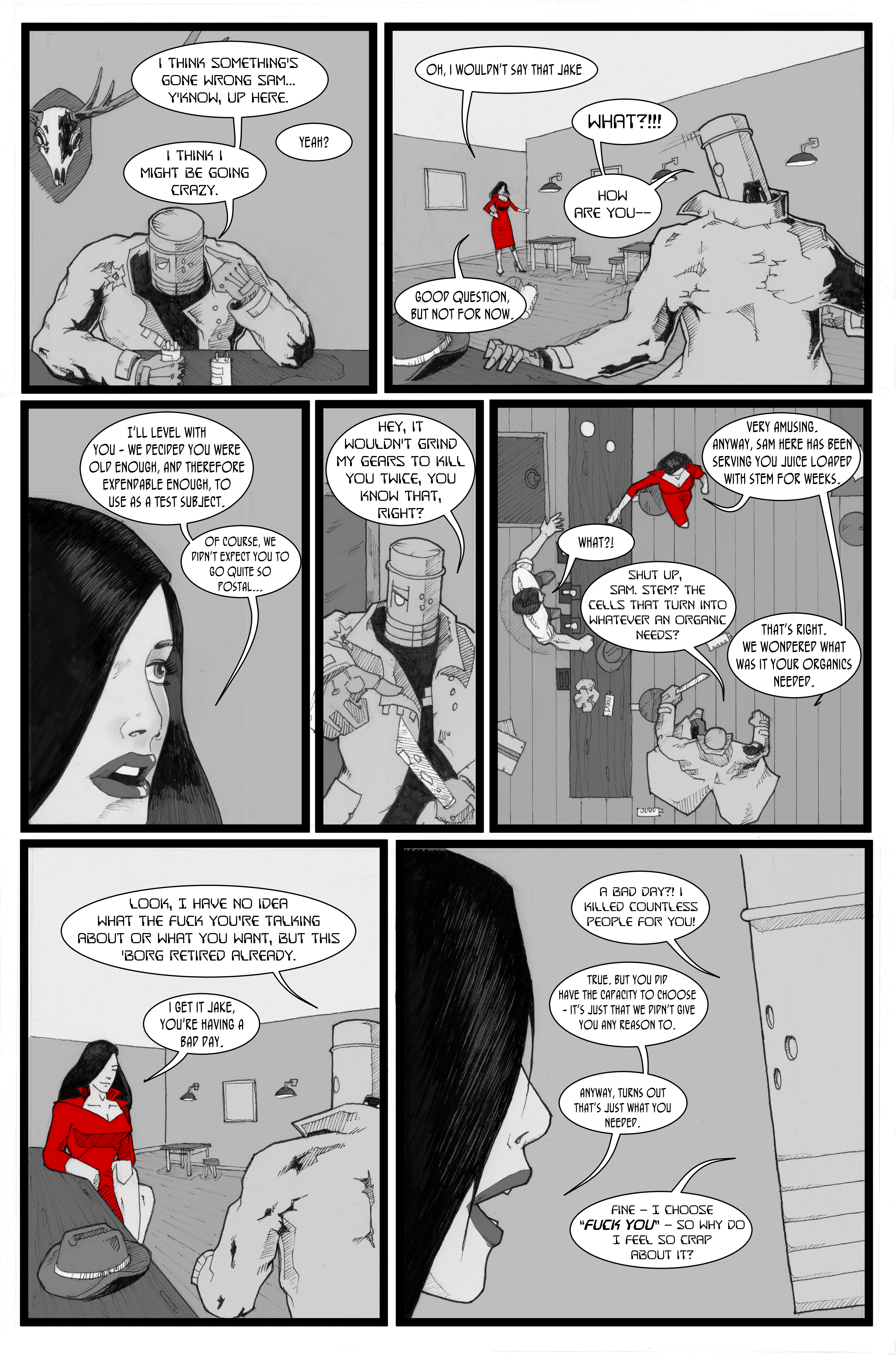
Here’s a panel from page 2, just in case you’re interested.