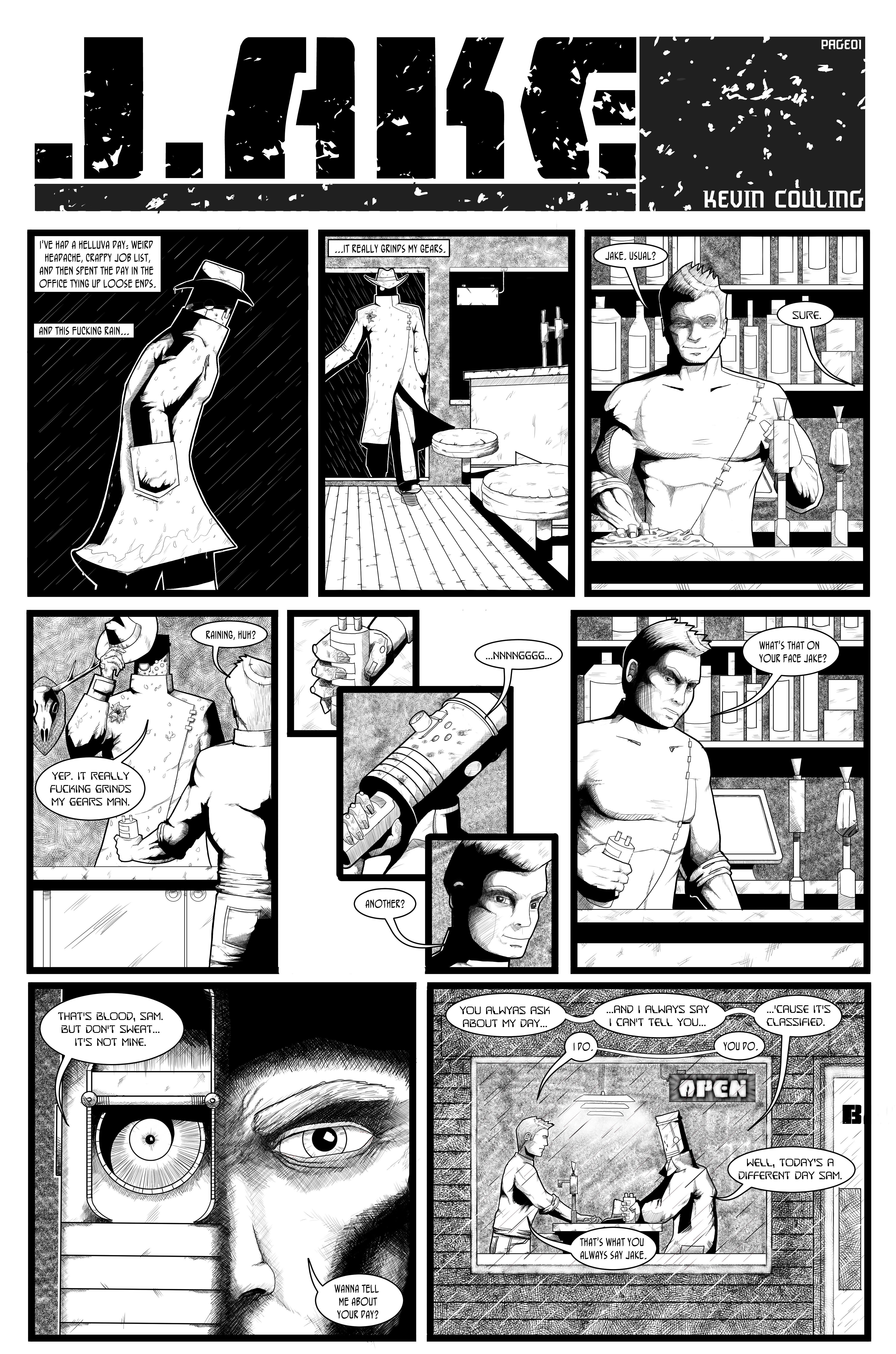
Possibly not one for the feint-hearted, and certainly not one for your nan, here’s a review of this short anthology brought to us by the small-press man-beast that is Tony Esmond (@Ezohyez – www.neverironanything.blogspot.com)
There are seven stories in this book, all written by Tony, amounting to 36 pages. We have five sequential pieces (each by a different artist) and a couple of prose shorts. Here’s the artwork credits:
‘Shelly’: Rachael Ball @Rachaelcartoons www.artacademy.org.uk
‘Peggy’: Sarah Harris @implausible
‘Diane’: Rik Jackson @gojacksongo www.rikjackson.co.uk
‘Lana’: Tom Curry @thischucklehead www.puntoten.tumblr.com
‘Sasha’: Charles H Raymond @not_so_tiny www.notsotiny.com
The cover-art is by your man Vince Hunt @jesterdiablo www.theredmaskfrommars.com
The two pin-ups in the back of the book are ‘Behind the Camera’ by Stuart Mulrain @TokenNerd www.oktruebelievers.com, and ‘Reality Sucks’ by Vince Hunt
The two prose shorts written by Tony are: ‘The Story of Sidney Small’ and ‘Peggy was a Rubbish Prostitute’.
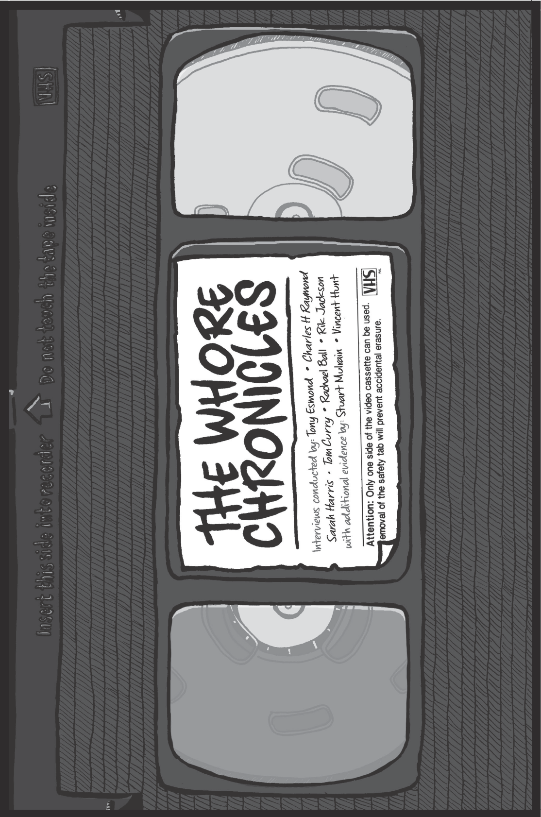
Let’s start at the start: Vince might have come up with anything for the cover – a rough London pub where some of the women in the book ply their trade, or the shadowy alley where some of them service their customers. But no. Instead we’ve got a cover that’s an old VHS cassette which immediately sets the period of the comic – this is a solid pre-turn of the century piece and we know it before we open the book. I don’t know whose idea that was, but I like it!
Not everyone will want to read this book, which is a bit of a shame. With that title, I’d probably hesitate to read it in public myself to be honest, but, while the title is entirely representative of what’s inside, it perhaps isn’t w
hat you might expect – there’s no actual sex in the book and no nudity, i.e. what you might expect from the title. None of the stories tries to present the sham glamour of Hollywood prostitutes, or the one-dimensional whore we often see as bit-part characters on TV; the women we meet here are all different, all individual. Their stories are unique with many motivations and experiences.
Each sequential story is a short interview with one of the women where they give you a brief insight into their lives. It would be easy to feel sorry for them, but I don’t imagine that pity is what they would want. I wonder if some of them would even know what they did want if you took the time to ask them – most of their world’s feel pretty damn bleak, where the luxury of hope is something that they probably don’t allow themselves.
The exception to this format in terms of the sequentials, is a back-story relating to a background character from the brilliant Cockney Kung-Fu, one of Tony’s other creations. In fact, there are two stories in here about Peggy – the sequential and a piece of prose. Knowing Tony, the fact that this sequential comes first is probably deliberate as there’s a definite cause and effect relationship between the two stories. I won’t say more but see what you think.
Finally, there’s a sort of flipped story in there too by way of the other prose piece. The Story of Sidney Small makes you realise that the punters aren’t all husbands whose wives don’t understand them or pissed business-men away at a conference. Some of them are just bastards.
I particularly enjoyed the sequentials in this book – the artwork has real variety and, for me, Rachel Balls’ work on Shelly is the stand-out.
When you read the stories told in the prose you make that face like you’ve just sicked-up into your mouth, but sometimes, it’s worth reminding yourself how good your life is and there are people who have to taste a bit of sick more often than not. For me, I’d have liked a little more punctuation in the prose now and again but nonetheless, powerful stuff from a guy who has obviously seen some right horrible shit in his long and, possibly, illustrious career.
All in all, I’d recommend this to anyone who isn’t too squeamish or too easily offended. If you want a flavour of what life on the streets is like, get yourself a copy of this moving book and, while you’re at it, think about donating to the charity Tony mentions at the back of the book; Beyond the Streets – they’re a UK based charity who sees the possibility of life beyond sexual exploitation. Find them at www.beyondthestreets.org.uk
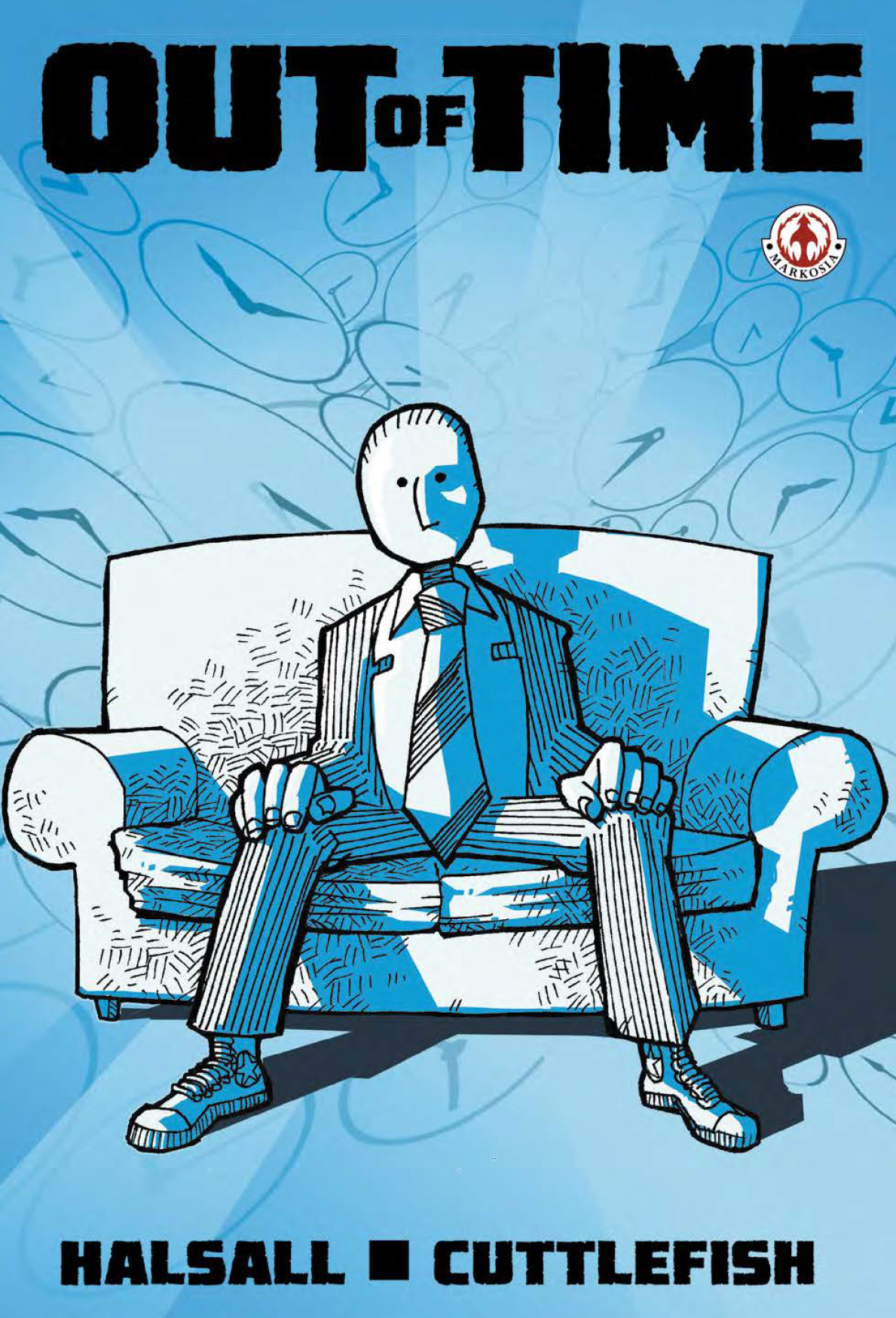 When Luke sent me the link and I downloaded Out of Time, I immediately realised that I’d seen this comic before – I still can’t remember when exactly but I thought at the time I really liked the cover, so getting to dip inside is real treat.
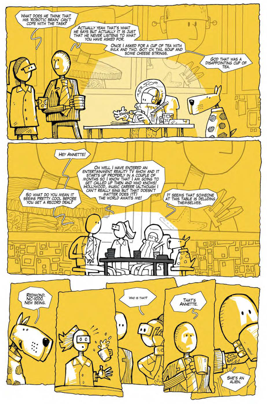 Backgrounds aren’t heavily detailed, colouring uses a really limited and largely unrealistic palette, and word balloons are funky hand drawn affairs. None of this, however unusual, is bad – every bit of it appears a consummate stylistic choice topped off by some really neat inks which are most successful when they are kept nice and simple. A slight criticism, and I’m working hard here to pull something out, is that I think both the inking and the colouring are slightly less convincing in panels where the palette gets too varied (in that you lose that really strong graphic element of shades of a single colour) or inks are too detailed (where inked shading goes further than solid blacks) – the middle section of issue one is an example, but this is pretty minor in what is otherwise really solid work from Cuttlefish. Does anyone know who this person is by the way or am I looking for a guy who squirts ink in my face if I approach too quickly from a jaunty angle at a con…?