Barking – Review.

Writing, art, and letters by Lucy Sullivan.

https://lucysullivanuk.com/

Instagram: @lucysullivanuk

Twitter: @LucySullivanUK

Barking Front Cover

Valentine’s Day, 2020. Looking forward to a pleasant evening with my good lady when, on the train back from Oxford she called to say that a particularly feisty pothole on a dark country road had ripped a hole in her tyre and she was waiting for the RAC to arrive.

An hour later I was sending her home in my car while I settled in for a lengthy contemplation of the rain beating on the window and an obscured view over a darkened Cheltenham.

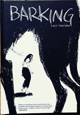
Not perhaps the evening I had in mind but, the consolation was that I had an Awesome Comics Podcast downloaded and ready to come in my ears. In that particular episode, Lucy Sullivan was the guest talking about her soon to be released book, Barking.

I’ve read enough comics, and especially indy comics, now to know that I can enjoy almost any type of story – not just the superhero books that I used to read back in the day. So, the semi-autobiographical story that Lucy depicted and the insight into her experiences sounded intriguing. Looking it up there and then, I immediately loved the artwork – a real must for me to invest in a book properly.

It took me  awhile to get hold of the book and I kept checking in on the samples of amazing at that Lucy was posting – the slightly frantic scratching of the pieces was evocative of confusion and anger – I later discovered this was exactly the right tone.

When the second printing came along, I ordered a copy and was interested to get an email from Lucy with a playlist to go along with the book – I held off reading it until I had time to sit down with both.

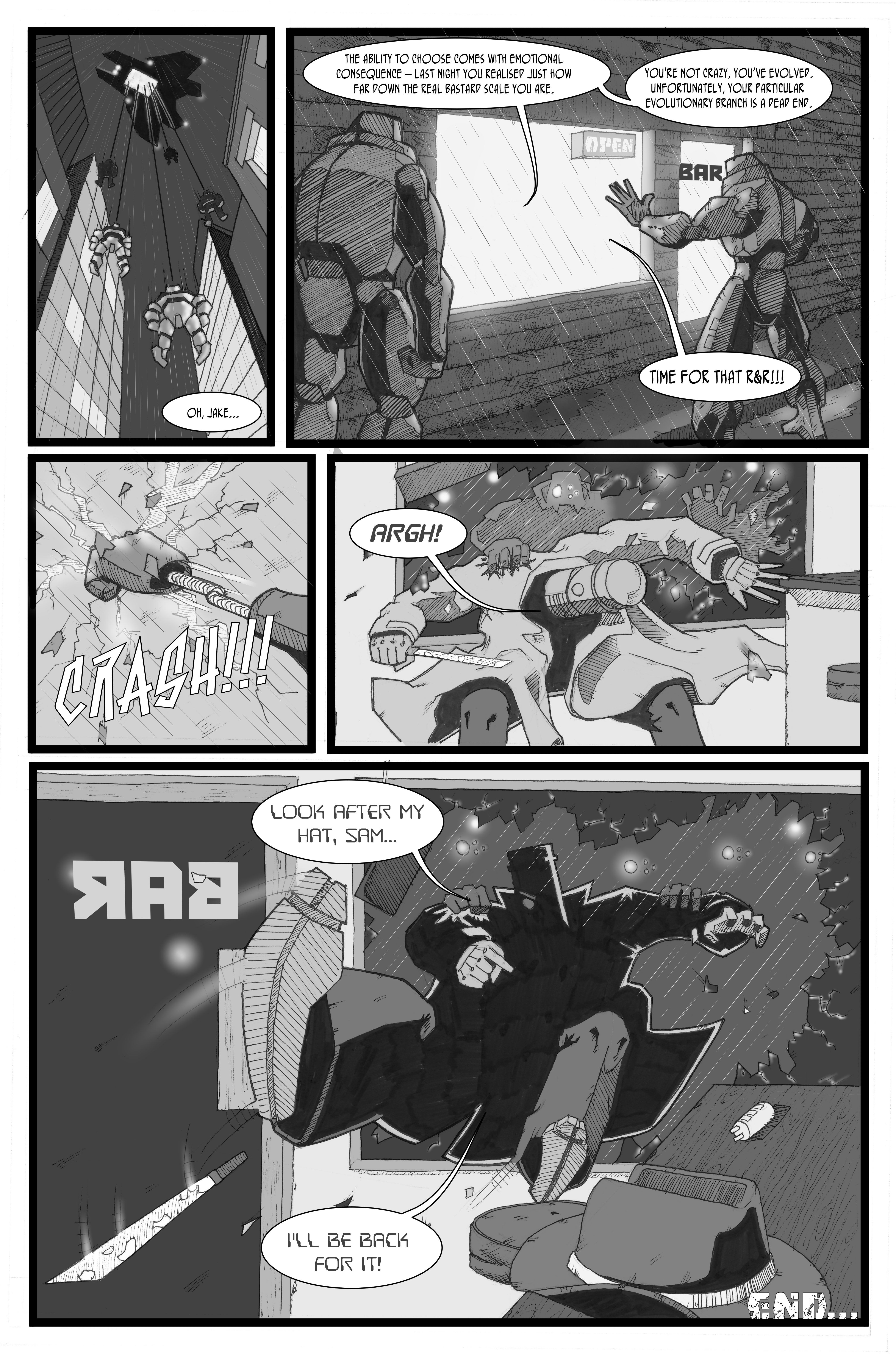
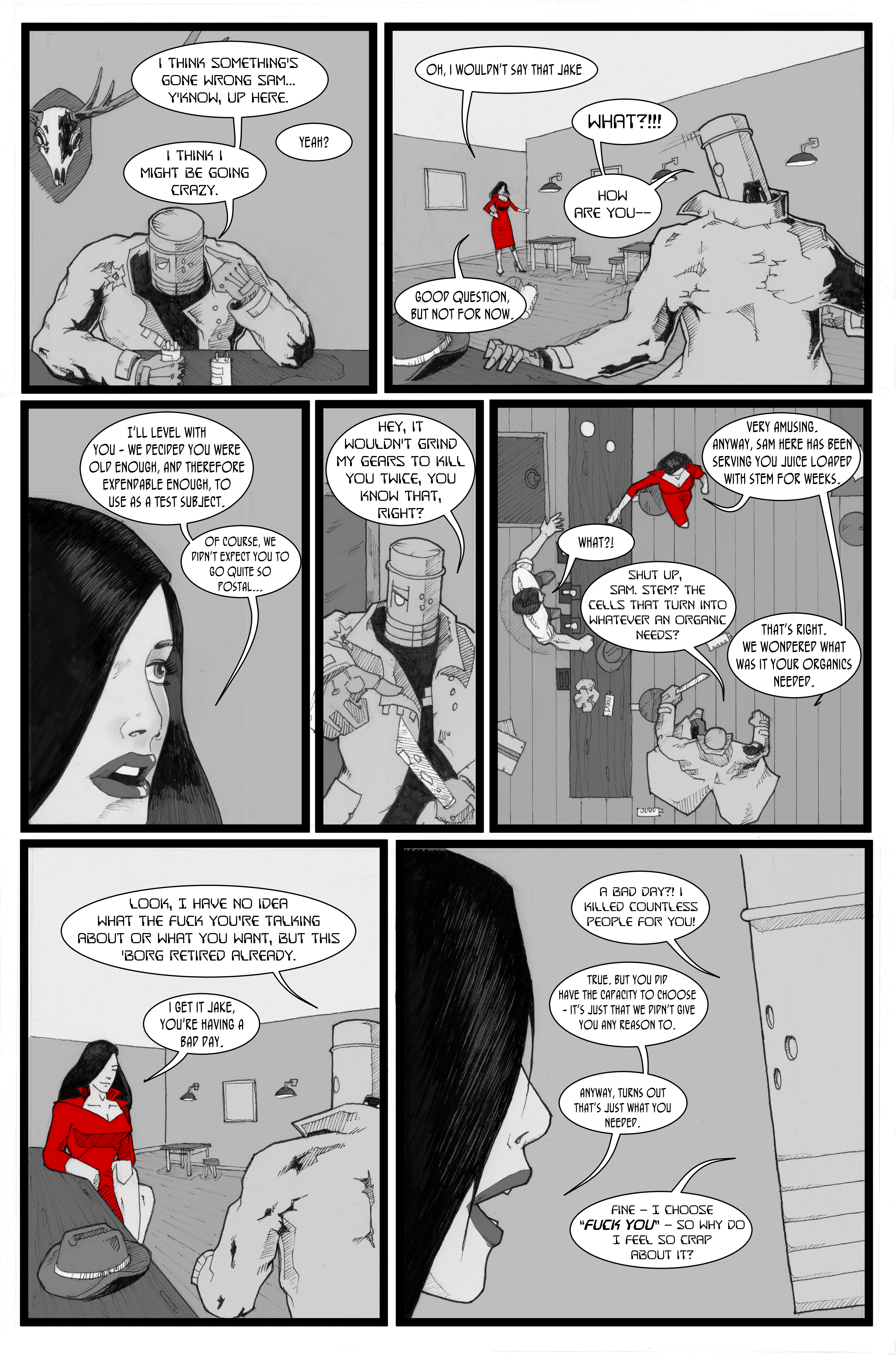
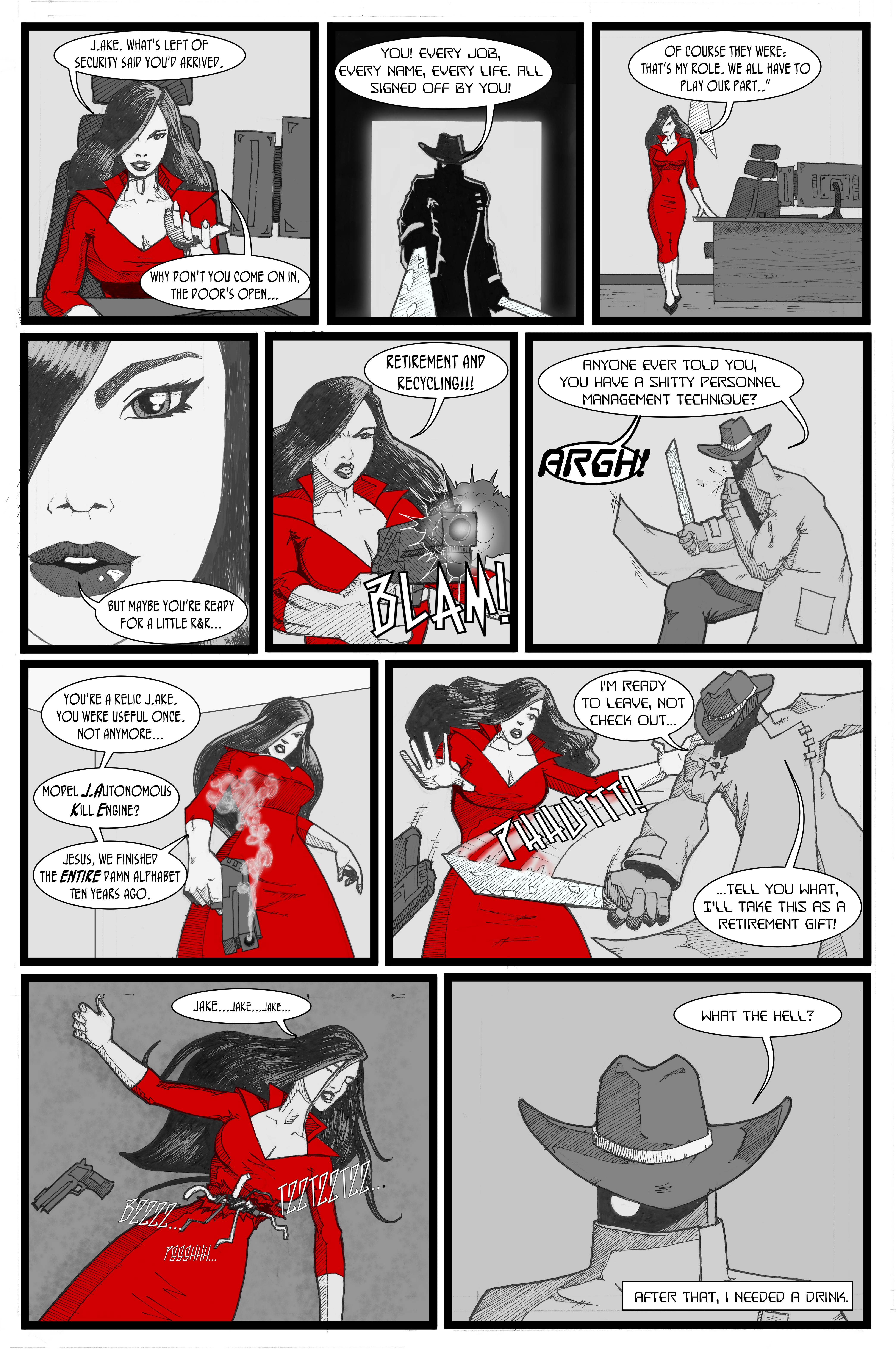
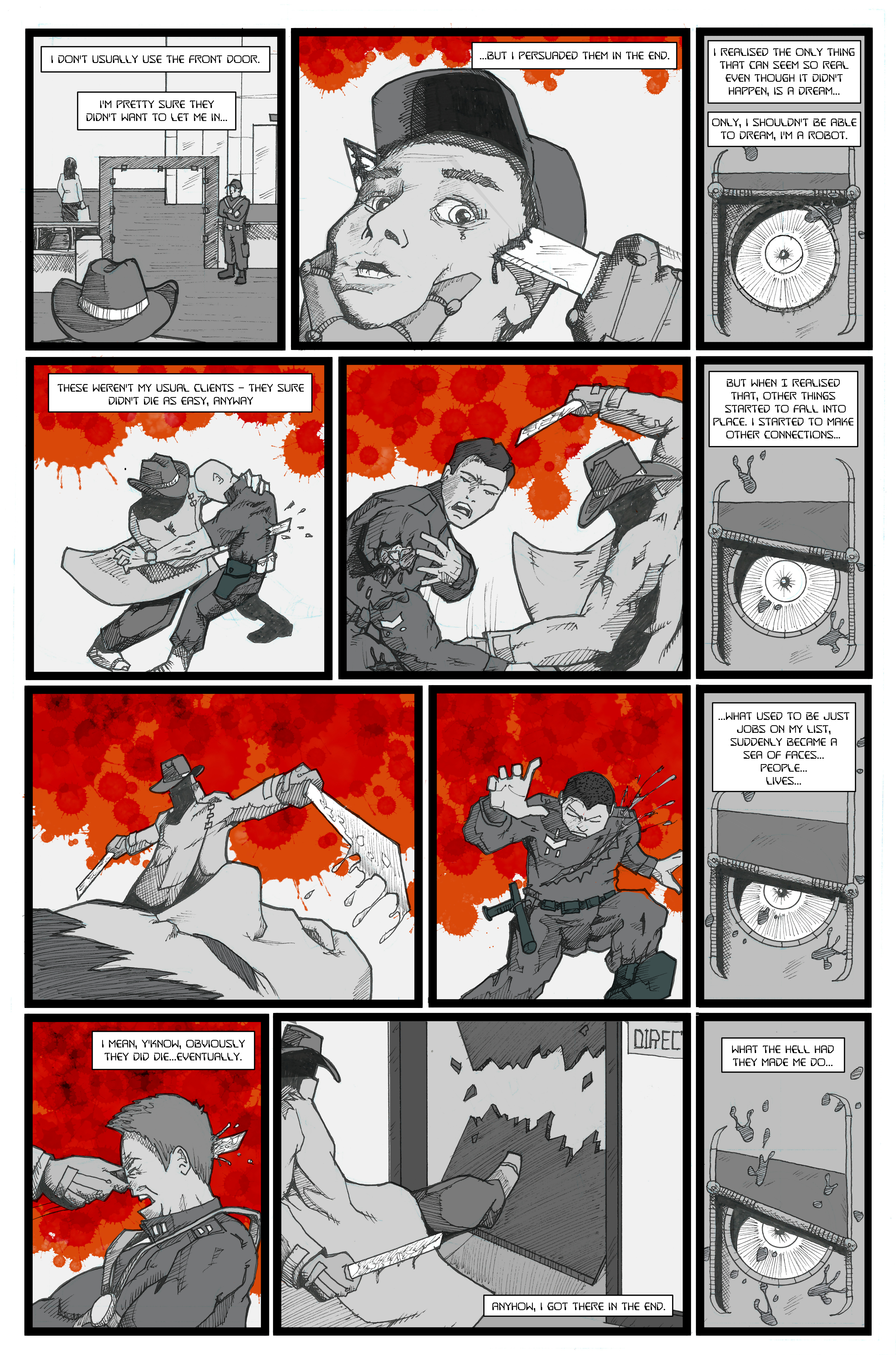
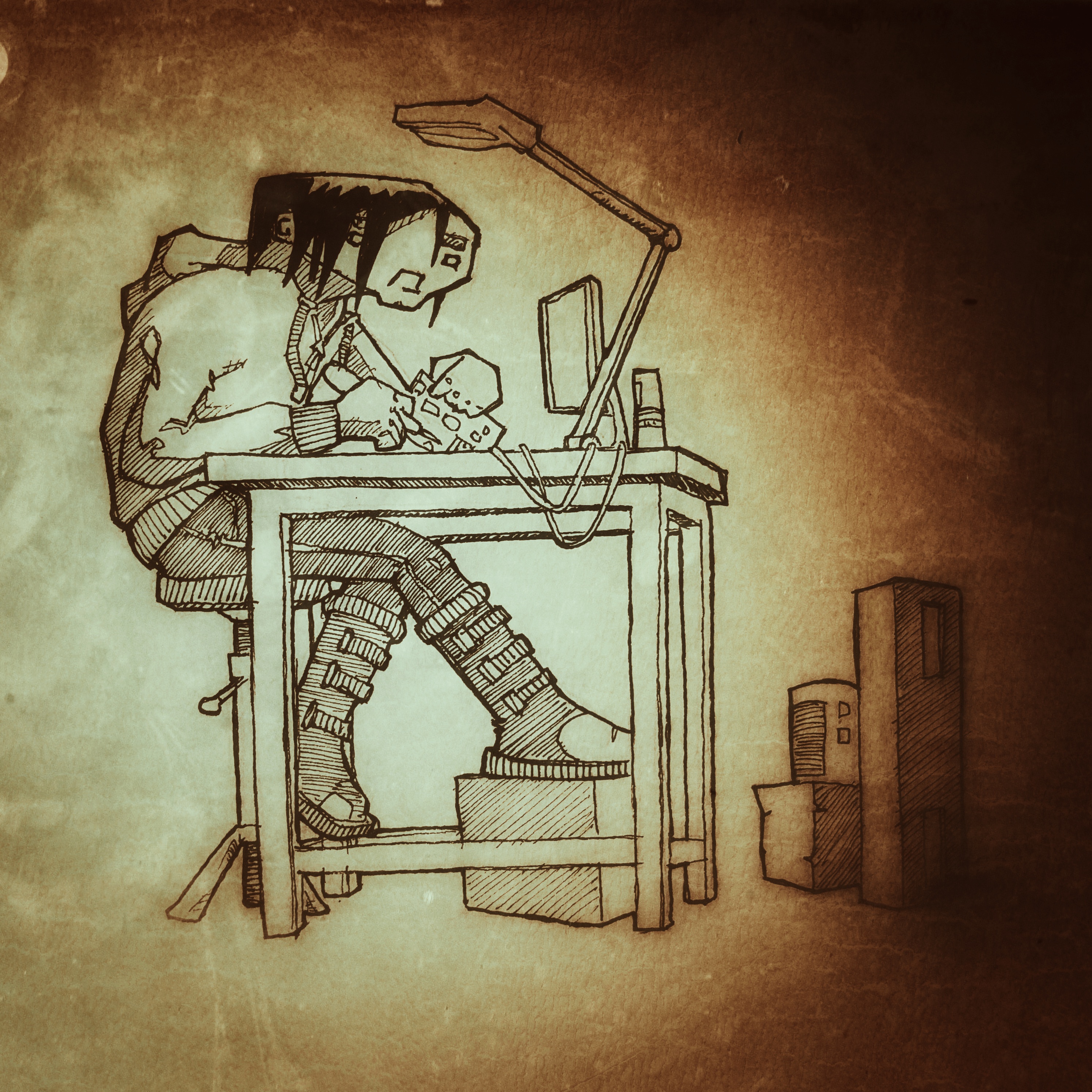
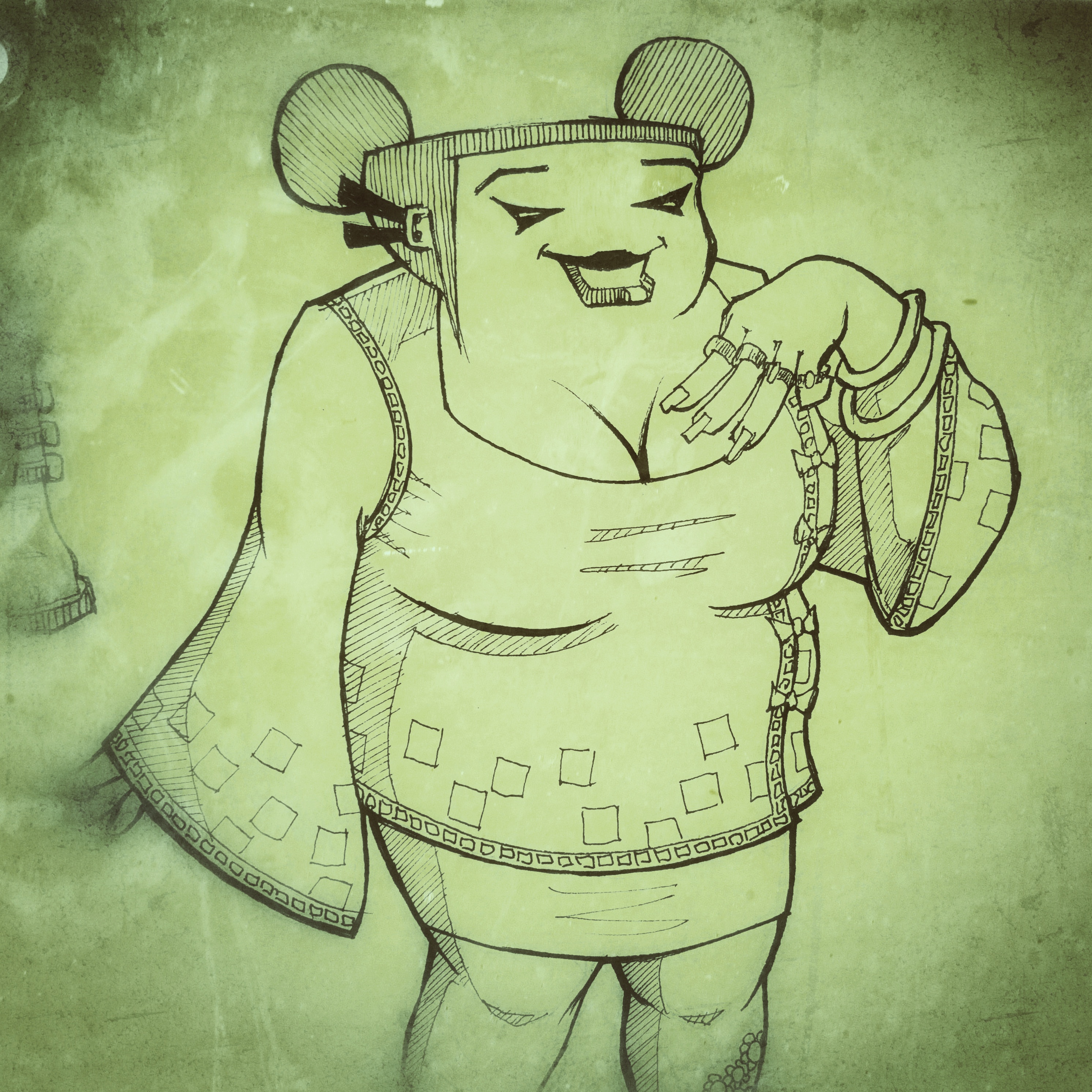
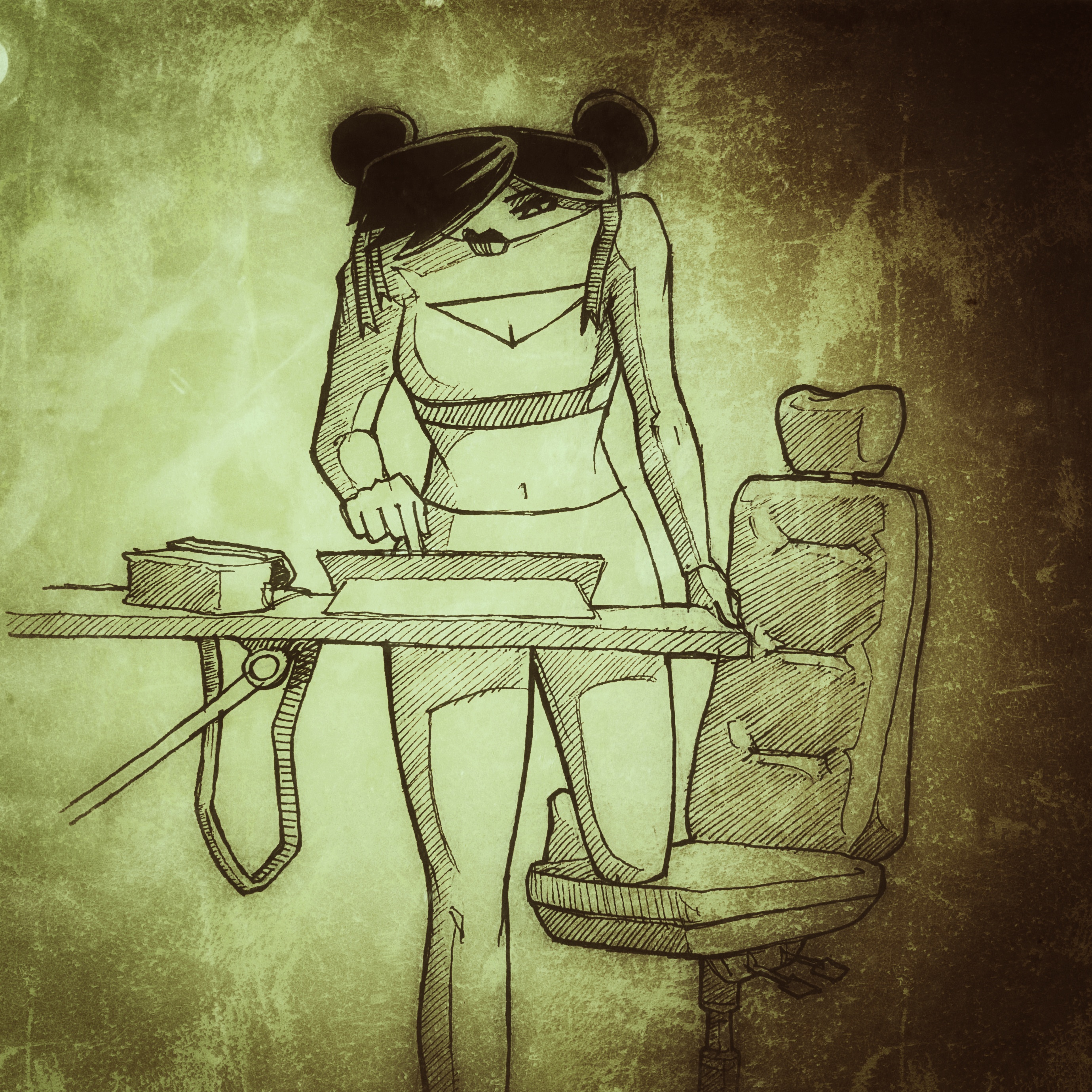
First off, let’s talk about that artwork. I really enjoy an expressive line in comic art – sure the clean-cut stuff can be great, but the art in Barking is so perfectly in keeping with the story – urgent,  challenging, and at times hard to decipher. Despite the fact that anatomy and perspective aren’t at all text book, Lucy’s background in art allows her to convey both movement and tone in a way that says ‘I know this looks a little off kilter, but I know exactly what I’m doing’. And she does.

I just want to dwell on that point about the art being sometimes hard to work out. Lucy is very clear about her struggle with mental health and this is of course a key strand of the story, and although I’ve not suffered in the same way, the sense of being overwhelmed and unable to process everything that’s happening is perhaps something many of us have experienced. So, the fact that we, as readers are challenged to makes sense of the apparently scrawled images which overlap and interact making some more difficult to read seems to be a direct depiction of a sate of mind and one which is handled beautifully.

It’s no spoiler to say that the story opens with the main character, Alix, in crisis – on a bridge and wrestling with the darkest of thoughts. Thoughts which soon take on shape and being and which become an important device in the tale: the ‘Black Dog’ is an age old manifestation of depression but here it takes on a slightly different role and is a constant and brooding presence.

Although the cause of Alix’s crisis seems pretty clear, for me that was called into question towards the end of the book but I’ll let you see what you think and not discuss the resolution here. Perhaps the best way to talk about it is through the soundtrack, which starts loud and brash with music that insists on filling your head, adding to the sense of disturbance and at times making it hard to concentrate on the text – once again, all contributing to the mood and experience of reading Barking. As it progresses, the playlist becomes infused with a melancholic introspection which I really enjoyed (oddly, I suppose) and, about two thirds of the way through everything takes on a more hopeful, uplifting vibe. All in all, it brought a whole new dimension to reading the book for me – fantastic.

There’s a lot more I could say about ‘Barking’, but probably the most useful thing is to recommend that you go get yourself a copy, download the playlist, sit and enjoy every dark, frantic, chaotic page of what is a classic comic.

The Whore Chronicles – review


Possibly not one for the feint-hearted, and certainly not one for your nan, here’s a review of this short anthology brought to us by the small-press man-beast that is Tony Esmond (@Ezohyez  –  www.neverironanything.blogspot.com)

There are seven stories in this book, all written by Tony, amounting to 36 pages. We have five sequential pieces (each by a different artist) and a couple of prose shorts. Here’s the artwork credits:


‘Shelly’: Rachael Ball @Rachaelcartoons  www.artacademy.org.uk

‘Peggy’: Sarah Harris @implausible

‘Diane’: Rik Jackson @gojacksongo www.rikjackson.co.uk

‘Lana’: Tom Curry @thischucklehead www.puntoten.tumblr.com

‘Sasha’: Charles H Raymond @not_so_tiny www.notsotiny.com

The cover-art is by your man Vince Hunt @jesterdiablo www.theredmaskfrommars.com

The two pin-ups in the back of the book are ‘Behind the Camera’ by Stuart Mulrain @TokenNerd www.oktruebelievers.com, and ‘Reality Sucks’ by Vince Hunt

The two prose shorts written by Tony are: ‘The Story of Sidney Small’ and ‘Peggy was a Rubbish Prostitute’.

Let’s start at the start: Vince might have come up with anything for the cover – a rough London pub where some of the women in the book ply their trade, or the shadowy alley where some of them service their customers. But no. Instead we’ve got a cover that’s an old VHS cassette which immediately sets the period of the comic – this is a solid pre-turn of the century piece and we know it before we open the book. I don’t know whose idea that was, but I like it!

Not everyone will want to read this book, which is a bit of a shame. With that title, I’d probably hesitate to read it in public myself to be honest, but, while the title is entirely representative of what’s inside, it perhaps isn’t w

hat you might expect – there’s no actual sex in the book and no nudity, i.e. what you might expect from the title. None of the stories tries to present the sham glamour of Hollywood prostitutes, or the one-dimensional whore we often see as bit-part characters on TV; the women we meet here are all different, all individual. Their stories are unique with many motivations and experiences.

Each sequential story is a short interview with one of the women where they give you a brief insight into their lives. It would be easy to feel sorry for them, but I don’t imagine that pity is what they would want. I wonder if some of them would even know what they did want if you took the time to ask them – most of their world’s feel pretty damn bleak, where the luxury of hope is something that they probably don’t allow themselves.

The exception to this format in terms of the sequentials, is a back-story relating to a background character from the brilliant Cockney Kung-Fu, one of Tony’s other creations. In fact, there are two stories in here about Peggy – the sequential and a piece of prose. Knowing Tony, the fact that this sequential comes first is probably deliberate as there’s a definite cause and effect relationship between the two stories. I won’t say more but see what you think.

Finally, there’s a sort of flipped story in there too by way of the other prose piece. The Story of Sidney Small makes you realise that the punters aren’t all husbands whose wives don’t understand them or pissed business-men away at a conference. Some of them are just bastards.

I particularly enjoyed the sequentials in this book – the artwork has real variety and, for me, Rachel Balls’ work on Shelly is the stand-out.

When you read the stories told in the prose you make that face like you’ve just sicked-up into your mouth, but sometimes, it’s worth reminding yourself how good your life is and there are people who have to taste a bit of sick more often than not. For me, I’d have liked a little more punctuation in the prose now and again but nonetheless, powerful stuff from a guy who has obviously seen some right horrible shit in his long and, possibly, illustrious career.

All in all, I’d recommend this to anyone who isn’t too squeamish or too easily offended. If you want a flavour of what life on the streets is like, get yourself a copy of this moving book and, while you’re at it, think about donating to the charity Tony mentions at the back of the book; Beyond the Streets – they’re a UK based charity who sees the possibility of life beyond sexual exploitation. Find them at www.beyondthestreets.org.uk


Awesome Comics Anthology, Issue 4. Review

Well, we’ve arrived at the end of an era. Ok, as era’s go, it’s not a very long one, but it is the end. At least for now. A year ago, the Awesome Comics Podcast boys put out Issue 1 of their three story, four issue anthology and, today, they dropped issue 4. Quite some achievement.

Looking at all four covers lined up at the OK True Believers comic con this morning, I have to say, they looked brilliant. As for what’s inside? Read on for a spoiler-free review, my friends.

Murder road

Story: Vincent Hunt (@jesterdiablo) and Daniel Marc Chant (@danielmarcchant)

Art / Letters: Vincent Hunt

For this final episode, the Chunt* has really narrowed things down, focusing entirely on the three main characters and the last minutes of this terrifying encounter. The atmosphere is great in this last scene – with occasional glimpses of sentinel like trees standing watch over the unfolding nightmare; the clearing in the forest feels oppressive and there’s a strong sense of claustrophobia as the darkness presses in.

I really like the way the guys have paced this; imaginative panel layouts which move the story on rapidly using images straight out of those stomach-churning horror movies you shouldn’t have watched when you were a kid – there’s no time wasted on dialogue here and no need for it either. You don’t need words to tell you whatever’s going on ain’t natural and you ought to be papping your under-crackers right about now!

The mother continues her Ripley impersonation and comes out of her corner fighting for the sake of her family with a great splash page and some inset panels that really feel like a cracking piece of cinematography.

As we move on, there’s more great work on the layouts which really speaks of Vince’s expertise on the graphic design front with some neat panel border breakout’s that add to a sense of dynamic action charging through the story.

There are some telling little choices that Vince has made in the artwork itself too – like a panel where he hasn’t delineated the visor of the Driver in profile making it seem like the darkness is flowing straight into or from the helmet of this hellish vision. Very nice.

The reveal of the story perhaps isn’t entirely a surprise but is certainly satisfying and doesn’t detract from how enjoyable this is; playing with some classic horror tropes, some deadly action, and a strong pay-off.

I’ve never read a horror comic before, and, putting all four issues together, this is a great entrée into that world. Familiar because it feels so cinematic, easy to read because of the pace, and satisfying because the story is very neatly packaged. All wrapped up with a blood-soaked ribbon.

Fantastic work boys, you should be rightly proud of yourselves.

*”Chunt” = Chant and Hunt, the deadly duo.

 Cockney Kung Fu – The Big Old Kent Road Kick-off, Parts 7 (I hear you knocking) and 8 (Queen Bee)

Story: Tony Esmond (@ezohyez)

Art / Letters: Nick Prolix (@nickprolix)

There’s an old adage among writers. I don’t know exactly how it goes but I think it goes something like “if you want your readers to feel empathy for your protagonist, put ‘em through the wringer”. Let’s just say, Tony’s wringer must be well and truly battered by the end of this forth issue.

Before we get in to any detail, let’s just have a chat about the feel of this story. Right from Issue 1, there was an underling sense that any one of the characters would screw another over at the first opportunity of turning any sort of profit – I mentioned it in some of my earlier reviews. There’s plenty to recommend this story, but I think, more than anything, it’s this feeling of being off balance that’s drawn me to it and which I’ve really enjoyed.

Once again, we’re treated to superb cartooning by the legendary Mr Prolix – the art’s been great throughout the story and his hand lettering and particularly the sound effects are things of beauty. The tension to his comical, almost caricature-like portrayal of the characters comes from the dark undertone of Tony’s story – it’s a low-down, violent tale of some really nasty bastards where the moral is fuck them or they’ll fuck you. It makes the read edgy in a fantastically compelling way.

Part 7 opens with a really nicely portrayed dream sequence while Red is still out cold from the end of the last issue – it shows us something of her past and how she came to be who she is and hints at a discipline that we haven’t seen in her before. Another layer to this character who I know Tony has plans for beyond this comic and which I’ve no doubt readers would love to see.

All my reviews are spoiler-free so I won’t tell you exactly what happens but, as in life, the story isn’t all neatly wrapped up with a bow and put aside ready for the next chapter to start. In Part 8, we’re introduced to some new but equally horrible characters and Red finds that there’s nowhere to go from the frying pan but into the fire.

It’s hard to know how to sum this story up – it’s funny, comical, jaunty, violent, vicious, dark, and nasty. All in a gritty soup than smells like a packed commuter tube in the height of summer. Whatever it is Esmond’s got planned for Red, you can bet it isn’t going to be plain-sailing. Bring it on, baby-cakes!

Vyper

Everything: Dan Butcher (@vanguardcomic)

Once again, Dan’s displaying some absolute chops with the panel layouts in this final issue of Vyper – we’re straight into the action here and the sharply tilted panels make for a really fast paced layout.

Dan’s portrayal of the action is brilliant – I’ve said before how much I like his use of blurring to create dynamic motion and depth of field, and it’s used again here with great aplomb. The environments too; like the city, the dock, and the establishing shot of the police HQ, work beautifully and once again teach us that any number pier you care to mention, in any coastal American city, is not the place to be after bedtime.

There’s some real jeopardy for the good guys in this scene and the classic action show feel just oozes from every panel and speech bubble – it’s so full of nostalgia, I’m surprised there’s any room for story!

But room there is. And not only for story, but for character development too. The main character really does go on a journey here; putting at least some of his dark past to rest and realising that he doesn’t have to be a complete dick all the time.

We’ve boiled things down to just a few key characters for most of this issue and the focus works really well – Lopez is also developing and we see the respect that she’s worked hard to gain from Vyper paying off as the relationship becomes more trusting and we realise there’s something in this for both of them.

There’s a nice scene towards the end of the story where Sloan thinks he’s got away with his duplicitous Vyper / Viperini shenanigans, but…well, you’ll have to read it to find out what happens there, but, let’s say no more than it’s a really sweet little twist.

It definitely feels like we need to see more of these characters as Dan drops in another potential follow-up story hook towards the end of the book and indeed the closing text gives me the strongest possible suspicion that that particular itch is going to get scratched…

Extras

There’s a nice little ‘interview’ at the back of the book exploring the experience the guys have had putting the book together over the past year, some nice little back-matter sketches and an invite to let them know what you think of the whole sorry affair. So, don’t disappoint and give  apiece of your mind by emailing awesomecomicspod@gmail.com or tweeting the hell out of them @theawesomepod

Beyond

So, I’ve been trying to make progress on my next comic but, frankly, it’s painfully slow. I seem to be working, like, a lot lately and struggling to find time to draw or write. And when there is a little time, once the thirst of the eternal list of the DIY purgatory has been slaked, I’m too knackered to do anything worthwhile.

That said, it’s not like I haven’t done anything. There’s been a lot of thinking and that’s good at least. I’ve also been thinking about the art style of the book and creating characters to populate the world; I thought I’d share some here.


I’m thinking black and white. Not really because of the expense, but more because “one thing at a time”! It’s enough to deal with the artwork and the script let alone attempting the pit of despair that is colouring…

Feel free to let me know what you think about any of these btw.


If you’re interested, it’s set in the future. In a world where economics and climate change have forced almost everyone into huge cities, all humanity packed into a tinder box of overcrowded, desperate lives. Where religion used to play the lead role in survival but now has fallen to the decadence of commerce. In this world, the further up the social ladder you are, the further up you live. You have light and air and all things sweet. Below, deep below, there are things that no-one wants to see, but that make the world tick irrespective of people’s preference for not acknowledging they’re there.


Out of Time – review

Story: Luke James Halsall https://lukejameshalsall.wordpress.com/ @LJHalsall

Art / colours / letters: Cuttlefish http://cuttlefishcomics.blogspot.co.uk/ @cuttlefishcomic

Publisher: Markosia @Markosia 

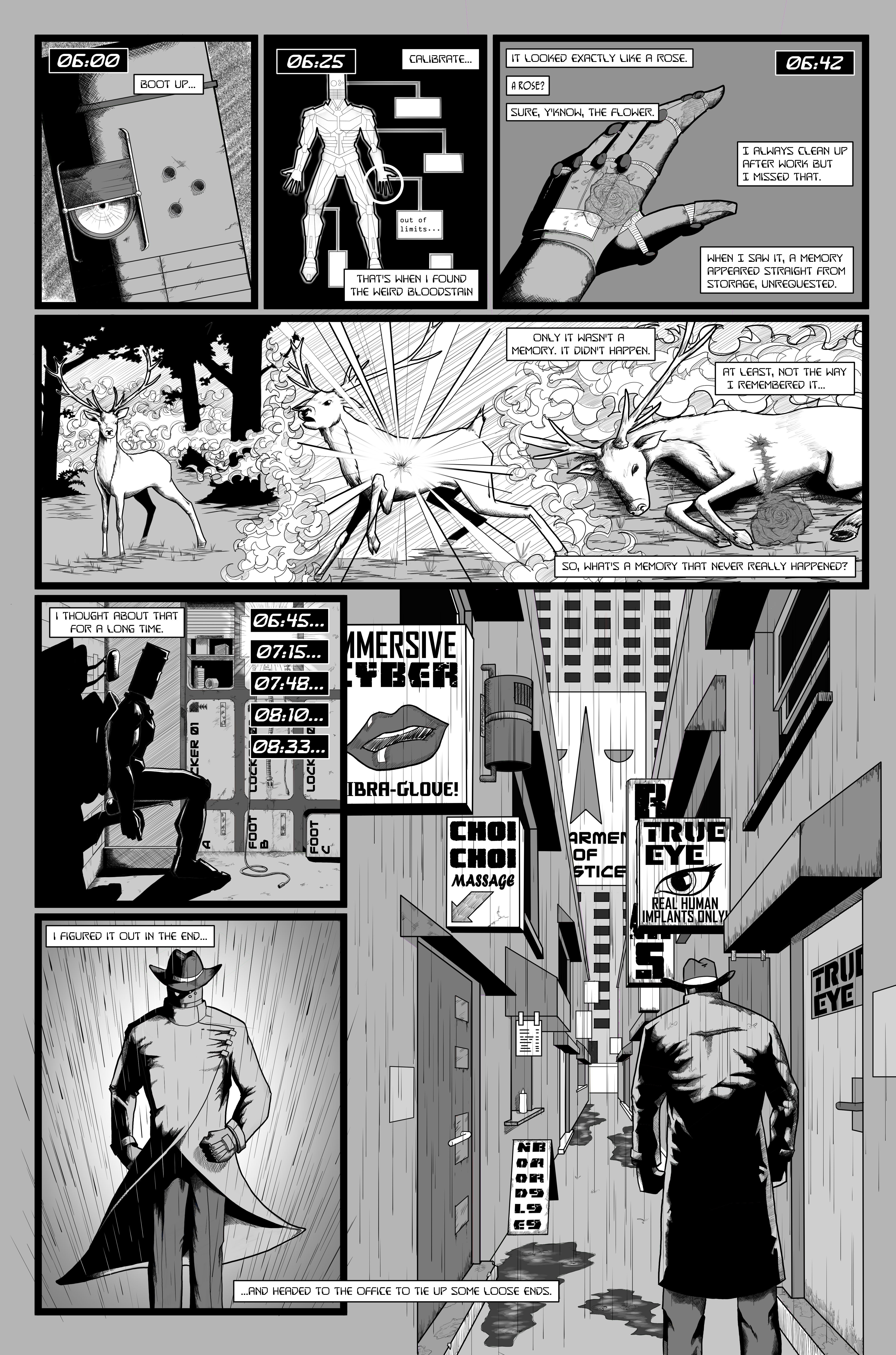
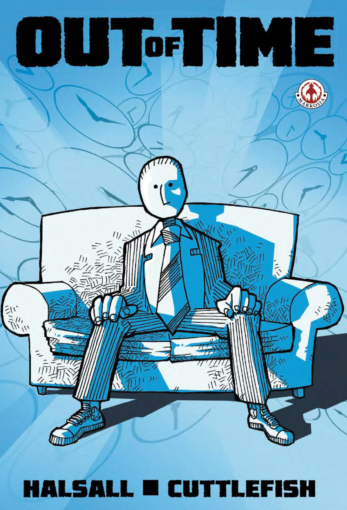
When Luke sent me the link and I downloaded Out of Time, I immediately realised that I’d seen this comic before – I still can’t remember when exactly but I thought at the time I really liked the cover, so getting to dip inside is real treat. 

Before we get into detail, let’s sum up: I’m reviewing the whole book here which is a collection of three issues, numbered 1, 2, and 4. This may seem odd, but as I only write spoiler-free reviews, you’ll have to read it to find out why this doesn’t make sense in a good way! You’re getting over 60 pages of story for your money here, so great value for a book you can download for under $4 (check out DriveThru Comics for the download). The guys were on the con-circuit hawking the book before it being picked up by Markosia after a meeting at Thought Bubble – just goes to show, it’s always worth making those connections at cons! 

So, let’s start with the artwork – it’s the first thing you notice about a book of course, and in this case it’s a good thing. The artwork isn’t entirely conventional but is nonetheless fantastic and that’s coming from someone who really got into, and then out of, comics in the ‘90s – and we all know what that means as far as artwork’s concerned: ’90s style art this ain’t, and the book is all the better for it. The characters only occasionally have mouths, sometimes don’t have arms (but still have hands) and frequently miss out on the joys of noses but that only adds to the wonderfully stylised appearance of the book. 

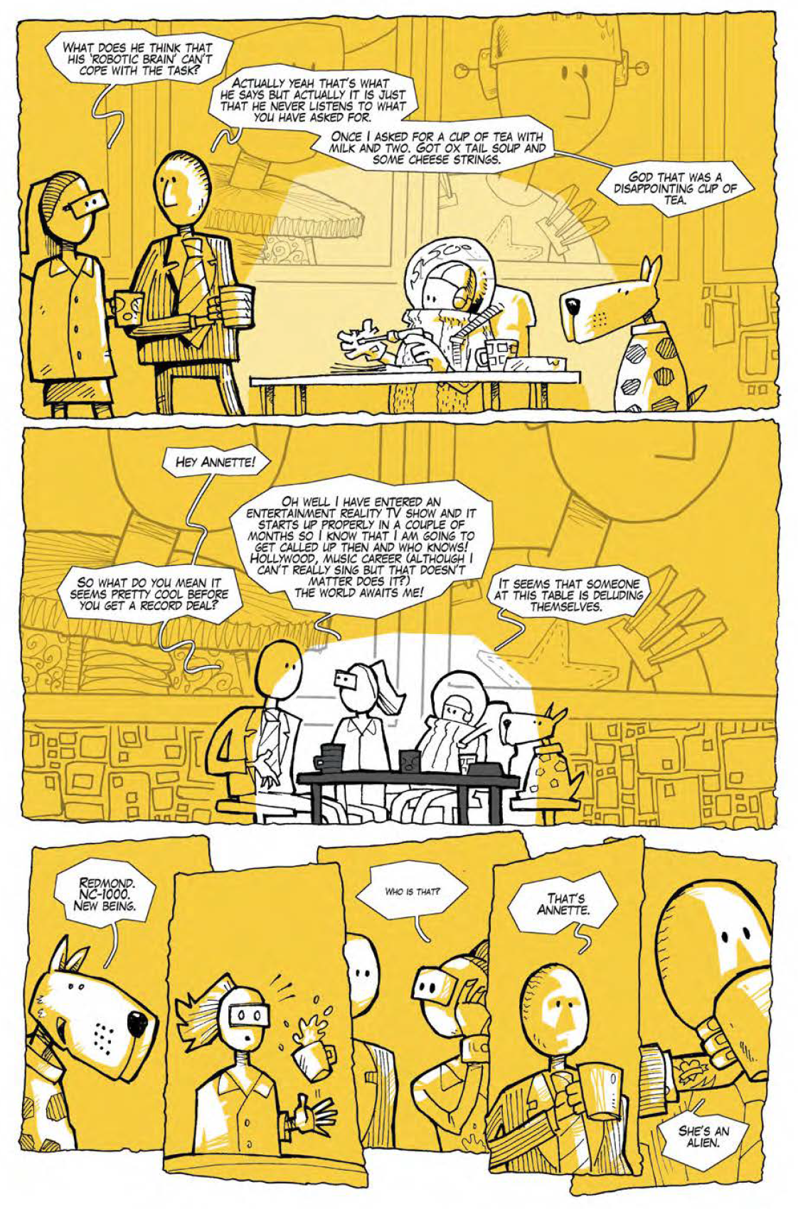
Backgrounds aren’t heavily detailed, colouring uses a really limited and largely unrealistic palette, and word balloons are funky hand drawn affairs. None of this, however unusual, is bad – every bit of it appears a consummate stylistic choice topped off by some really neat inks which are most successful when they are kept nice and simple. A slight criticism, and I’m working hard here to pull something out, is that I think both the inking and the colouring are slightly less convincing in panels where the palette gets too varied (in that you lose that really strong graphic element of shades of a single colour) or inks are too detailed (where inked shading goes further than solid blacks) – the middle section of issue one is an example, but this is pretty minor in what is otherwise really solid work from Cuttlefish. Does anyone know who this person is by the way or am I looking for a guy who squirts ink in my face if I approach too quickly from a jaunty angle at a con…?

Onto the story. As I say, no spoilers (although the book’s been out for some time and I’m not sure that the script is really built around surprises, so I think I’m pretty safe), so I’ll keep things relatively general. 

The story is about a small team of employees at a company who offer holidays to different periods in time to rich clients – when I say different periods of time, I don’t mean dressing up in green tights, sticking a feather in your cap and pretending you’re robbing from the rich. No, we’re talking actual time travel – which, as everyone knows, is a mind bender of a concept and something one would be well advised to steer clear of as a plot device. Given that, you have to hand it to the nutcase that is Luke James Halsall for taking it on! 

Halsall sails above the old time-travel pitfall of getting bogged down in the “major boring shit” of the mechanics of it all – his main tool for this nimble little authoring trick? The classic time-travelling-sofa; naturally. I know, but it just is, ok? 

While the story gads along at a rare old pace, it isn’t full of any great suspense which is fine because what we have here is a tale that relies on the characters and comedy to entertain the reader. Just before we get to those features though, it’s great that the story “gets about a bit” with scenes both in antiquity and in the future, all well visualised by Cuttlefish. Different realities are also mentioned but not explored in this book: I’m hoping that’ll be the subject of a future publication! 

In terms of characters, some are more successful than others, with Redmond, NC-1000 and Dave being the ones that stand out. The dialogue of these three really works to give you a sense of character and quickly established itself as the distinctive voice of each. The other characters are good supporting players but perhaps lack the more clearly drawn appeal of these three. 

One issue that jarred slightly was that the characters often use language that feels a little less natural than is comfortable, with fewer contractions than you might expect (e.g. “…what we are saying…” instead of “…what we’re saying…”). For many people this probably isn’t an issue, but writing natural dialogue is a really tricky business and it’s something that I find takes me out of a story if it doesn’t quite flow which happens here occasionally. 

As for comedy, I found the funniest moments of the book were those delivered by characterisation rather than dialogue written purely for laughs – both Redmond and NC-1000 have some great lines which are funny because it’s an insight to their heads rather than being funny per se. I’d definitely say that this is something to focus on in the future as it works really well here.  

To sum up, Out of time, is a good book full of fantastic artwork, some neat story and cool characters. I’d certainly recommend taking this little beauty for a spin! I’m really looking forward to what these guys are cooking up next. 

J.AKE – Page 6

Welcome to the final page of J.AKE.

After spending years doing the wetwork of the Department of Justice, our hero has a dream in which he sees the death of innocence. The awakening makes him realise the horror of the work he has carried out with impunity, and he’s pissed. Heading straight for the Director, he visits terrible revenge on the staff of the Department of Justice. The Director decides J.AKE is expendable and, after failing to terminate him, he cuts her down and she is revealed as a cyborg, more sophisticated, but just like J.AKE. Later, she (or maybe a copy) turns up in Sam’s bar and he understands that the Department can’t be stopped so easily. The Director explains that the organic part of his brain has developed what amounts to a conscience as a consequence of being secretly fed stem cells. Let’s see how this mess ends…