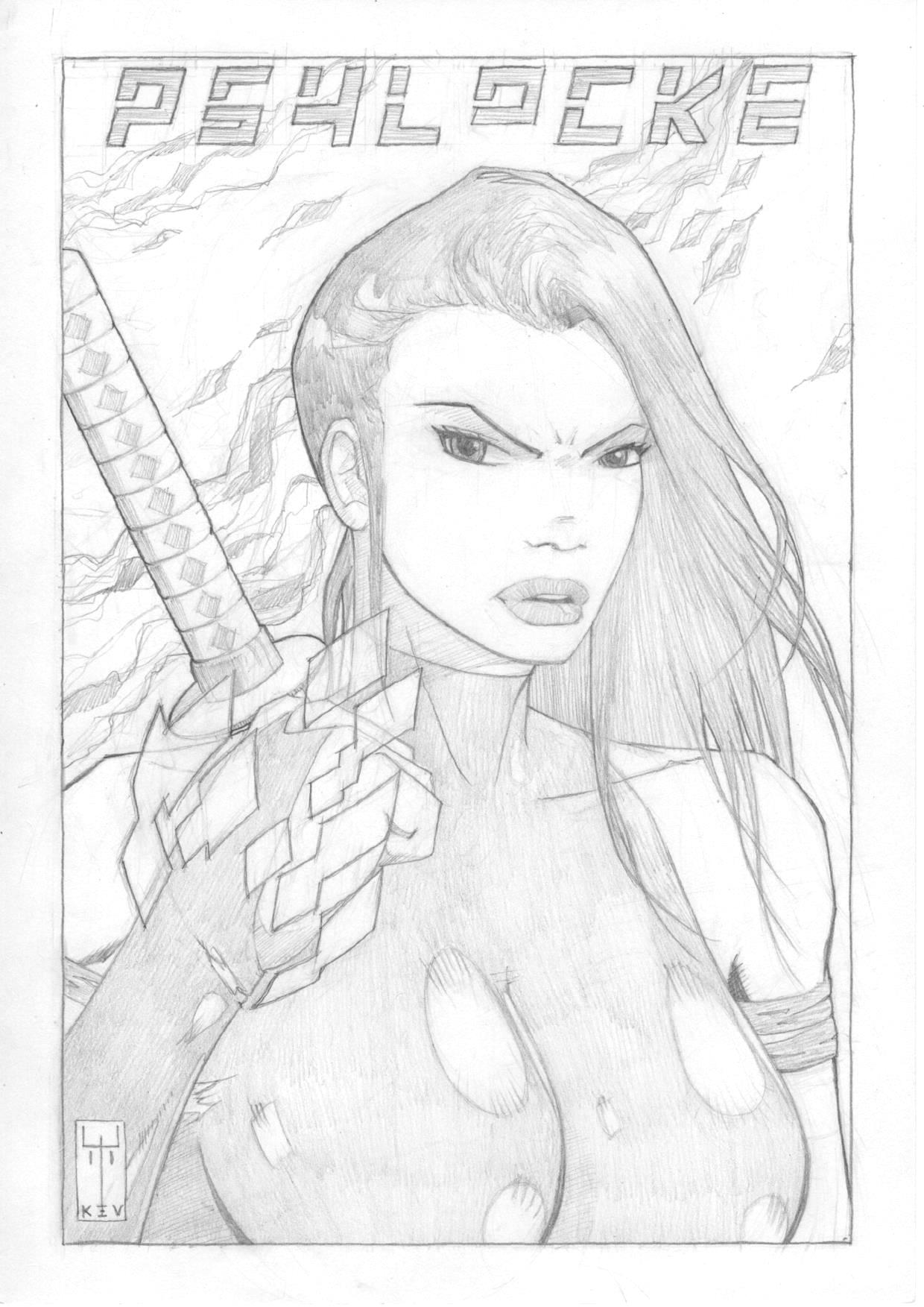
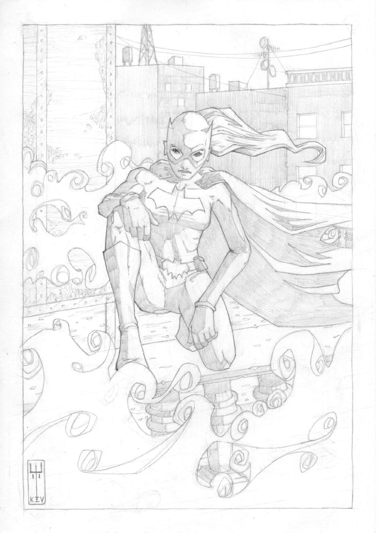
Marvel characters – Psylocke
Pourings from a pinball mind…
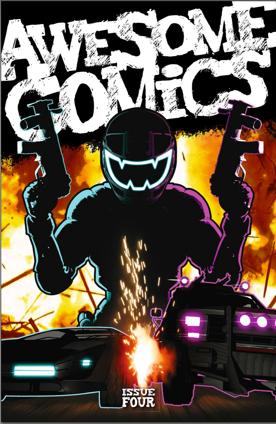 Well, we’ve arrived at the end of an era. Ok, as era’s go, it’s not a very long one, but it is the end. At least for now. A year ago, the Awesome Comics Podcast boys put out Issue 1 of their three story, four issue anthology and, today, they dropped issue 4. Quite some achievement.
Looking at all four covers lined up at the OK True Believers comic con this morning, I have to say, they looked brilliant. As for what’s inside? Read on for a spoiler-free review, my friends.
Murder road
Story: Vincent Hunt (@jesterdiablo) and Daniel Marc Chant (@danielmarcchant)
Art / Letters: Vincent Hunt
For this final episode, the Chunt* has really narrowed things down, focusing entirely on the three main characters and the last minutes of this terrifying encounter. The atmosphere is great in this last scene – with occasional glimpses of sentinel like trees standing watch over the unfolding nightmare; the clearing in the forest feels oppressive and there’s a strong sense of claustrophobia as the darkness presses in.
I really like the way the guys have paced this; imaginative panel layouts which move the story on rapidly using images straight out of those stomach-churning horror movies you shouldn’t have watched when you were a kid – there’s no time wasted on dialogue here and no need for it either. You don’t need words to tell you whatever’s going on ain’t natural and you ought to be papping your under-crackers right about now!
The mother continues her Ripley impersonation and comes out of her corner fighting for the sake of her family with a great splash page and some inset panels that really feel like a cracking piece of cinematography.
As we move on, there’s more great work on the layouts which really speaks of Vince’s expertise on the graphic design front with some neat panel border breakout’s that add to a sense of dynamic action charging through the story.
There are some telling little choices that Vince has made in the artwork itself too – like a panel where he hasn’t delineated the visor of the Driver in profile making it seem like the darkness is flowing straight into or from the helmet of this hellish vision. Very nice.
The reveal of the story perhaps isn’t entirely a surprise but is certainly satisfying and doesn’t detract from how enjoyable this is; playing with some classic horror tropes, some deadly action, and a strong pay-off.
I’ve never read a horror comic before, and, putting all four issues together, this is a great entrée into that world. Familiar because it feels so cinematic, easy to read because of the pace, and satisfying because the story is very neatly packaged. All wrapped up with a blood-soaked ribbon.
Fantastic work boys, you should be rightly proud of yourselves.
*”Chunt” = Chant and Hunt, the deadly duo.
Cockney Kung Fu – The Big Old Kent Road Kick-off, Parts 7 (I hear you knocking) and 8 (Queen Bee)
Story: Tony Esmond (@ezohyez)
Art / Letters: Nick Prolix (@nickprolix)
There’s an old adage among writers. I don’t know exactly how it goes but I think it goes something like “if you want your readers to feel empathy for your protagonist, put ‘em through the wringer”. Let’s just say, Tony’s wringer must be well and truly battered by the end of this forth issue.
Before we get in to any detail, let’s just have a chat about the feel of this story. Right from Issue 1, there was an underling sense that any one of the characters would screw another over at the first opportunity of turning any sort of profit – I mentioned it in some of my earlier reviews. There’s plenty to recommend this story, but I think, more than anything, it’s this feeling of being off balance that’s drawn me to it and which I’ve really enjoyed.
Once again, we’re treated to superb cartooning by the legendary Mr Prolix – the art’s been great throughout the story and his hand lettering and particularly the sound effects are things of beauty. The tension to his comical, almost caricature-like portrayal of the characters comes from the dark undertone of Tony’s story – it’s a low-down, violent tale of some really nasty bastards where the moral is fuck them or they’ll fuck you. It makes the read edgy in a fantastically compelling way.
Part 7 opens with a really nicely portrayed dream sequence while Red is still out cold from the end of the last issue – it shows us something of her past and how she came to be who she is and hints at a discipline that we haven’t seen in her before. Another layer to this character who I know Tony has plans for beyond this comic and which I’ve no doubt readers would love to see.
All my reviews are spoiler-free so I won’t tell you exactly what happens but, as in life, the story isn’t all neatly wrapped up with a bow and put aside ready for the next chapter to start. In Part 8, we’re introduced to some new but equally horrible characters and Red finds that there’s nowhere to go from the frying pan but into the fire.
It’s hard to know how to sum this story up – it’s funny, comical, jaunty, violent, vicious, dark, and nasty. All in a gritty soup than smells like a packed commuter tube in the height of summer. Whatever it is Esmond’s got planned for Red, you can bet it isn’t going to be plain-sailing. Bring it on, baby-cakes!
Vyper
Everything: Dan Butcher (@vanguardcomic)
Once again, Dan’s displaying some absolute chops with the panel layouts in this final issue of Vyper – we’re straight into the action here and the sharply tilted panels make for a really fast paced layout.
Dan’s portrayal of the action is brilliant – I’ve said before how much I like his use of blurring to create dynamic motion and depth of field, and it’s used again here with great aplomb. The environments too; like the city, the dock, and the establishing shot of the police HQ, work beautifully and once again teach us that any number pier you care to mention, in any coastal American city, is not the place to be after bedtime.
There’s some real jeopardy for the good guys in this scene and the classic action show feel just oozes from every panel and speech bubble – it’s so full of nostalgia, I’m surprised there’s any room for story!
But room there is. And not only for story, but for character development too. The main character really does go on a journey here; putting at least some of his dark past to rest and realising that he doesn’t have to be a complete dick all the time.
We’ve boiled things down to just a few key characters for most of this issue and the focus works really well – Lopez is also developing and we see the respect that she’s worked hard to gain from Vyper paying off as the relationship becomes more trusting and we realise there’s something in this for both of them.
There’s a nice scene towards the end of the story where Sloan thinks he’s got away with his duplicitous Vyper / Viperini shenanigans, but…well, you’ll have to read it to find out what happens there, but, let’s say no more than it’s a really sweet little twist.
It definitely feels like we need to see more of these characters as Dan drops in another potential follow-up story hook towards the end of the book and indeed the closing text gives me the strongest possible suspicion that that particular itch is going to get scratched…
Extras
There’s a nice little ‘interview’ at the back of the book exploring the experience the guys have had putting the book together over the past year, some nice little back-matter sketches and an invite to let them know what you think of the whole sorry affair. So, don’t disappoint and give apiece of your mind by emailing awesomecomicspod@gmail.com or tweeting the hell out of them @theawesomepod
Once again, Tony Esmond has slipped a little unexpected something into my bulging inbox and, to be honest, I was only too happy to receive. Following our meet up for a couple of jars after work, Tony dropped me a link to Issue 3 and I figured the least I could do in return was to give it a damn good reading and write down what I thought about it all. So here it is.
Let’s start with the cover. Despite being a guy who appears to have a small Thomas the Tank Engine toy held captive between his toes as his Twitter profile pic, it hasn’t stopped Ed Traquino (@feliqscomics) really pulling one off on the cover art – it looks fantastic and shows Red really digging the funk in one of her more unguarded moments, which I suspect don’t happen often. Very nice work man!
Murder road
Story: Vincent Hunt (@jesterdiablo) and Daniel Marc Chant (@danielmarcchant)
Art / Letters: Vincent Hunt
Part 3 opens on a flashback scene of the mum character and, what I guess is her high school sweetheart / soon to be husband (slightly freakily, his name is the same as my dad’s, which is a worry to be honest). The music playing in the background immediately confirms that we’re back in the day when the two young lovers declare their devotion to each other with the choice of song beings a nice touch with the first line we ‘hear’ sitting perfectly with the tone of the book.
The transition back to present is handled really well – it could have been a harsh cut but as it is you can almost feel the final words the guys says echoing down the years to stroke your spine with grave-cold fingers.
As we come back to the present, the pace really picks up and the boys (who, from here on, I’ll be referring to collectively as “the Chunt”) have timed this issue beautifully; if I was reading a print copy, I’d be in danger of giving myself a very nasty papercut whipping the pages over to see what the hell happens next. The story canters along at rare old pace – I tore through this and had to go back a second time to properly take it all in.
Again, Vince reinforces that whatever this is, it’s been going on for years with the mum being the link between then and now. She takes on a real Ripley-esque feel in the second half of this issue and, frankly, I would not like to be the one to short-change her at the diner ‘cause she’d be likely to tear a new one. Possibly two.
The terror is really mounting as we switch back to the action where the Chunt provide only a petit morceau of gore d’jour but it’s plenty to let you know that The Driver is a twisted bastard alright, just in case you weren’t sure already.
I won’t tell you how this episode ends, but it’s a real treat and cues up the final part beautifully. Can’t wait to see what dark, twisted finale is planned for this very much depleted cast!
Cockney Kung Fu – The Big Old Kent Road Kick-off, Parts 4 (She wears it well)
Story: Tony Esmond (@ezohyez)
Art / Letters: Nick Prolix (@nickprolix)
We’re straight into the thick of it here with no titles and no fucking around. Red and the boys are dead set on parting the punters of the joint with their hard-earned and they’re aren’t about to take an IOU.
It was clear that the job wasn’t going to go the way Red thought in the last episodes – where would be the jeopardy for our lovely lady in that? And so it proves.
There’s something really conflicting about this whole story for me and I mean that in the best possible way: on the one hand you have this jaunty, old fashioned language that we’ve all seen in old movies if not in real life which sort of gives you a slightly off-kilter sense of fun. And then you realise that these people are absolute bastards. It gives you a wonderfully uneasy feeling as you read it – great work by the Segal doppelganger that is Tony Esmond.
There’s a beautifully paced scene where one of the boys takes off his balaclava which can only mean one thing (assuming you’ve watched just about any heist movie, like, ever) – it happens at the bottom of a page and the next panel is fantastic; Nick has totally nailed it; brilliant!
Once again, Custard doesn’t say much, but what he does say is deeply moving and profound – now doubt after this one last job, he’ll move to India and become a yogi…
Part 5 is a classic caper where it all goes sideways like Bobby Charlton’s comb-over in a brisk wind – it’s pacey and fun and might even be slapstick if there wasn’t this undercurrent of dark skulduggery and lingering doubt in the back of your mind. Nick’s art only adds to the Ealing studios feel of the whole thing which is just such a perfect fit.
By the time we get to Part 6 we’re left in no doubt that who the bad boy of this piece is – just a bit too nasty to really be your mate, but you laugh at all his twisted jokes because he might just beat the crap out of you if you don’t. No idea what’s going to happen to this guy, but I’m hoping it isn’t pretty.
As I said in my review of the first issue, you see here the fragility of Red’s existence in a world where the sands can shift under your feet in the blink of an eye and your friends become your enemies in a constantly turbulent environment where you don’t have the luxury of trust. Whether you take any notice of it or not, the shadow of a malign and precarious truth sits just on the edge of your vision when you read this story and for all it’s jaunty, Ladykillers banter, it’s disturbing. And I love it.
Roll on issue 4.
Vyper
Everything: Dan Butcher (@vanguardcomic)
I have to start by saying that I absolutely love Dan’s done layouts in this issue; he’s really done some great work with panels including switching to an off kilter diagonal as the action heats up bringing a whole new level to the experience of reading the story. There are plenty of panel border breakouts too which really make the artwork pop. That and Dan’s as ever brilliant backgrounds make this a great looking story.
As for the story itself, the dialogue once again captures that ‘80s exposition vibe as we get ready for the action and Vyper gets a briefing he’s obviously going to give as much credence to as the lessons of his Sunday school teacher; he’s a loose cannon, but what the Hell – who else is going to look that good in those tight pants and a shiny helmet…
Later in the story there’s a detail I hadn’t picked up on before – there’s a hint that his secret identity is part of a larger organisation and while we don’t hear any more about it, I wonder if Dan has more backstory up his sleeve than he’s sharing. I like that nod to a bigger picture without any explanation – just like real life. Sort of.
Virtually all the bad guys here are nameless henchmen; just as they should be, with the focus squarely on the big bad who our hero has personal history with and who’ll probably be one half of the badass showdown that’s on the cards for the final episode.
Sloane naturally goes off-piste and the jeopardy cranks up as the mission starts to go south – as with every good ‘80s action movie, when the shooting starts, things get manic and over the top with the body count racking up at an alarming rate; none of your A-Team, how did those guys come out of the horrendous car-crash / fall / shoot-out with just a headache BS here. Dan handles the sound effects of all this action nicely too; both of the shooting, and the screeching of wheels. Talking of wheels, the Vyper itself is really well drafted. You see it from lots of different angles and it always looks convincing; no mean feat. I can’t wait until Dan really challenges himself with a story about a Mongolian reindeer herder who travels everywhere with his extended family on horseback!
We leave this episode with Sloane now having an almost impossible task – complete the mission, while defeating the big-bad, and saving the girl. Will he do it? I guess we’ll have to tune in next time to find out!
Extras
Once again, a couple of pages of childish, near-the-knuckle fans’ letters for readers to enjoy at the back of the book – obviously spot-on and entirely appropriate for the mental age of us degenerate ACP fans.
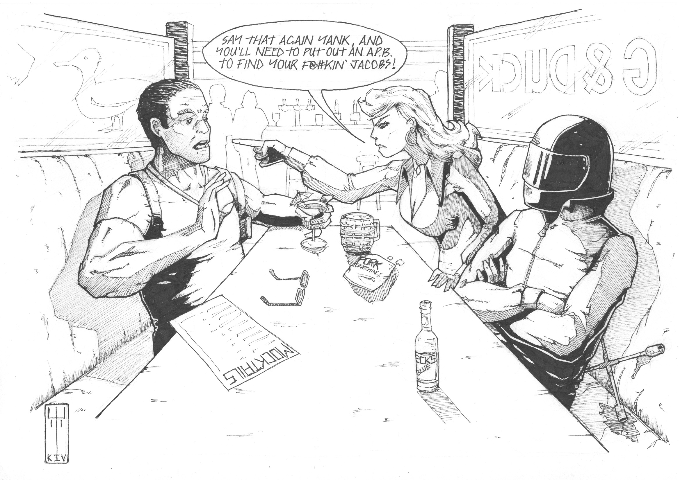
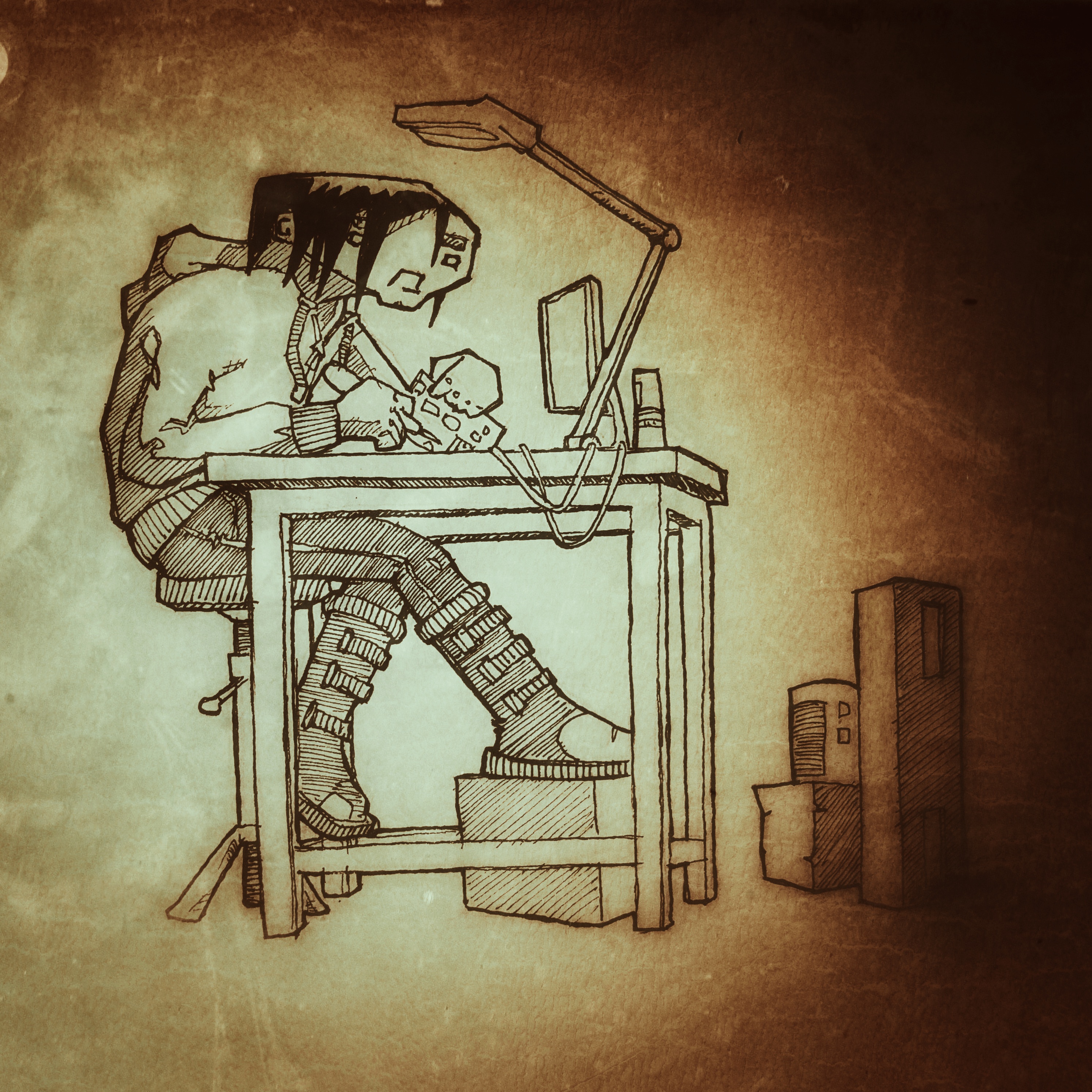
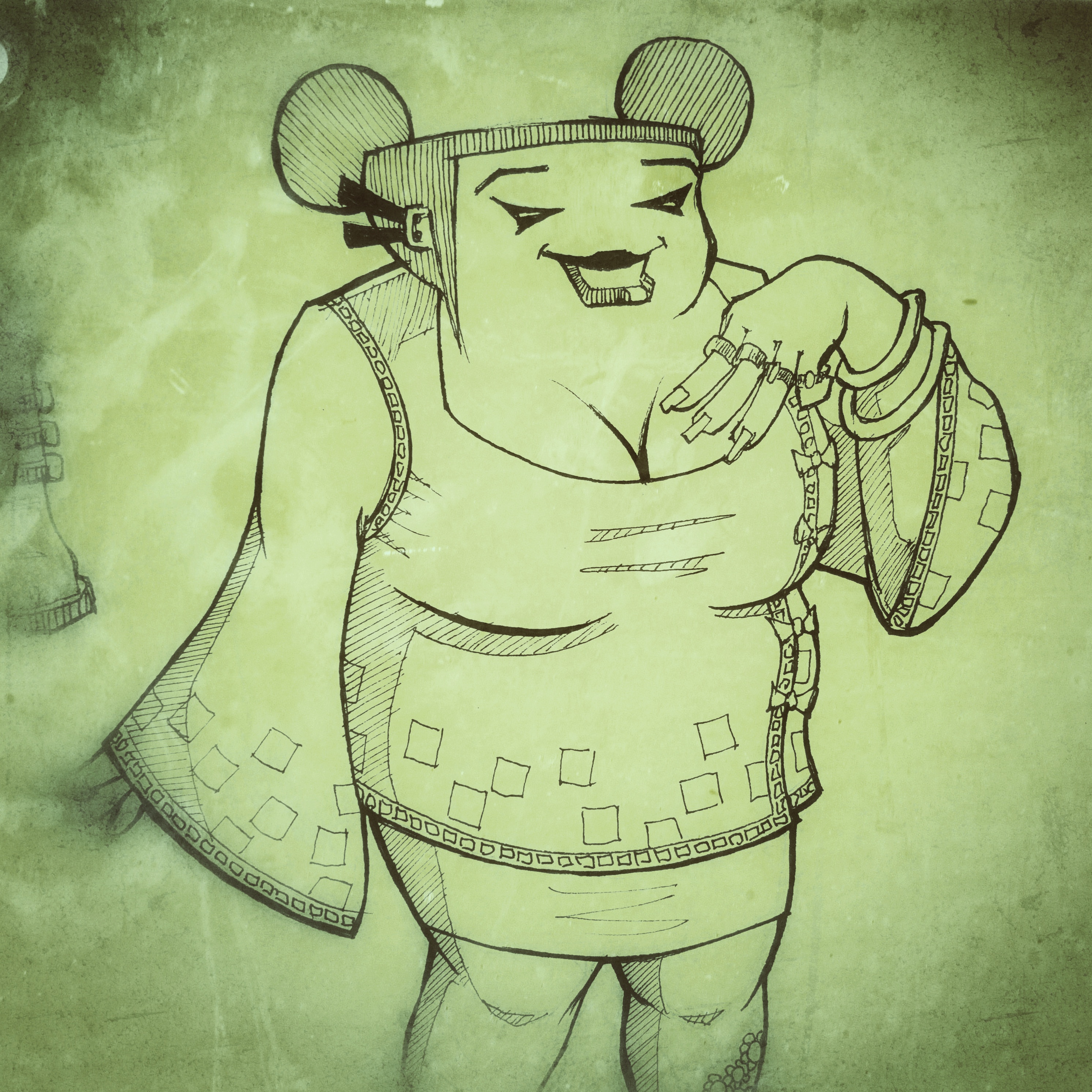
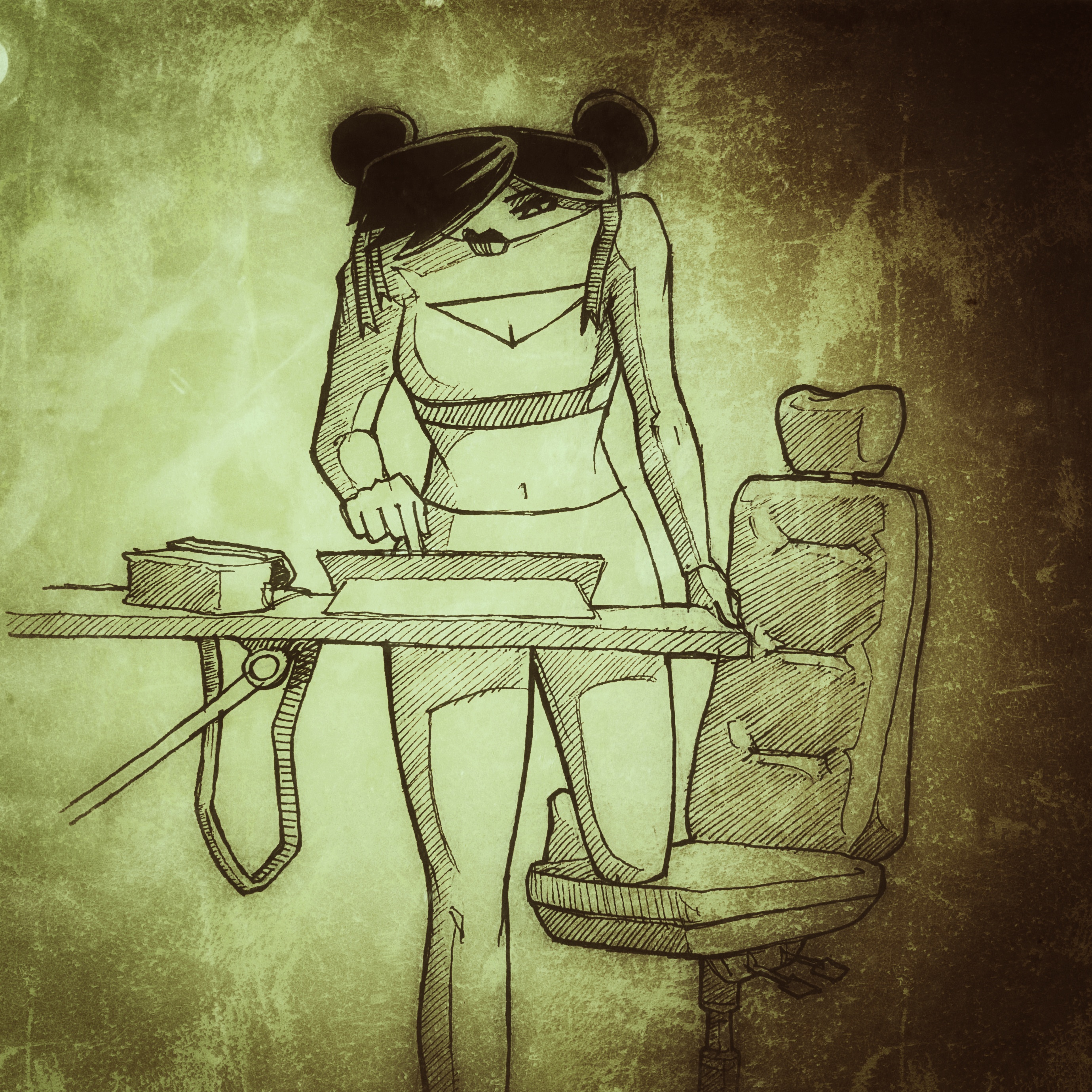
There’s a page of fan art too with some great work on display – again, no less than you’d expect from the dedicated followers of Awesome! My own piece didn’t make it into the book, so I thought I’d share it with you below dear reader – enjoy!
So, I’ve been trying to make progress on my next comic but, frankly, it’s painfully slow. I seem to be working, like, a lot lately and struggling to find time to draw or write. And when there is a little time, once the thirst of the eternal list of the DIY purgatory has been slaked, I’m too knackered to do anything worthwhile.
That said, it’s not like I haven’t done anything. There’s been a lot of thinking and that’s good at least. I’ve also been thinking about the art style of the book and creating characters to populate the world; I thought I’d share some here.
I’m thinking black and white. Not really because of the expense, but more because “one thing at a time”! It’s enough to deal with the artwork and the script let alone attempting the pit of despair that is colouring…
Feel free to let me know what you think about any of these btw.
If you’re interested, it’s set in the future. In a world where economics and climate change have forced almost everyone into huge cities, all humanity packed into a tinder box of overcrowded, desperate lives. Where religion used to play the lead role in survival but now has fallen to the decadence of commerce. In this world, the further up the social ladder you are, the further up you live. You have light and air and all things sweet. Below, deep below, there are things that no-one wants to see, but that make the world tick irrespective of people’s preference for not acknowledging they’re there.
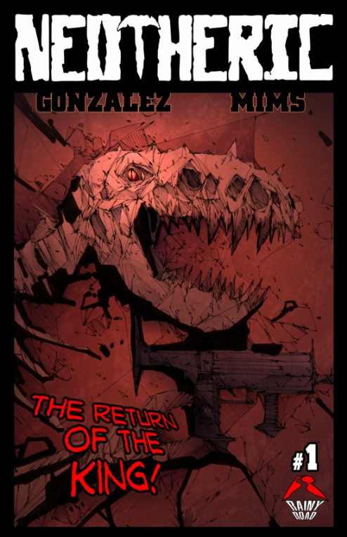
Neotheric Vol 1, #1 & #2
Story and letters: Michael T Gonzalez
Art: Dave Mims
Finally got round to installing the Comichaus app today – and instantly regretted not doing it sooner. The very first book I picked, pretty much at random, is fantastic!
First up, this is not an all-ages read – there’s violence and swearing a-plenty, so if you’re under like 10 or whatever (when do they start swearing and playing inappropriate games these days?), you shouldn’t be reading this…Seriously though, it has a “Mature” explicit rating so save it for later kids; there are plenty of cool all-ages books out there for you.
Right, on with the (no spoilers) review.
Something that used to right-royally yank my tatlocks was a cover that hooked you in and made you buy a book that was a load of old turd on the inside – I’m very happy to report that this bad boy is 100% on the button; the cover looks just like the internal art. Which, in case you’re wondering, is freakin’ awesome!
The colouring uses lots of gradients and a slightly muted, but rangy, palette that works beautifully with really fantastic linework – and this is the real strength of Mims’ work here – he does an inspired job. At first glance it looks like there are too many lines, but somehow, it works to create a strongly graphic feel with sparse backgrounds, expressive characters and great action. This is some of my favourite artwork this year; sweet!
The story is a little off-the-wall and, although you might think you can spot the backstory of the main characters pretty quickly, issue 2 ups the ante and raises an eyebrow: no spoilers, but there appears to be at least one pretty famous dude in this series… I’m digging the premise and I’m looking forward to seeing where this story goes and I’m kind of expecting it to be not where I think! The dialogue throughout is nice and tight, funny, and natural – really great work which isn’t always in evidence in indie comics and a big thumbs up to Gonzalez for this work.
Pretty quickly he’s managed to create some interesting characters who are shaping up really well – one of what appears to be the main couple of characters (right now at least – I’ve been caught like that before…) is looking to be particularly interesting and I can’t wait to see what happens to him. I have some ideas of what his arc might be, but let’s just wait and see if he can step up and crack destiny right in the chops. I hope so…
Gonzalez also does the lettering duties here and does them brilliantly. He’s come up with some neat ways of dealing with different voices and the word balloons are tidy and sized well for the panels. A big shout out to him for the use of thought balloons too – I miss them.
All in all, you want to jump on board with this immediately, like now! It’s worth the Comichaus subscription all by itself! Amazing value!
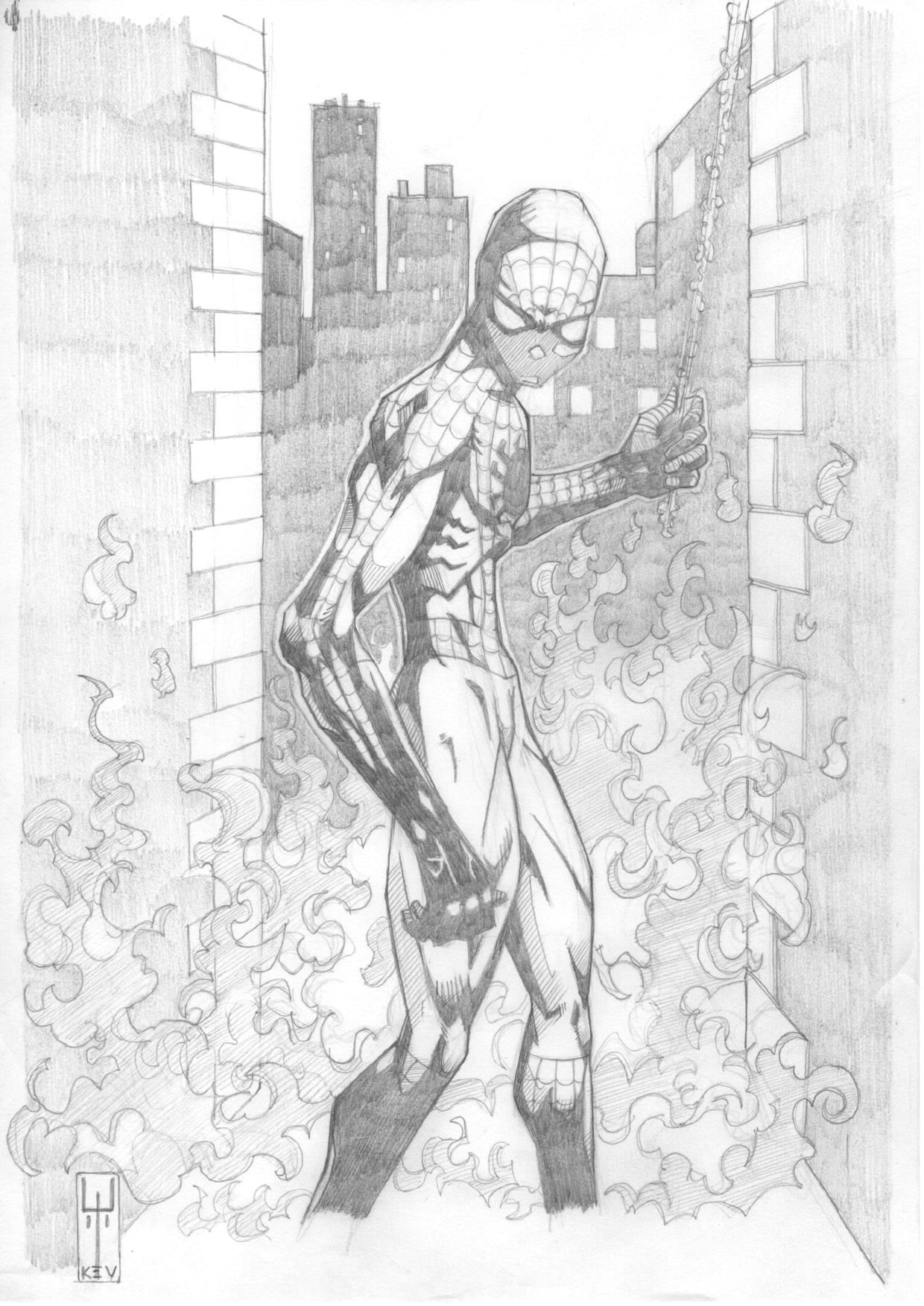
So, when you find out @MrRiktus and @Trindles_ are collaborating in some kind of holy union of arty goodness, you have to celebrate. And what better way than knocking out a little tribute sort of thing…
Ok, so not your classic looking Spiderman, but why not?
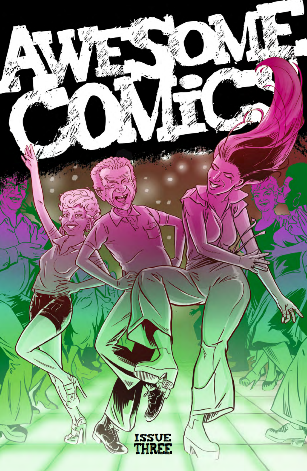
Imagine, dear reader, if you can, my unbounded delight when Tony Esmond slipped a little something into my inbox last night and I certainly had a warm fuzzy feeling (more of relief than anything) when it turned out to be a review copy of the Awesome Comics Anthology, Issue 2.
Let’s not waste any more time and crack on. As always, the review is spoiler free.
First off we have a very tasty piece of cover art by Andy Bloor (@andybloor) which focuses on Murder Road, the first story in the book, and gives us more than a subtle hint as to the darkness of issue 2 of that particular little tale…
Murder road
Story: Vincent Hunt (@jesterdiablo) and Daniel Marc Chant (@danielmarcchant)
Art / Letters: Vincent Hunt
Well, I’m happy to say that my prediction for issue two of Murder Road was cock-on: the proverbial is hitting the fan with gusto in an intense and fast moving sequence of people’s evenings ending even worse than that time Vince got mugged by his cat.
It was pretty clear that things were going to go south for a decent chunk of the cast in the last episode and I was slack jawed throughout as many met their demise in a variety of claret-soaked ways, but my particular favourite has to be desiccation inducing tyre smoke; what a cool idea!
Most of the people we see here are classic horror expendables and, as such, we don’t learn much about them. But there are a couple who we start to understand more clearly and that brings a certain level of intrigue around where they’re going to end up. We don’t get to see two of the main characters from the first episode, and it seems clear that they’ll turn up next time and say: “Well, it certainly looks like the young folks have been having one of their cockamamie parties all right!” (or something along those lines…), and I’m really looking forward to seeing who makes it as far as issue 3.
Not having read any horror comics before, I was slightly surprised at how much I enjoyed this piece of in-your-face violent story-telling. Notwithstanding the worry of being turned by the chaps, it’s clear that they’re having fun coming up with the ideas in this episode and, although the story isn’t significantly advanced, it does a great job of leaving you wide eyed and wondering what the hell just happened!
Great work boys; keep it up!
Cockney Kung Fu – The Big Old Kent Road Kick-off, Parts 3 (Bellbottoms) and 4 (She wears it well)
Story: Tony Esmond (@ezohyez)
Art / Letters: Nick Prolix (@nickprolix)
In Part 3 we pick up right where we left off with Red about to get up to her neck in a caper that hardly seems quite cricket – she might be the ‘bit of posh’ on the job, but she’s taking no crap from anyone and I have a feeling that’s going to be a theme of this story.
We meet a few new faces who make up the transit van full of low life that are going to pull off the job – I particularly like Custard; brilliant name and his dialogue is perfect! Talking of dialogue, Tony handles that really well with the mix of tone and 70’s slang hitting just the right note to sound natural.
As an aside, when writing dialogue, I often think people don’t realise how much we contract words when we speak and, for me, mishandling that always make it sound like characters are giving a speech rather than having a conversation. Seeing lots of contractions written down can look a bit odd, and I think authors sometimes remove them unnecessarily for that reason. I haven’t written much comic dialogue, but I have written a decent amount of prose and the old read-it-out-loud test can often make it clear where contractions ought to appear. Anyhow, none of that has anything to do with Cockney Kung Fu by the way, I just wanted to get it off my chest!
Part 4 focuses on the job which is definitely more akin to something out of The Sweeney than Ocean’s Eleven, but again, that’s just how it should be; gritty, rough, and a bit ugly.
There are some great references in panel backgrounds thanks to Mr Prolix (anyone remember Rumbelows?) and once again his art works a treat with the period story. Having just finished listening to the ACP talking lettering, I have to put on record how much I admire the effort Nick puts into that here (and his other work incidentally) – not only are the words in the balloons wonderfully laid out and lettering consistent, but the titles, sound effects and other text are all spot on.
At the end of Part 4 we leave the story with what I’m sure is going to be some quality action about to hit with the sting of a rushed back, sack and crack job in cheap beauty parlour – can’t wait!
Vyper
Everything: Dan Butcher (@vanguardcomic)
The opening of this episode of Vyper is so 80’s it hurts – I recall with fondness the time I got a 14” colour portable and a VCR for my room and was able to squirrel myself away for hours watching movies with characters that look exactly like these. Dan’s done a lush job of building on the great start from issue 1 in this respect.
Viperini confirms that he’s about as inappropriate as any 80’s hero you care to mention (and more so than most) pretty much as soon as he opens his mouth and Lopez, his partner, is confirmed as his moral compass which he’s temporarily lost down the sofa – although I can’t help thinking he’ll find it again before this story’s finished; at least I hope he does.
There’s a great flashback in this episode, brought on by our tight-trousered hero spotting a symbol he knows only too well from his past. We start to see something of his history which begins to explain why he’s so full of it and I hope Dan explores some more of his main character’s psyche in the rest of the story.
The one (very minor) problem I had with issue 1 was a tendency for the characters to be a little verbose but the dialogue has been nicely tightened up in this episode as Dan gets to know the characters and that really helps with the flow and pacing of the story.
We leave the story loaded with jeopardy and every chance that one of the main characters is likely to fid themselves in the deep and claggy in pretty short order. Perfect.
Once again, the artwork is Butcher through and through with some nice graphic touches which are always a pleasing addition to the look of his comics. I’m really liking this story and it feels like it has the scope to delve a little deeper into character as well as being full of kick-arse action – here’s hoping!
Extras
We’re treated to not one, but two pages of readers letters at the back of the book – each suitably irreverent and exactly what you’d expect from the listeners of the ACP (that’s the Awesome Comics Podcast in case you’ve been living in a space suit with the awesome filter turned up to max for the last 150 weeks you dickfer! That’s an 80s film reference for those of you too young to remember the glorious age of fluorescent socks the first time around…)
We also get a dose of fan art on the Board of Awesome which really shows off that at least four people read issue 1. Good work chaps!
Story: Luke James Halsall https://lukejameshalsall.wordpress.com/ @LJHalsall
Art / colours / letters: Cuttlefish http://cuttlefishcomics.blogspot.co.uk/ @cuttlefishcomic
Publisher: Markosia @Markosia
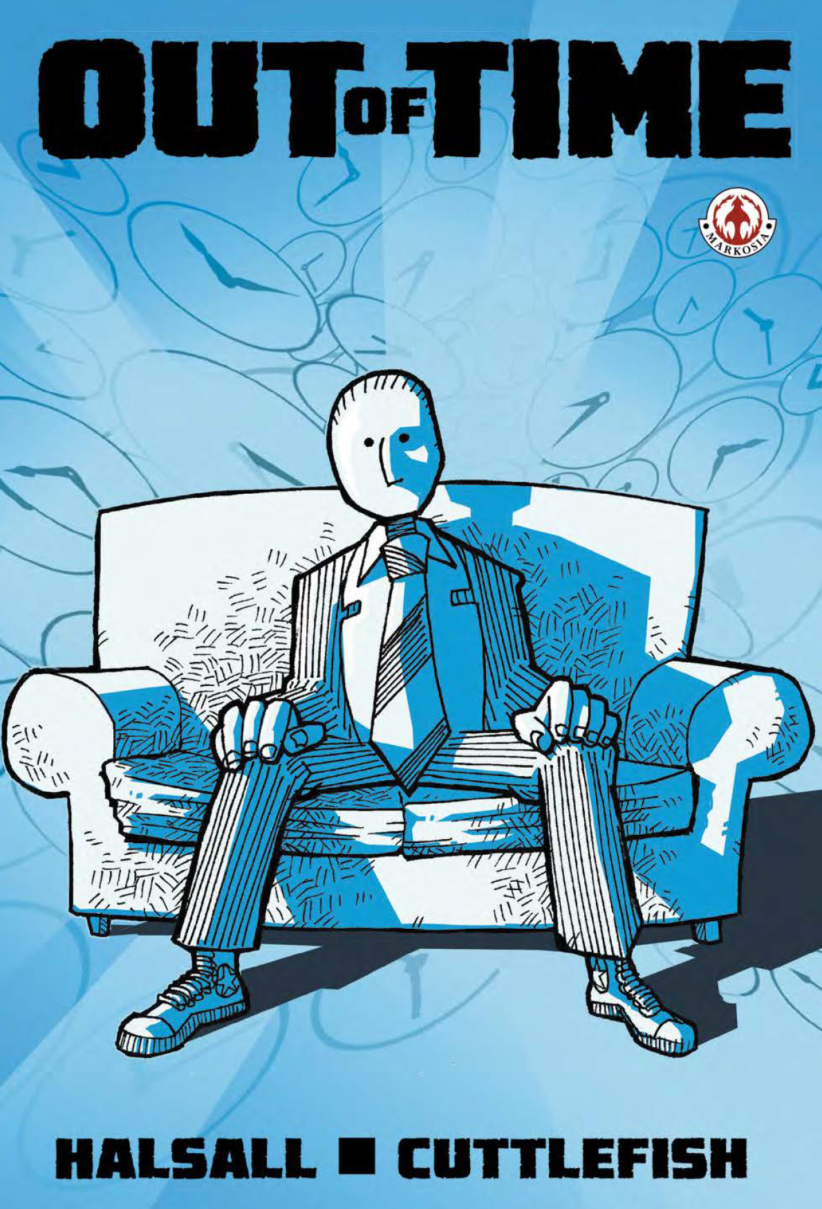 When Luke sent me the link and I downloaded Out of Time, I immediately realised that I’d seen this comic before – I still can’t remember when exactly but I thought at the time I really liked the cover, so getting to dip inside is real treat.
Before we get into detail, let’s sum up: I’m reviewing the whole book here which is a collection of three issues, numbered 1, 2, and 4. This may seem odd, but as I only write spoiler-free reviews, you’ll have to read it to find out why this doesn’t make sense in a good way! You’re getting over 60 pages of story for your money here, so great value for a book you can download for under $4 (check out DriveThru Comics for the download). The guys were on the con-circuit hawking the book before it being picked up by Markosia after a meeting at Thought Bubble – just goes to show, it’s always worth making those connections at cons!
So, let’s start with the artwork – it’s the first thing you notice about a book of course, and in this case it’s a good thing. The artwork isn’t entirely conventional but is nonetheless fantastic and that’s coming from someone who really got into, and then out of, comics in the ‘90s – and we all know what that means as far as artwork’s concerned: ’90s style art this ain’t, and the book is all the better for it. The characters only occasionally have mouths, sometimes don’t have arms (but still have hands) and frequently miss out on the joys of noses but that only adds to the wonderfully stylised appearance of the book.
 Backgrounds aren’t heavily detailed, colouring uses a really limited and largely unrealistic palette, and word balloons are funky hand drawn affairs. None of this, however unusual, is bad – every bit of it appears a consummate stylistic choice topped off by some really neat inks which are most successful when they are kept nice and simple. A slight criticism, and I’m working hard here to pull something out, is that I think both the inking and the colouring are slightly less convincing in panels where the palette gets too varied (in that you lose that really strong graphic element of shades of a single colour) or inks are too detailed (where inked shading goes further than solid blacks) – the middle section of issue one is an example, but this is pretty minor in what is otherwise really solid work from Cuttlefish. Does anyone know who this person is by the way or am I looking for a guy who squirts ink in my face if I approach too quickly from a jaunty angle at a con…?
Onto the story. As I say, no spoilers (although the book’s been out for some time and I’m not sure that the script is really built around surprises, so I think I’m pretty safe), so I’ll keep things relatively general.
The story is about a small team of employees at a company who offer holidays to different periods in time to rich clients – when I say different periods of time, I don’t mean dressing up in green tights, sticking a feather in your cap and pretending you’re robbing from the rich. No, we’re talking actual time travel – which, as everyone knows, is a mind bender of a concept and something one would be well advised to steer clear of as a plot device. Given that, you have to hand it to the nutcase that is Luke James Halsall for taking it on!
Halsall sails above the old time-travel pitfall of getting bogged down in the “major boring shit” of the mechanics of it all – his main tool for this nimble little authoring trick? The classic time-travelling-sofa; naturally. I know, but it just is, ok?
While the story gads along at a rare old pace, it isn’t full of any great suspense which is fine because what we have here is a tale that relies on the characters and comedy to entertain the reader. Just before we get to those features though, it’s great that the story “gets about a bit” with scenes both in antiquity and in the future, all well visualised by Cuttlefish. Different realities are also mentioned but not explored in this book: I’m hoping that’ll be the subject of a future publication!
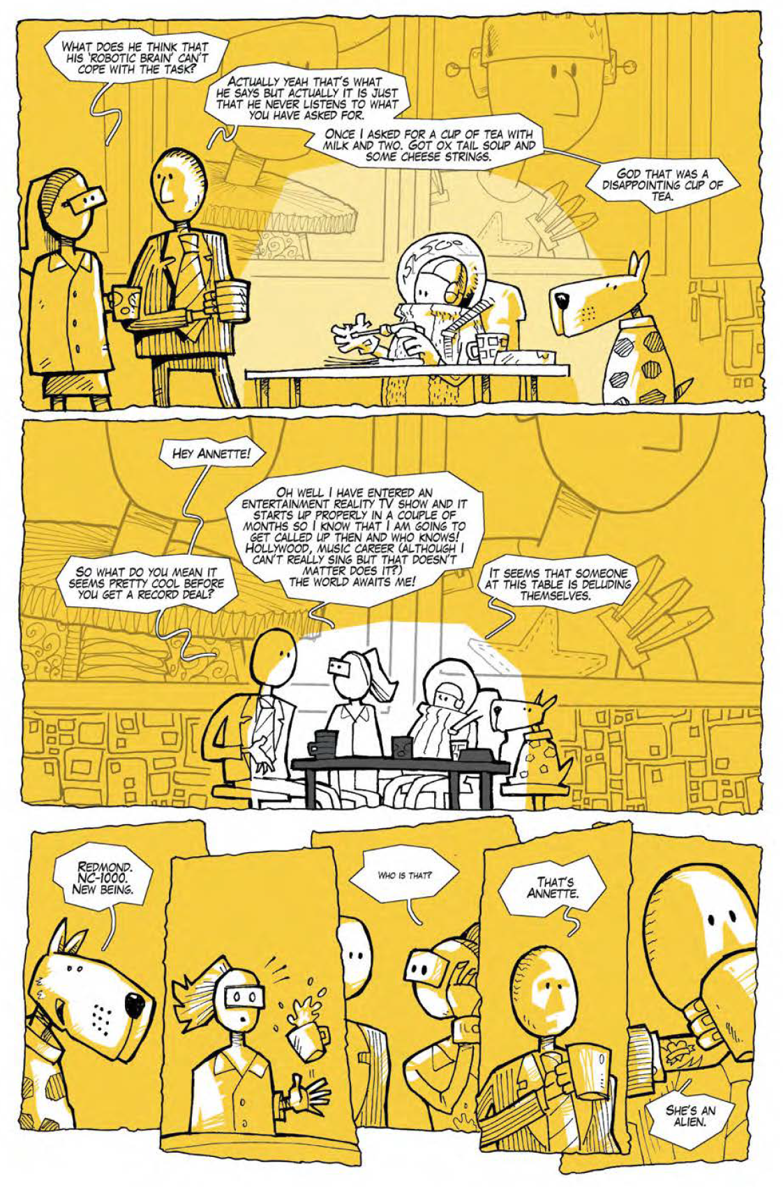
In terms of characters, some are more successful than others, with Redmond, NC-1000 and Dave being the ones that stand out. The dialogue of these three really works to give you a sense of character and quickly established itself as the distinctive voice of each. The other characters are good supporting players but perhaps lack the more clearly drawn appeal of these three.
One issue that jarred slightly was that the characters often use language that feels a little less natural than is comfortable, with fewer contractions than you might expect (e.g. “…what we are saying…” instead of “…what we’re saying…”). For many people this probably isn’t an issue, but writing natural dialogue is a really tricky business and it’s something that I find takes me out of a story if it doesn’t quite flow which happens here occasionally.
As for comedy, I found the funniest moments of the book were those delivered by characterisation rather than dialogue written purely for laughs – both Redmond and NC-1000 have some great lines which are funny because it’s an insight to their heads rather than being funny per se. I’d definitely say that this is something to focus on in the future as it works really well here.
To sum up, Out of time, is a good book full of fantastic artwork, some neat story and cool characters. I’d certainly recommend taking this little beauty for a spin! I’m really looking forward to what these guys are cooking up next.
 Ever since Lizzie Boyle (@lizzieboylesays) told me, much to my amazement, that there was such a thing as a small press scene and I dragged my good lady to Frome and the delights of my first ever comic event, I’ve been listening to the rantings of the Awesome Comics Podcast crew. Vince (who appears to do all the work), Dan (who literally will read anything out on air) and Tony (who has a mouth like the potty of a toddler with norovirus) who entertain us with their comic-based shenanigans each week. Oh, those guys…
We all know that they’ve been making comics of their own or collaborating with others for years, but now they’ve really gone and done it; they’ve come together in the heady whirlwind of monochrome pages and alcohol fuelled (I’m guessing) madness that is their first anthology. Three stories told over four issues. Let’s check out issue one.
First up: Murder road
Story: Vincent Hunt (@jesterdiablo) and Daniel Marc Chant (@danielmarcchant)
Art / Letters: Vincent Hunt
From the first page, and even without reading the text, you know this story is going to be dark. Once the story kicks in, it immediately has the feel of an 80s action movie (for some reason it put me in mind of The Wraith although I’ve not seen that since it went straight to video about the time I left school) which gives it a great nostalgic feel boosted with some awesome cheese in the script.
The characters here stand out as classic tropes – the testosterone-high jerk, his under-appreciated girlfriend, a concerned mother, and the local cop, all of which are hitting just the right notes as a perfect cast of characters for the story. Assuming they survive!
There’s obvious jeopardy building up here as things hot up on the road, and other characters are racing against time to intervene in what I suspect will end up being a pretty messy situation come issue 2!
I enjoyed the scripting in this comic and you can certainly hear Vince in the dialogue but I did feel like the conversation between the cop and the mum could have been a little tighter – I can see exactly what the guys were trying to do, but a judicious edit would, I think, have carried what needed to be said with fewer words and helped to keep the pace up across these panels.
Overall the feel of the story is great, and the deceptively simple rendering belies the quality of the work and, in particular, the facial expression art which, take it from me, is really tricky to pull off.
So, a solid start to Murder Road and I’m looking forward to getting some properly dark action in issue 2 – I’ll definitely be back for it!
Next: “Back off boogaloo”, The Big Old Kent Road Kick-off, Parts 1 and 2
Story: Tony Esmond (@ezohyez)
Art / Letters: Nick Prolix (@nickprolix)
Right. Give me a minute to work out what my eyes have just had done to them…ah yes, I see…
I’ll be totally honest; I wasn’t sure about the art to start with – my real comic education was in the 90s and, for better or worse, that creates expectations. I’m glad of the week I gave the book before I wrote this though as it gave me time to realise just how wrong I was.
The thing I realised that I had missed originally was how Nick’s wonderfully classic style of art has been used to create a harsh, but not jarring, contrast to the subject it’s portraying which gives the whole story a quirky feel that really suits – an inspired choice of artist by Tony; I wonder if that was a conscious decision…
A week of reflection and then coming back to the comic and I can see how good that is: the artwork is in Nick’s signature style and is work (if it weren’t for the content) that would fit right in to the pages of a comic I was reading when I was still in short trousers, but the content is unapologetically violent; even the Bash Street Kids would wonder if they’d crossed the line.
A little like Murder Road, the artwork is deceptively simple and sits perfectly in the context of a gritty 70s London that doesn’t treat anyone very well who can’t give as good as they get.
Part 1 and 2 are each five pages, Tony’s preferred approach to scripting, which works really well here. The dialogue is sparse which lets the artwork tell the story and is suggestive of the trust that Tony obviously has in Nick to deliver.
Part 1 set’s us up with the main protagonist; Red, the Soho Sista, and leaves in no doubt that a) you really shouldn’t whistle at ladies in the street and b) you probably wouldn’t take her home to meet your nan. Part 2 confirms her badass status but also helps us understand something of the environment she’s surviving in with fickle ‘friends’ who would likely turn you over for the price of a pint and everyone doing what they need to to survive.
The atmosphere throughout is sort of jaunty but with a raw edge that gets darker and seedier as we move through the 10-page story. There’s every indication that Red is going to be fighting for more than money in issue 2. Bring it on.
And finally: Vyper
Everything: Dan Butcher (@vanguardcomic)
The opening page of Vyper sets the story up so that we know this is an action movie – and it couldn’t fit the mould any better if it tried.
Dan’s worked hard here to cover plenty of ground in the first issue – giving us a taste of the sort of action I hope we can expect from the whole story and an introduction to all the key players (with the exception of the big bad, who I can just feel lurking in the wings): our hero, his sidekick, their brow-beaten boss and the woman I’m assuming will become the love interest. Classic.
The dialogue is sharp, witty and on point, and there are also some really funny touches in here – not only in the script but in nonsense like the police captain’s sphincter issues and the huge junk on display when Sloan Vyperini makes his first appearance. And there’s another classic trope: the guy is called Viperini, he’s also Vyper, the titular character, but you can bet no-one will pick up on that little gem of a coincidence.
There’s a lot of talking in this issue and I wondered a couple of times if there was more than it really needed. It’s not that there’s much in the way of exposition so it’s not like a couple of extra pages would have allowed Dan to thin out the dialogue per panel, it’s just that he looks to have wanted to get as much cheese in as possible. And on balance, I think it just about works out.
The artwork is classic Butcher and anyone familiar with Vanguard will recognise it immediately. The almost airbrushed finish and plenty of edge lighting alongside some great graphic elements make it a good-looking comic.
A fitting finale to a superb anthology. Can’t wait for issue 2.