Awesome Comics Anthology, Issue 4. Review

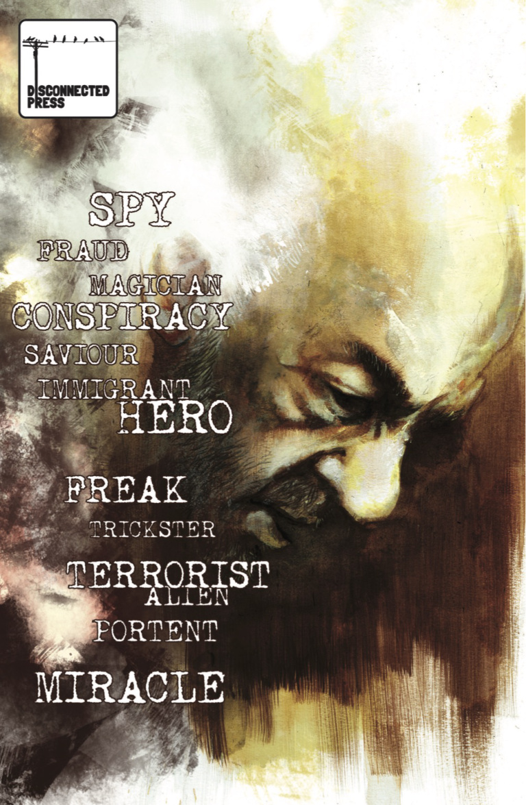
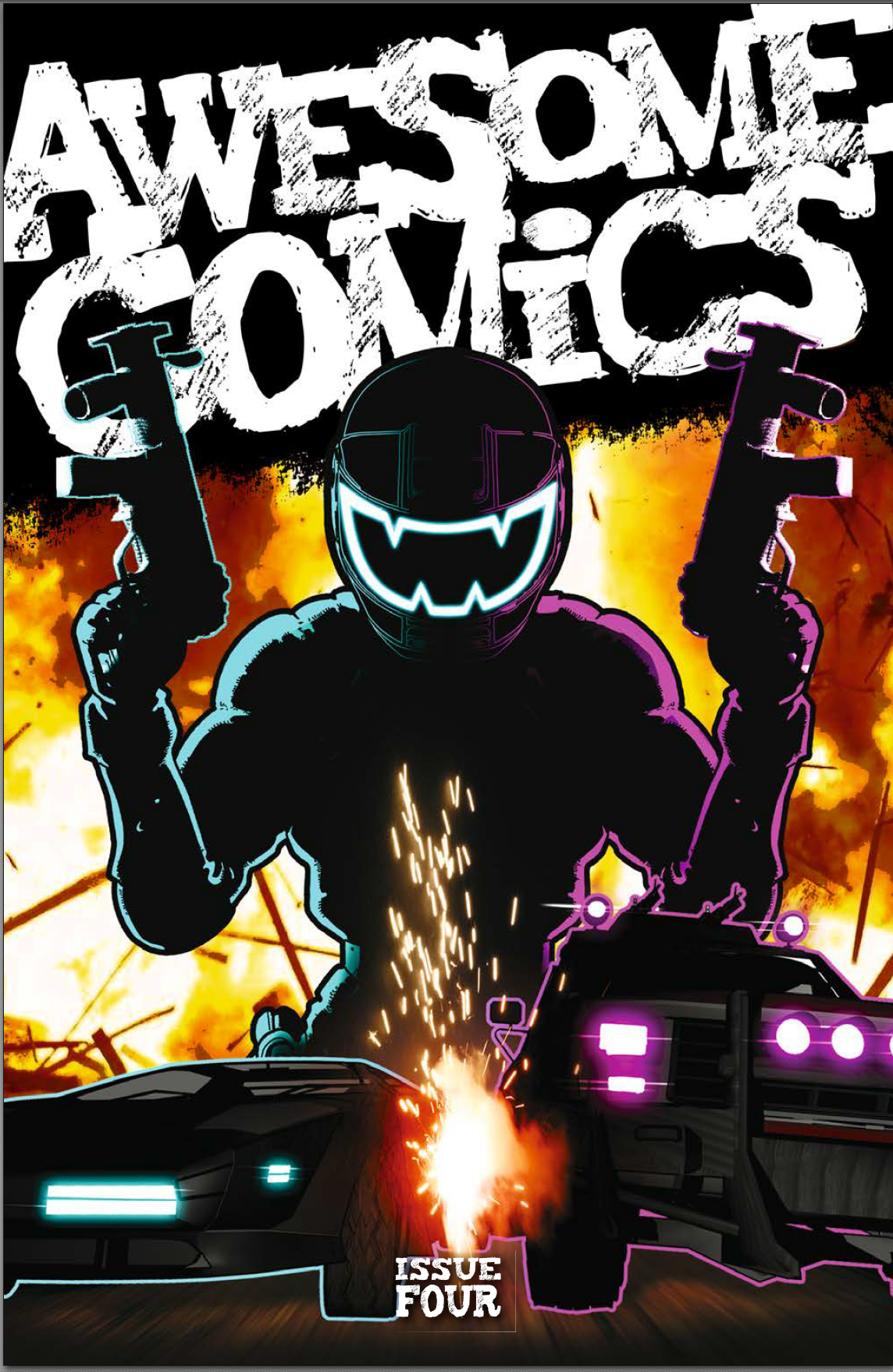
Well, we’ve arrived at the end of an era. Ok, as era’s go, it’s not a very long one, but it is the end. At least for now. A year ago, the Awesome Comics Podcast boys put out Issue 1 of their three story, four issue anthology and, today, they dropped issue 4. Quite some achievement.

Looking at all four covers lined up at the OK True Believers comic con this morning, I have to say, they looked brilliant. As for what’s inside? Read on for a spoiler-free review, my friends.

Murder road

Story: Vincent Hunt (@jesterdiablo) and Daniel Marc Chant (@danielmarcchant)

Art / Letters: Vincent Hunt

For this final episode, the Chunt* has really narrowed things down, focusing entirely on the three main characters and the last minutes of this terrifying encounter. The atmosphere is great in this last scene – with occasional glimpses of sentinel like trees standing watch over the unfolding nightmare; the clearing in the forest feels oppressive and there’s a strong sense of claustrophobia as the darkness presses in.

I really like the way the guys have paced this; imaginative panel layouts which move the story on rapidly using images straight out of those stomach-churning horror movies you shouldn’t have watched when you were a kid – there’s no time wasted on dialogue here and no need for it either. You don’t need words to tell you whatever’s going on ain’t natural and you ought to be papping your under-crackers right about now!

The mother continues her Ripley impersonation and comes out of her corner fighting for the sake of her family with a great splash page and some inset panels that really feel like a cracking piece of cinematography.

As we move on, there’s more great work on the layouts which really speaks of Vince’s expertise on the graphic design front with some neat panel border breakout’s that add to a sense of dynamic action charging through the story.

There are some telling little choices that Vince has made in the artwork itself too – like a panel where he hasn’t delineated the visor of the Driver in profile making it seem like the darkness is flowing straight into or from the helmet of this hellish vision. Very nice.

The reveal of the story perhaps isn’t entirely a surprise but is certainly satisfying and doesn’t detract from how enjoyable this is; playing with some classic horror tropes, some deadly action, and a strong pay-off.

I’ve never read a horror comic before, and, putting all four issues together, this is a great entrée into that world. Familiar because it feels so cinematic, easy to read because of the pace, and satisfying because the story is very neatly packaged. All wrapped up with a blood-soaked ribbon.

Fantastic work boys, you should be rightly proud of yourselves.

*”Chunt” = Chant and Hunt, the deadly duo.

 Cockney Kung Fu – The Big Old Kent Road Kick-off, Parts 7 (I hear you knocking) and 8 (Queen Bee)

Story: Tony Esmond (@ezohyez)

Art / Letters: Nick Prolix (@nickprolix)

There’s an old adage among writers. I don’t know exactly how it goes but I think it goes something like “if you want your readers to feel empathy for your protagonist, put ‘em through the wringer”. Let’s just say, Tony’s wringer must be well and truly battered by the end of this forth issue.

Before we get in to any detail, let’s just have a chat about the feel of this story. Right from Issue 1, there was an underling sense that any one of the characters would screw another over at the first opportunity of turning any sort of profit – I mentioned it in some of my earlier reviews. There’s plenty to recommend this story, but I think, more than anything, it’s this feeling of being off balance that’s drawn me to it and which I’ve really enjoyed.

Once again, we’re treated to superb cartooning by the legendary Mr Prolix – the art’s been great throughout the story and his hand lettering and particularly the sound effects are things of beauty. The tension to his comical, almost caricature-like portrayal of the characters comes from the dark undertone of Tony’s story – it’s a low-down, violent tale of some really nasty bastards where the moral is fuck them or they’ll fuck you. It makes the read edgy in a fantastically compelling way.

Part 7 opens with a really nicely portrayed dream sequence while Red is still out cold from the end of the last issue – it shows us something of her past and how she came to be who she is and hints at a discipline that we haven’t seen in her before. Another layer to this character who I know Tony has plans for beyond this comic and which I’ve no doubt readers would love to see.

All my reviews are spoiler-free so I won’t tell you exactly what happens but, as in life, the story isn’t all neatly wrapped up with a bow and put aside ready for the next chapter to start. In Part 8, we’re introduced to some new but equally horrible characters and Red finds that there’s nowhere to go from the frying pan but into the fire.

It’s hard to know how to sum this story up – it’s funny, comical, jaunty, violent, vicious, dark, and nasty. All in a gritty soup than smells like a packed commuter tube in the height of summer. Whatever it is Esmond’s got planned for Red, you can bet it isn’t going to be plain-sailing. Bring it on, baby-cakes!

Vyper

Everything: Dan Butcher (@vanguardcomic)

Once again, Dan’s displaying some absolute chops with the panel layouts in this final issue of Vyper – we’re straight into the action here and the sharply tilted panels make for a really fast paced layout.

Dan’s portrayal of the action is brilliant – I’ve said before how much I like his use of blurring to create dynamic motion and depth of field, and it’s used again here with great aplomb. The environments too; like the city, the dock, and the establishing shot of the police HQ, work beautifully and once again teach us that any number pier you care to mention, in any coastal American city, is not the place to be after bedtime.

There’s some real jeopardy for the good guys in this scene and the classic action show feel just oozes from every panel and speech bubble – it’s so full of nostalgia, I’m surprised there’s any room for story!

But room there is. And not only for story, but for character development too. The main character really does go on a journey here; putting at least some of his dark past to rest and realising that he doesn’t have to be a complete dick all the time.

We’ve boiled things down to just a few key characters for most of this issue and the focus works really well – Lopez is also developing and we see the respect that she’s worked hard to gain from Vyper paying off as the relationship becomes more trusting and we realise there’s something in this for both of them.

There’s a nice scene towards the end of the story where Sloan thinks he’s got away with his duplicitous Vyper / Viperini shenanigans, but…well, you’ll have to read it to find out what happens there, but, let’s say no more than it’s a really sweet little twist.

It definitely feels like we need to see more of these characters as Dan drops in another potential follow-up story hook towards the end of the book and indeed the closing text gives me the strongest possible suspicion that that particular itch is going to get scratched…

Extras

There’s a nice little ‘interview’ at the back of the book exploring the experience the guys have had putting the book together over the past year, some nice little back-matter sketches and an invite to let them know what you think of the whole sorry affair. So, don’t disappoint and give  apiece of your mind by emailing awesomecomicspod@gmail.com or tweeting the hell out of them @theawesomepod

Disconnected Press – new book review. I sort of wish I knew what it was called!

Story: Lizzie Boyle @lizzieboylesays

Art: Connor Boyle @pencil_monkey

Letters: Jim Campbell @CampbellLetters

Publisher: Disconnected Press www.disconnectedpress.co.uk

Disconnected PRess

Saturday 3rd Feb found me at the first comic con of the year: True Believers, in Cheltenham. As ever a great event, but that’s not up for discussion right now. Right now, what we need to talk about is the new(ish) book from Disconnected Press which was released at Thought Bubble 2017.

The first thing to say about it is that I have no idea what it’s called. And that’s how it’s supposed to be. The front cover has a whole heap of words on it, any of which could be the title and, as it happens, also used to describe the protagonist: Hero, Feak, Miracle – any of these, or the other ten words on the cover, could fit the bill to describe the central character, depending on the cut of your jib.

The fella we’re talking about here looks to be in his sixties, not exactly in the prime of life or what you expect as the focus of a comic. Don’t let that fool you though; he can do extraordinary things. The central theme the book explores is how an individual displaying what look a lot like ‘super powers’ might be treated; by friends, neighbours, governments. No spoilers, so I won’t say exactly what happens, but this is an awesome piece of work from Disconnected Press.

Lizzie’s writing is sharp – although there’s very little in the way of shouting or the usual confrontational language of a superhero book (and we could certainly slot it into that genre), she manages to create a tension that urges the story on. At the same time, you can imagine the central character’s voice being soft and tinged with loneliness as he makes choices for the sake of others at his own expense. She also manages to help us understand how, despite the maturity of his years, this guy is lost – he doesn’t understand what’s happening to him or have any real control over his situation; creating a fascinating contrast between a man entering old age and a sense of vulnerability more akin to that of a bewildered child. Really great work.

Of course, a comic can live or die by the quality of the artwork, and for me that’s what comics have always been about; if the artwork’s off, I can really struggle to get into the story. I haven’t read as many comics as some, but it’s probably into three figures and I’m hard pushed to remember one where the artwork so brilliantly supports the story. Connor has nailed it with work that fit’s the emotionally raw tone of this book perfectly. Largely monochrome with elements of colour, he told me he used a variety of traditional media to arrive at what is right up there as one of the best-looking books I’ve read. His linework, which sits over the textured paint and crayon, seems to pull the characters out of the obscured fog of a background to become wonderfully rendered, almost ghost like figures. There’s an economy to the art which lets the panels breath throughout the book and plenty of panels with no dialogue – it would be great to hear from Lizzie and Connor how much of that was scripted and how much artistic interpretation. Whatever the answer, this is a fantastic looking book.

Finally, a word for Jim Campbell on letters – the book certainly isn’t dialogue heavy but Jim manages to set out the balloons so that they’re never detrimental to the artwork. Add to that the fact that every panel is wonderfully generous; the white space around the text helping to give the dialogue space which really supports the pacing of the story – another great piece of the jigsaw.

Overall then, this is an outstanding book and if you want something that is thought provoking, emotional and beautiful to look at you could do far worse than this.

True Believers Comic Festival Summer Variant write up

With only a couple of hours to spare on Sunday morning away from the seemingly never-ending project to reinvigorate the Chez Couling cludgy, I knew I needed to spend it wisely – a trip to the True Believers Comic Festival Summer Variant was an obvious choice; particularly as it was in Gloucester, only a few miles from home. You can check out the main True Believers site right here.

Given everything else that’s going on, I hadn’t had time to properly check who was going to be at the con, but, having been to the previous Summer Variant and the main TBCF, I had a sneaky suspicion that Mr Mulrain was unlikely to throw me a furball. And so it proved.

I was a little too keen and, after being kicked out for trying to get in before the event opened and spending fifteen minutes looking for a sale at Poundland, I was one of the first through the door.

The venue was fantastic – the 13thC Blackfriars Priory is somewhat tucked away but if some lanky kid in a Spiderman costume can find it, so can you (next time. Obviously don’t go there now as the wedding that’s happening won’t know what to make of your Punisher cosplay rig). To be fair, the Spidey cosplayer did turn some heads as he literally sprinted down the alley from town to the venue – I didn’t see who was chasing him; presumably a guy in a stripy jumper with terrible skin.

Blackfriars Priory

Anyhow, the main hall where the comic tables were set up was great being both huge and historically interesting – an improvement over the previous years’ location which, despite hosting far fewer tables, was somewhat cramped (although they did do a good sarsaparilla…Check out Smokey Joe’s if you have no idea what I’m talking about).

The creators on display were great and I had a fantastic chat with Robin Etherington before snaffling a couple of books to be given as presents later this year. Robin and Lorenzo really have the con thing off to a fine art – they were totally on point with levels of enthusiasm and engagement I haven’t experienced outside a cheerleader convention. This was epitomised when Jack, an 11 year old fan of their creation “Von Doogan”, turned up in wicked cosplay and then produced a near perfect Von Doogan page he had created with his dad. If you don’t know the work of the brothers E (and you should), you can catch up with them here.

After spending quite some time with those guys and their being very complementary about some of my work (after I bought the books btw so I’m convinced it wasn’t a sales tactic), I moved on to chat to Ben, the manager of Proud Lion, the local comics’ emporium. Super helpful (despite mashing his finger in con-prep nightmare hell) and helped me sort out how to get hold of the end of Chris Wildgoose’s Batgirl run. I also picked up a mint second-hand copy of “Low, Vol 1: The Delirium of hope” for a very reasonable price. I’ve never seen this book before but as soon as I looked inside, the art worked it’s magic and money changed hands – check it out here.

After securing that little beauty, I sidled up to the table of the unassuming Mr Prolix. I’ve been following his antics since the announcement of Cockney Kung Fu (a collaboration with Tony Esmond of The Awesome Comics Podcast fame. What do you mean you don’t listen to the ACP? Shame on you! Go subscribe here right now! Unless you’re under 18, in which case just move on; there’s nothing to see here…) and you can sign up to the mailer for that feisty little drunken master of a project here. Nick was good enough to show me some of the pages and they are looking fantastic – can’t wait to see it in print! I grabbed “Slang Pictorial 1 & 2” while I was loitering (I paid, of course) and had to laugh at Nick’s unique (for comic cons) £#.99 pricing strategy – pretty sure he’s the only guy who’s cash tin contained pennies…

Next up was a visit to the several longbox tables, although no luck restocking my original Secret Wars run – I’ll get there in the end, although #8 could be a bit pricey apparently…

At the other end of the hall was a raised area where the mighty Milmo (Sarah Millman for those of you who don’t listen to the ACP) had set out her stall. Sarah was great to chat to – really engaging and enthusiastic about her work and comics in general. I hadn’t realised she was an artist full-time which is pretty freakin’ cool – good for you Milmo! As soon as I finish this post btw, I’m off to read “NPC Tea #1”. I know I’m behind the times but you gotta start somewhere right! Go visit Sarah here for a dose of Milmo magic.

All in all a great couple of hours which resulted in a nice little haul of goodies which I’m desperate to get reading so that’s your lot kids – catch you next time!

Kev