 Ever since Lizzie Boyle () told me, much to my amazement, that there was such a thing as a small press scene and I dragged my good lady to Frome and the delights of my first ever comic event, I’ve been listening to the rantings of the Awesome Comics Podcast crew. Vince (who appears to do all the work), Dan (who literally will read anything out on air) and Tony (who has a mouth like the potty of a toddler with norovirus) who entertain us with their comic-based shenanigans each week. Oh, those guys…
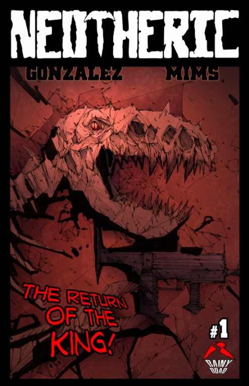
We all know that they’ve been making comics of their own or collaborating with others for years, but now they’ve really gone and done it; they’ve come together in the heady whirlwind of monochrome pages and alcohol fuelled (I’m guessing) madness that is their first anthology. Three stories told over four issues. Let’s check out issue one.
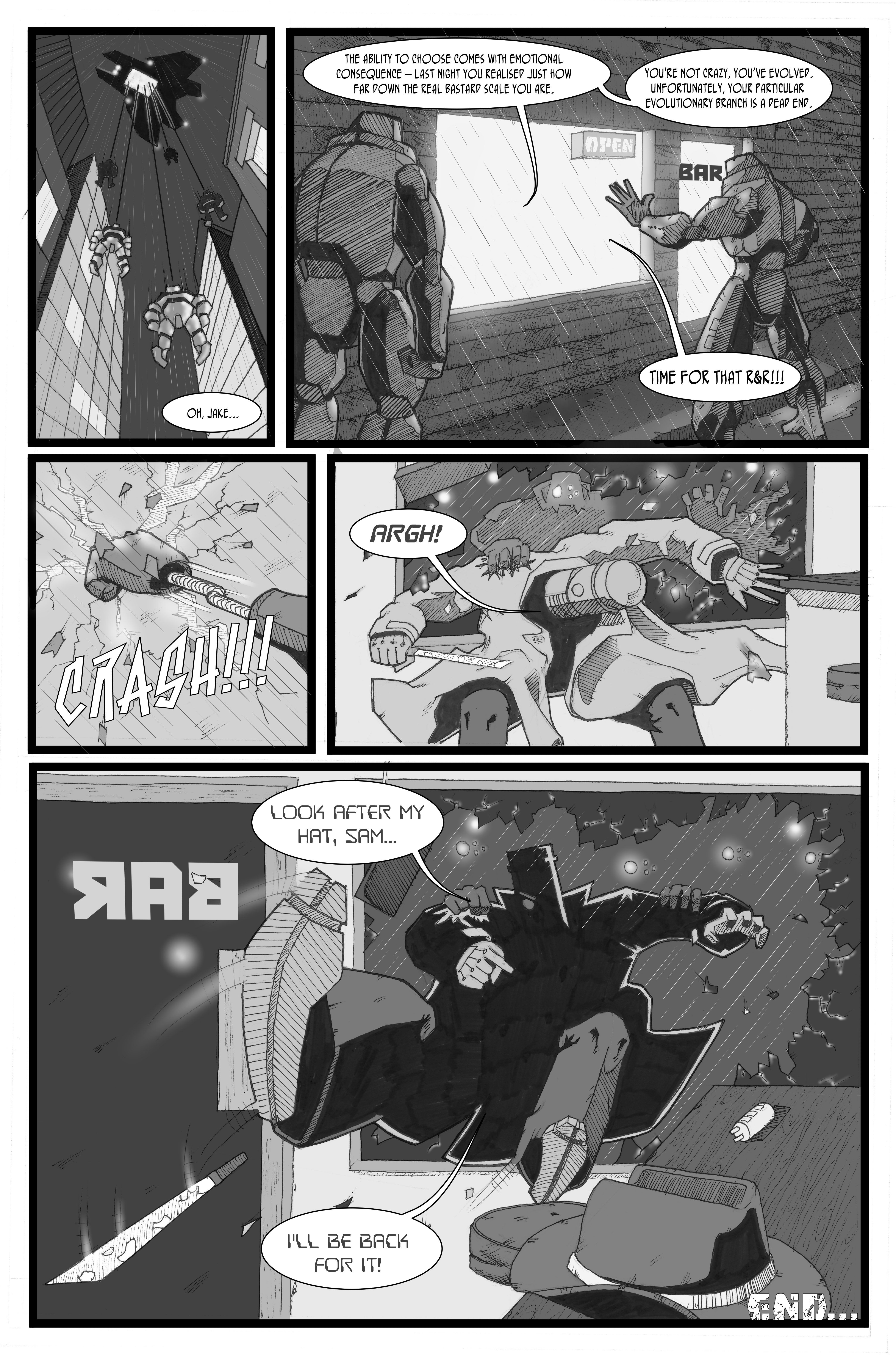
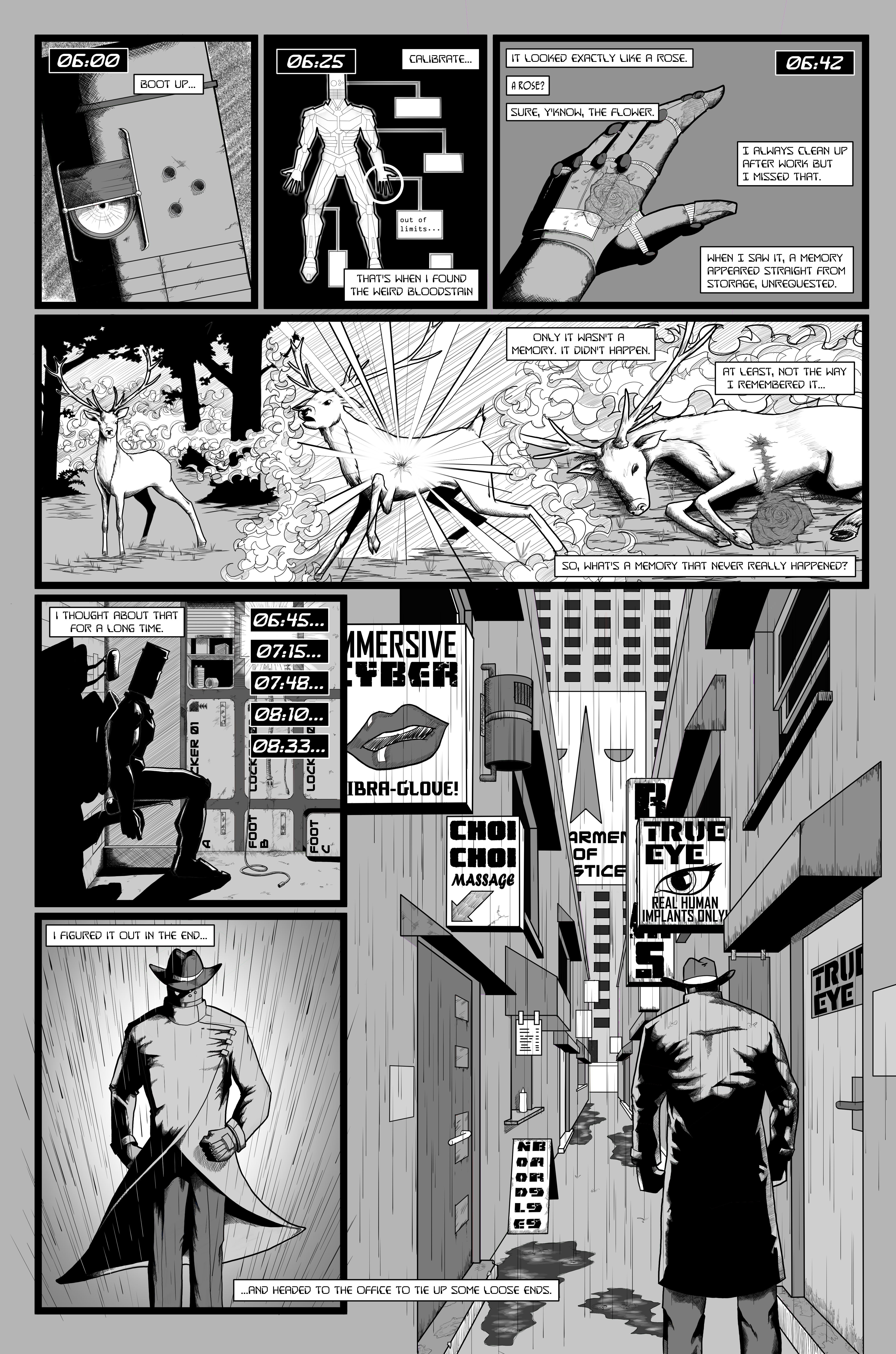
First up: Murder road
Story: Vincent Hunt (@jesterdiablo) and Daniel Marc Chant (@danielmarcchant)
Art / Letters: Vincent Hunt
From the first page, and even without reading the text, you know this story is going to be dark. Once the story kicks in, it immediately has the feel of an 80s action movie (for some reason it put me in mind of The Wraith although I’ve not seen that since it went straight to video about the time I left school) which gives it a great nostalgic feel boosted with some awesome cheese in the script.
The characters here stand out as classic tropes – the testosterone-high jerk, his under-appreciated girlfriend, a concerned mother, and the local cop, all of which are hitting just the right notes as a perfect cast of characters for the story. Assuming they survive!
There’s obvious jeopardy building up here as things hot up on the road, and other characters are racing against time to intervene in what I suspect will end up being a pretty messy situation come issue 2!
I enjoyed the scripting in this comic and you can certainly hear Vince in the dialogue but I did feel like the conversation between the cop and the mum could have been a little tighter – I can see exactly what the guys were trying to do, but a judicious edit would, I think, have carried what needed to be said with fewer words and helped to keep the pace up across these panels.
Overall the feel of the story is great, and the deceptively simple rendering belies the quality of the work and, in particular, the facial expression art which, take it from me, is really tricky to pull off.
So, a solid start to Murder Road and I’m looking forward to getting some properly dark action in issue 2 – I’ll definitely be back for it!
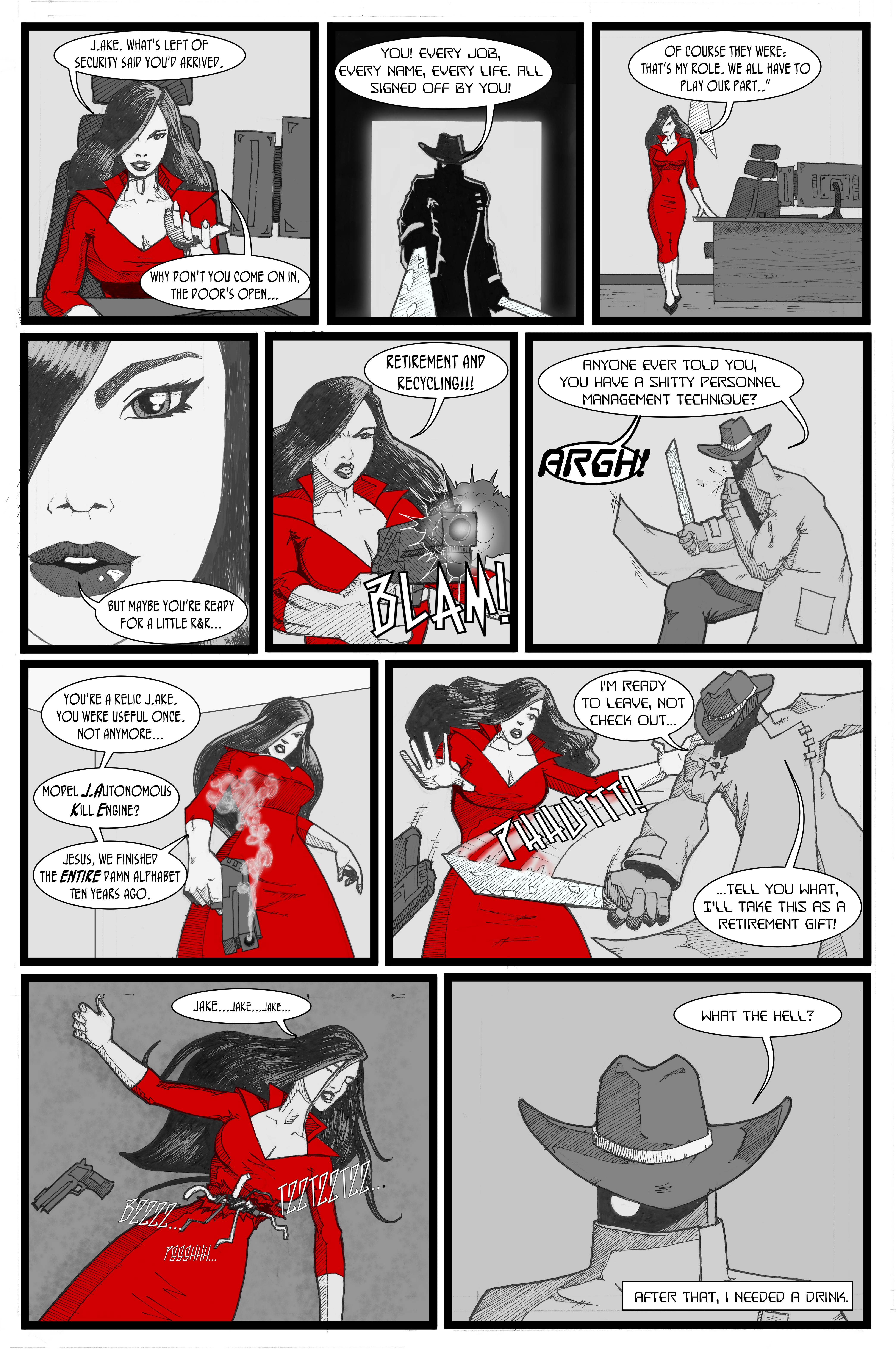
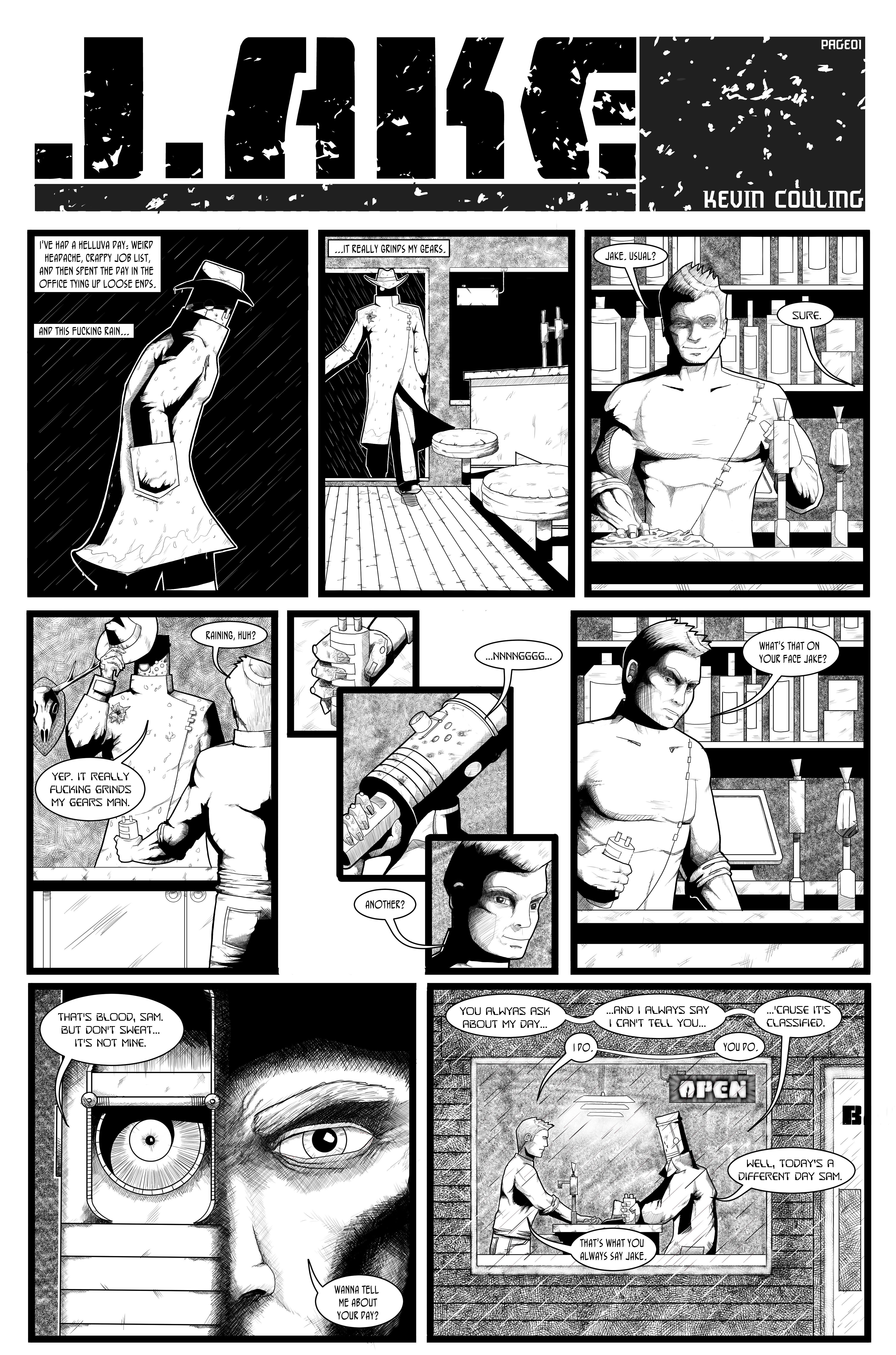
Next: “Back off boogaloo”, The Big Old Kent Road Kick-off, Parts 1 and 2
Story: Tony Esmond (@ezohyez)
Art / Letters: Nick Prolix (@nickprolix)
Right. Give me a minute to work out what my eyes have just had done to them…ah yes, I see…
I’ll be totally honest; I wasn’t sure about the art to start with – my real comic education was in the 90s and, for better or worse, that creates expectations. I’m glad of the week I gave the book before I wrote this though as it gave me time to realise just how wrong I was.
The thing I realised that I had missed originally was how Nick’s wonderfully classic style of art has been used to create a harsh, but not jarring, contrast to the subject it’s portraying which gives the whole story a quirky feel that really suits – an inspired choice of artist by Tony; I wonder if that was a conscious decision…
A week of reflection and then coming back to the comic and I can see how good that is: the artwork is in Nick’s signature style and is work (if it weren’t for the content) that would fit right in to the pages of a comic I was reading when I was still in short trousers, but the content is unapologetically violent; even the Bash Street Kids would wonder if they’d crossed the line.
A little like Murder Road, the artwork is deceptively simple and sits perfectly in the context of a gritty 70s London that doesn’t treat anyone very well who can’t give as good as they get.
Part 1 and 2 are each five pages, Tony’s preferred approach to scripting, which works really well here. The dialogue is sparse which lets the artwork tell the story and is suggestive of the trust that Tony obviously has in Nick to deliver.
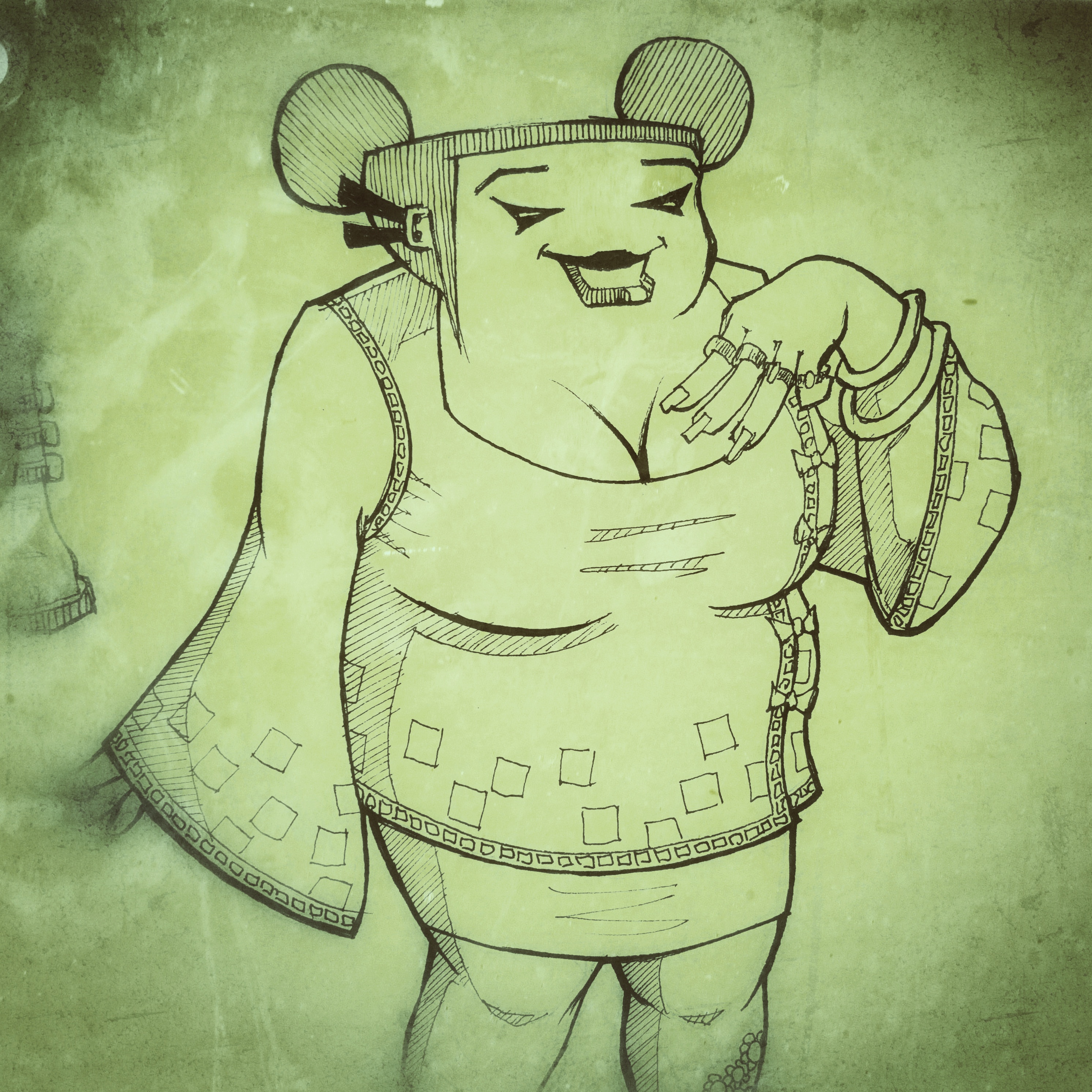
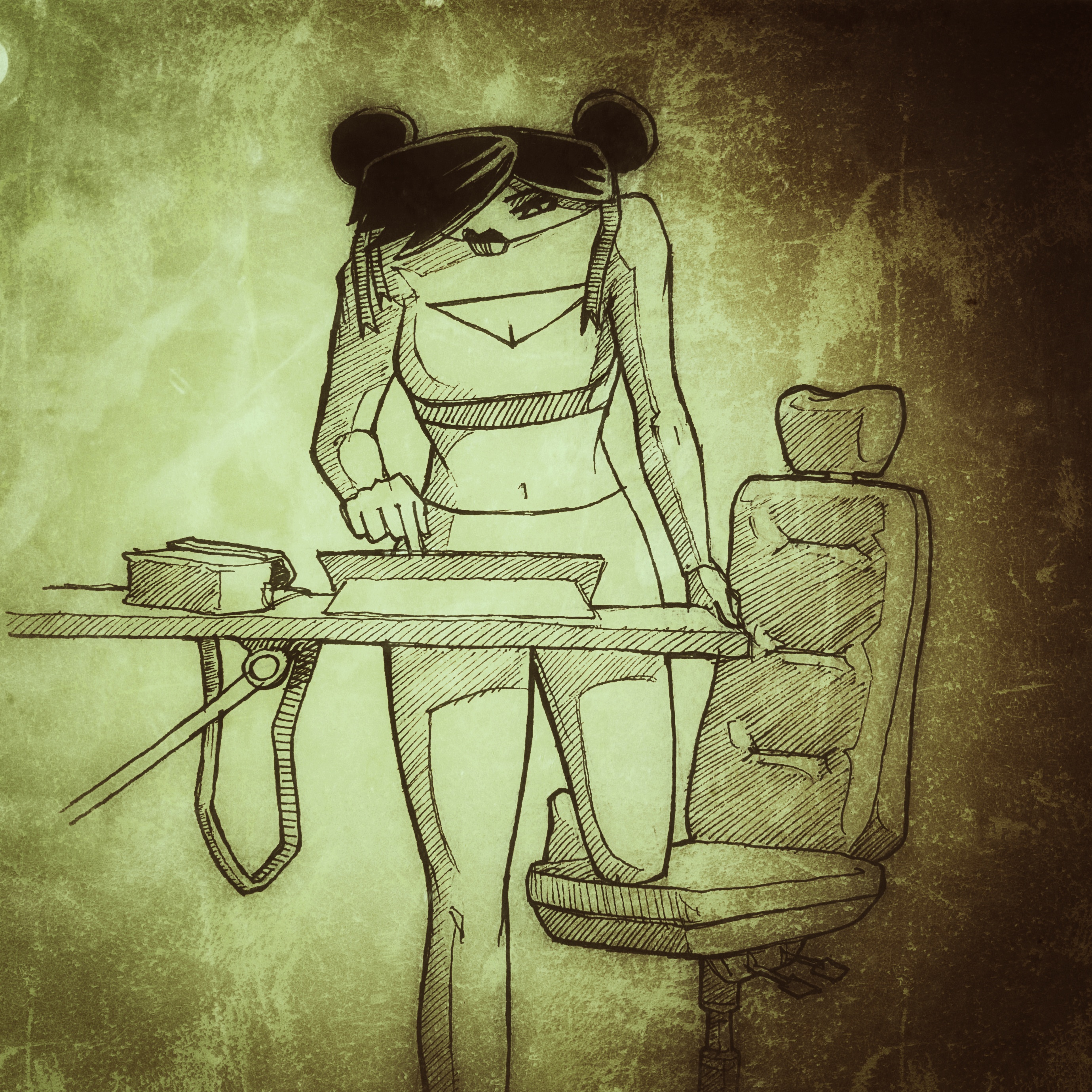
Part 1 set’s us up with the main protagonist; Red, the Soho Sista, and leaves in no doubt that a) you really shouldn’t whistle at ladies in the street and b) you probably wouldn’t take her home to meet your nan. Part 2 confirms her badass status but also helps us understand something of the environment she’s surviving in with fickle ‘friends’ who would likely turn you over for the price of a pint and everyone doing what they need to to survive.
The atmosphere throughout is sort of jaunty but with a raw edge that gets darker and seedier as we move through the 10-page story. There’s every indication that Red is going to be fighting for more than money in issue 2. Bring it on.
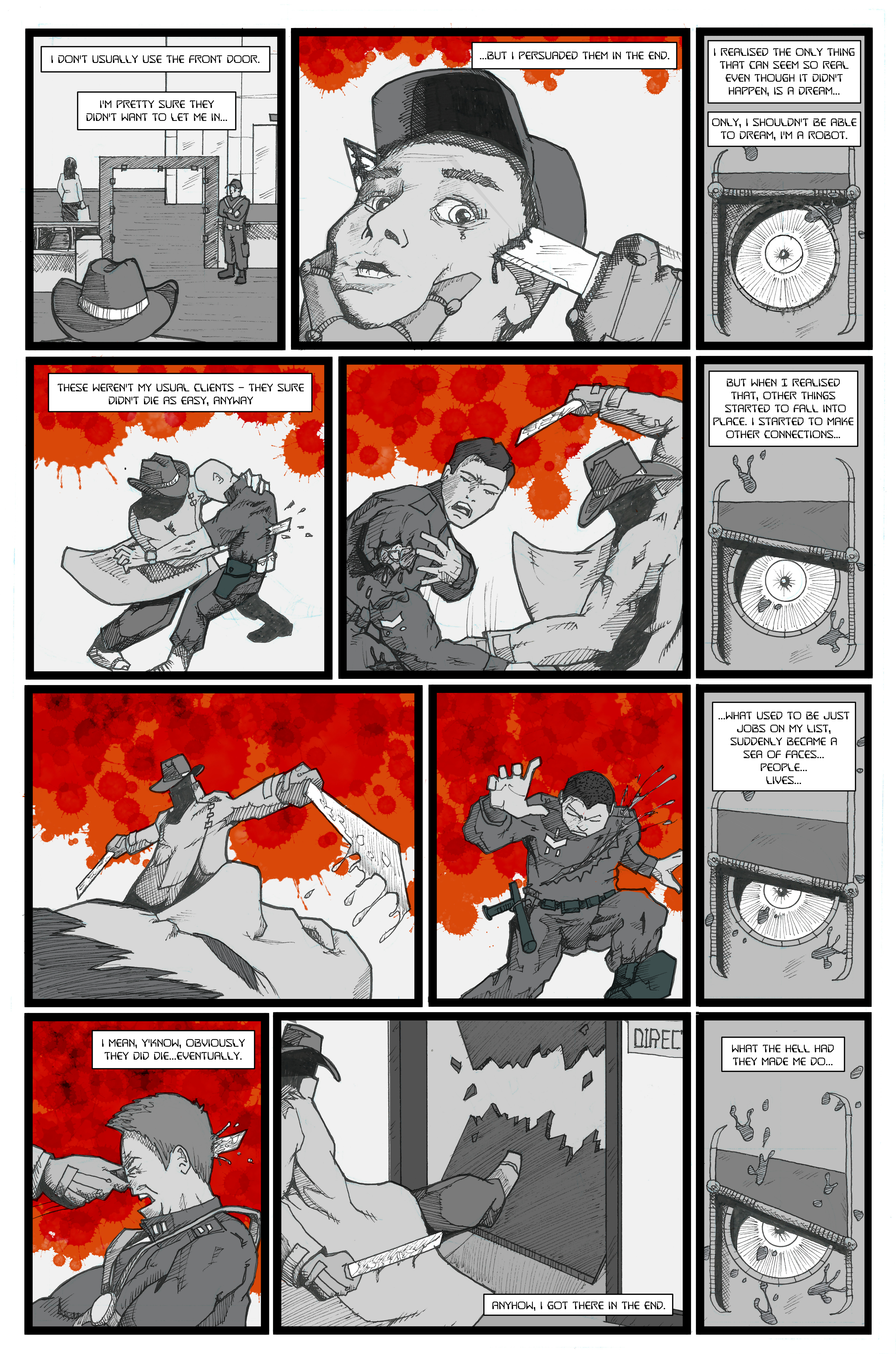
And finally: Vyper
Everything: Dan Butcher (@vanguardcomic)
The opening page of Vyper sets the story up so that we know this is an action movie – and it couldn’t fit the mould any better if it tried.
Dan’s worked hard here to cover plenty of ground in the first issue – giving us a taste of the sort of action I hope we can expect from the whole story and an introduction to all the key players (with the exception of the big bad, who I can just feel lurking in the wings): our hero, his sidekick, their brow-beaten boss and the woman I’m assuming will become the love interest. Classic.
The dialogue is sharp, witty and on point, and there are also some really funny touches in here – not only in the script but in nonsense like the police captain’s sphincter issues and the huge junk on display when Sloan Vyperini makes his first appearance. And there’s another classic trope: the guy is called Viperini, he’s also Vyper, the titular character, but you can bet no-one will pick up on that little gem of a coincidence.
There’s a lot of talking in this issue and I wondered a couple of times if there was more than it really needed. It’s not that there’s much in the way of exposition so it’s not like a couple of extra pages would have allowed Dan to thin out the dialogue per panel, it’s just that he looks to have wanted to get as much cheese in as possible. And on balance, I think it just about works out.
The artwork is classic Butcher and anyone familiar with Vanguard will recognise it immediately. The almost airbrushed finish and plenty of edge lighting alongside some great graphic elements make it a good-looking comic.
A fitting finale to a superb anthology. Can’t wait for issue 2.
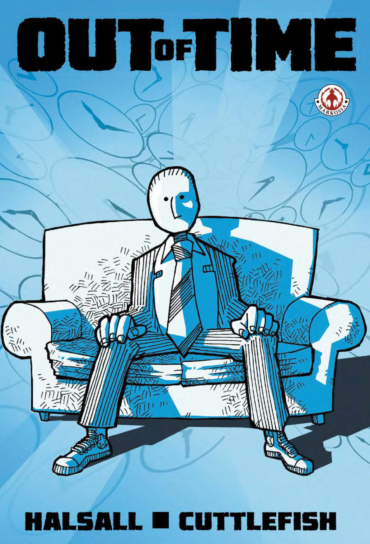 When Luke sent me the link and I downloaded Out of Time, I immediately realised that I’d seen this comic before – I still can’t remember when exactly but I thought at the time I really liked the cover, so getting to dip inside is real treat.
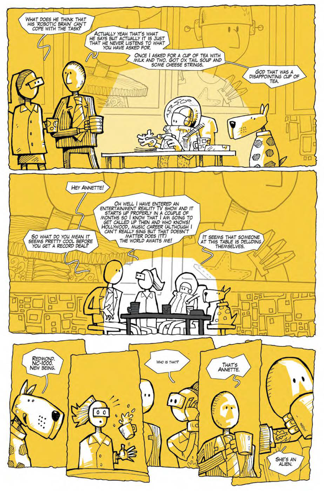 Backgrounds aren’t heavily detailed, colouring uses a really limited and largely unrealistic palette, and word balloons are funky hand drawn affairs. None of this, however unusual, is bad – every bit of it appears a consummate stylistic choice topped off by some really neat inks which are most successful when they are kept nice and simple. A slight criticism, and I’m working hard here to pull something out, is that I think both the inking and the colouring are slightly less convincing in panels where the palette gets too varied (in that you lose that really strong graphic element of shades of a single colour) or inks are too detailed (where inked shading goes further than solid blacks) – the middle section of issue one is an example, but this is pretty minor in what is otherwise really solid work from Cuttlefish. Does anyone know who this person is by the way or am I looking for a guy who squirts ink in my face if I approach too quickly from a jaunty angle at a con…?