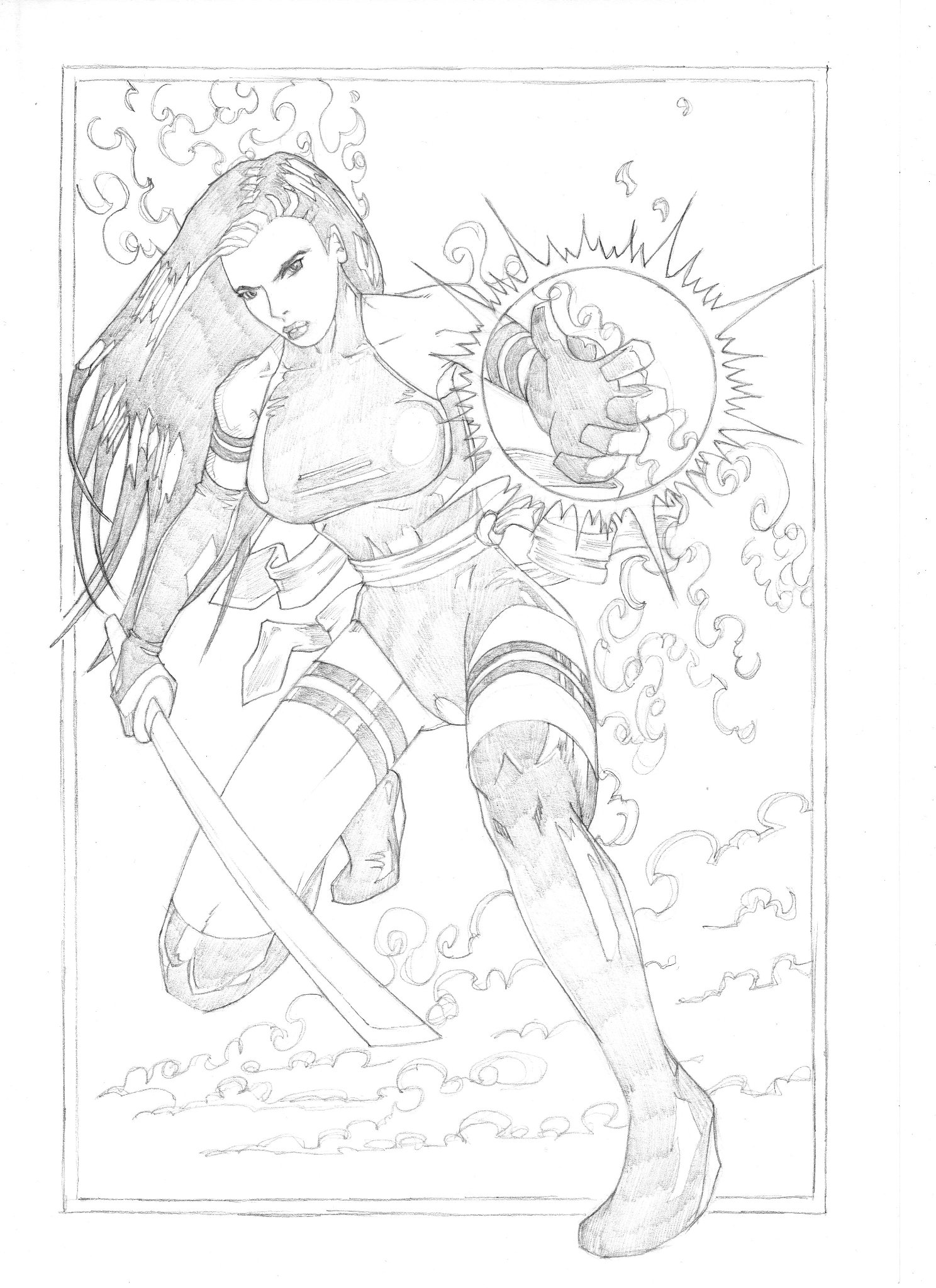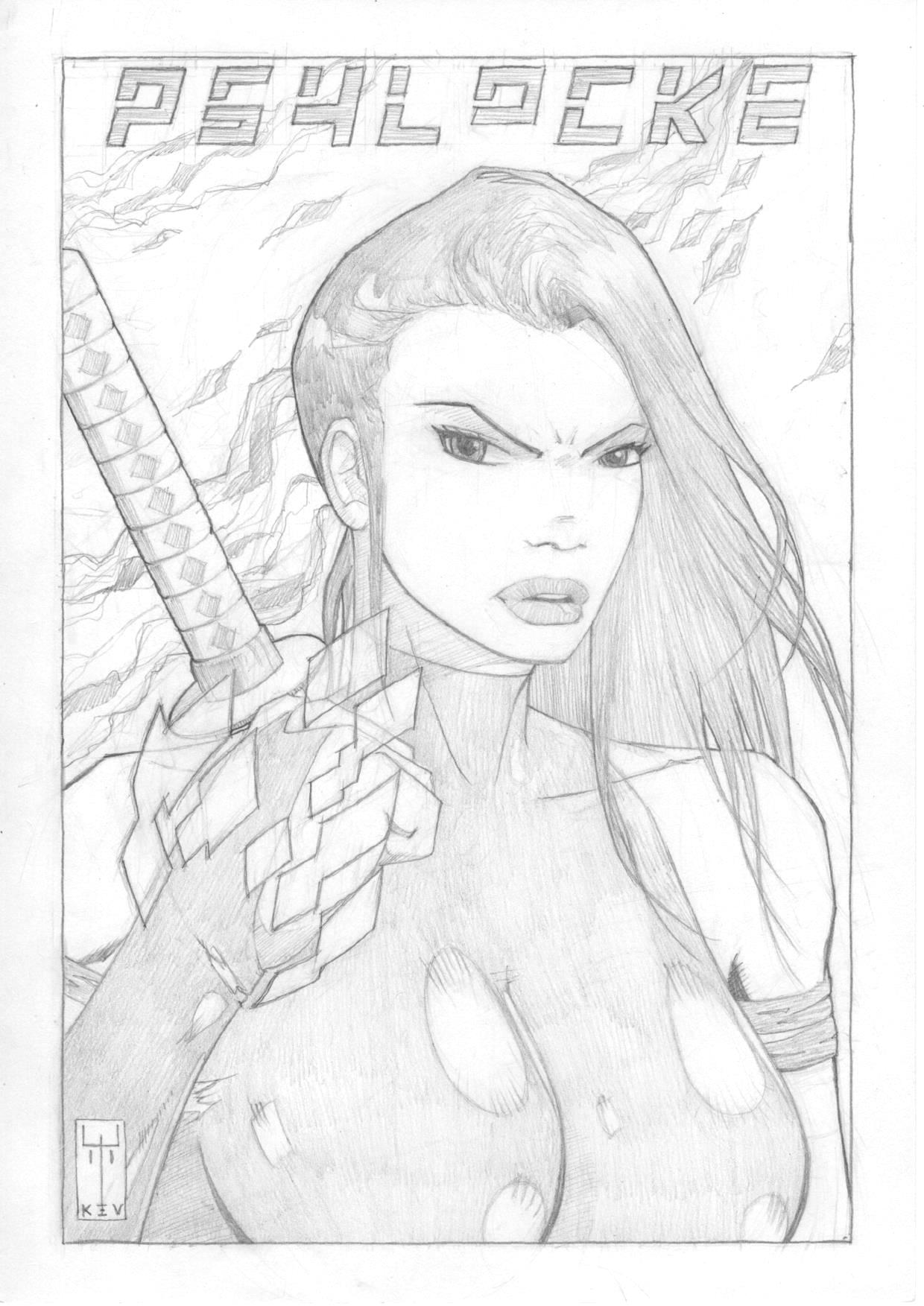
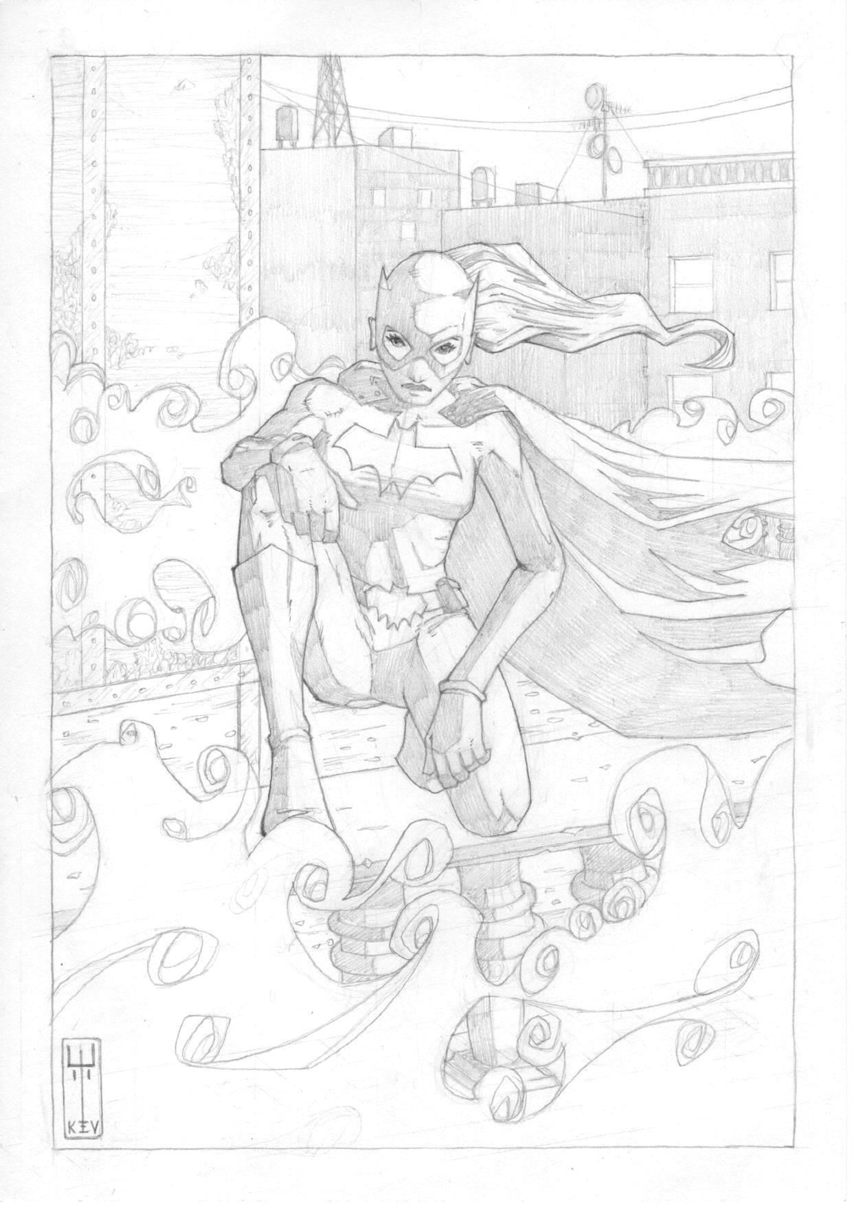
Marvel characters – Psylocke
Pourings from a pinball mind…
So, I’ve been trying to make progress on my next comic but, frankly, it’s painfully slow. I seem to be working, like, a lot lately and struggling to find time to draw or write. And when there is a little time, once the thirst of the eternal list of the DIY purgatory has been slaked, I’m too knackered to do anything worthwhile.
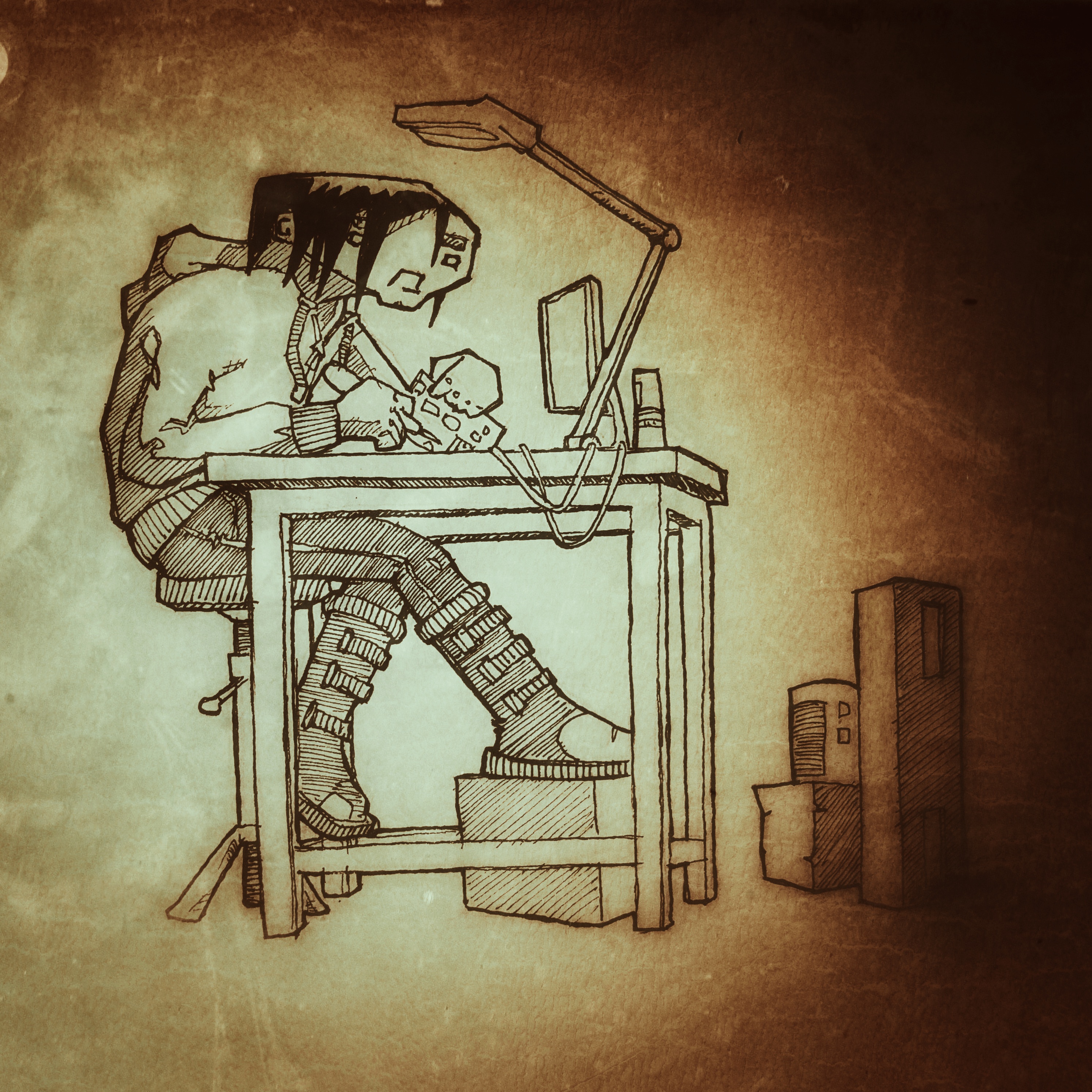
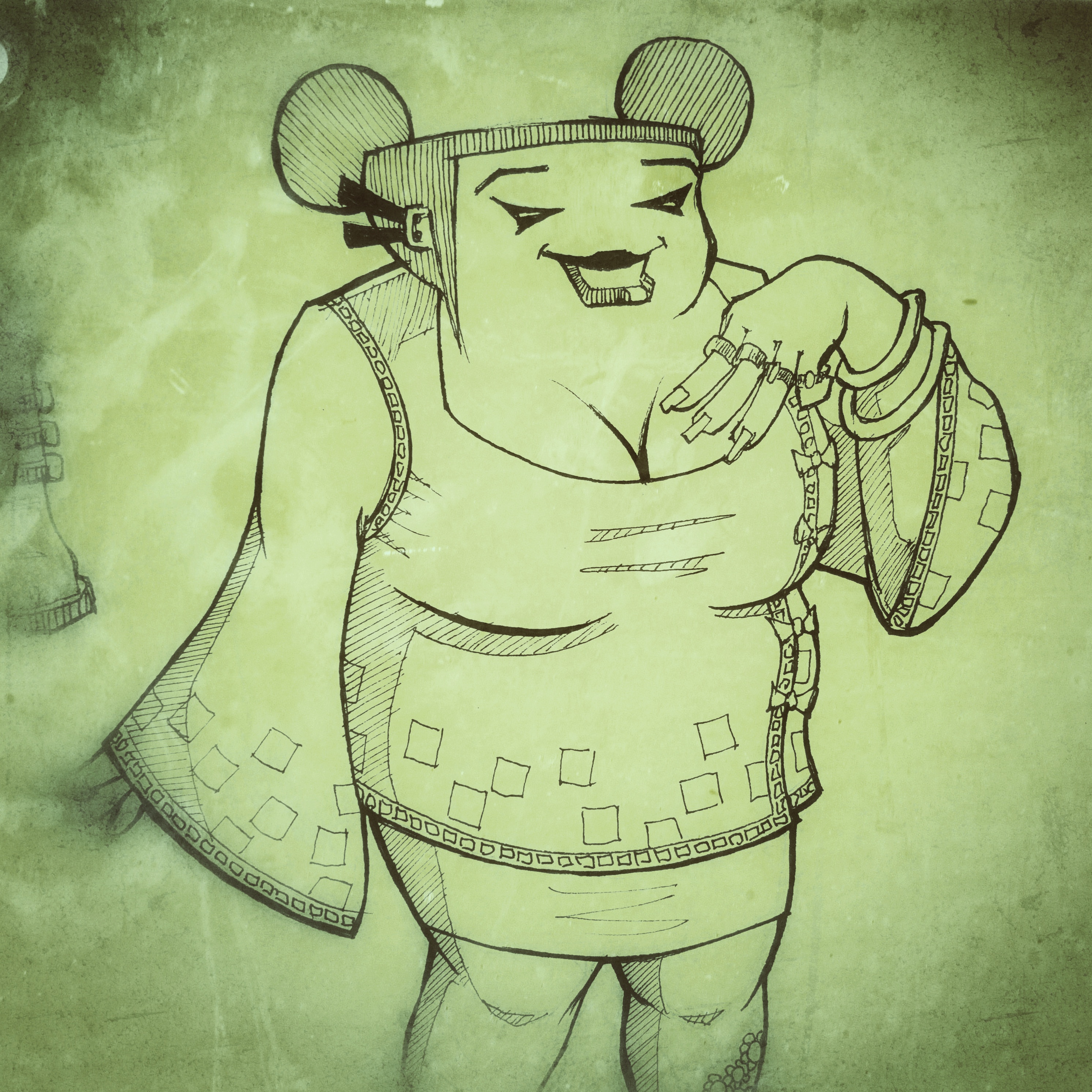
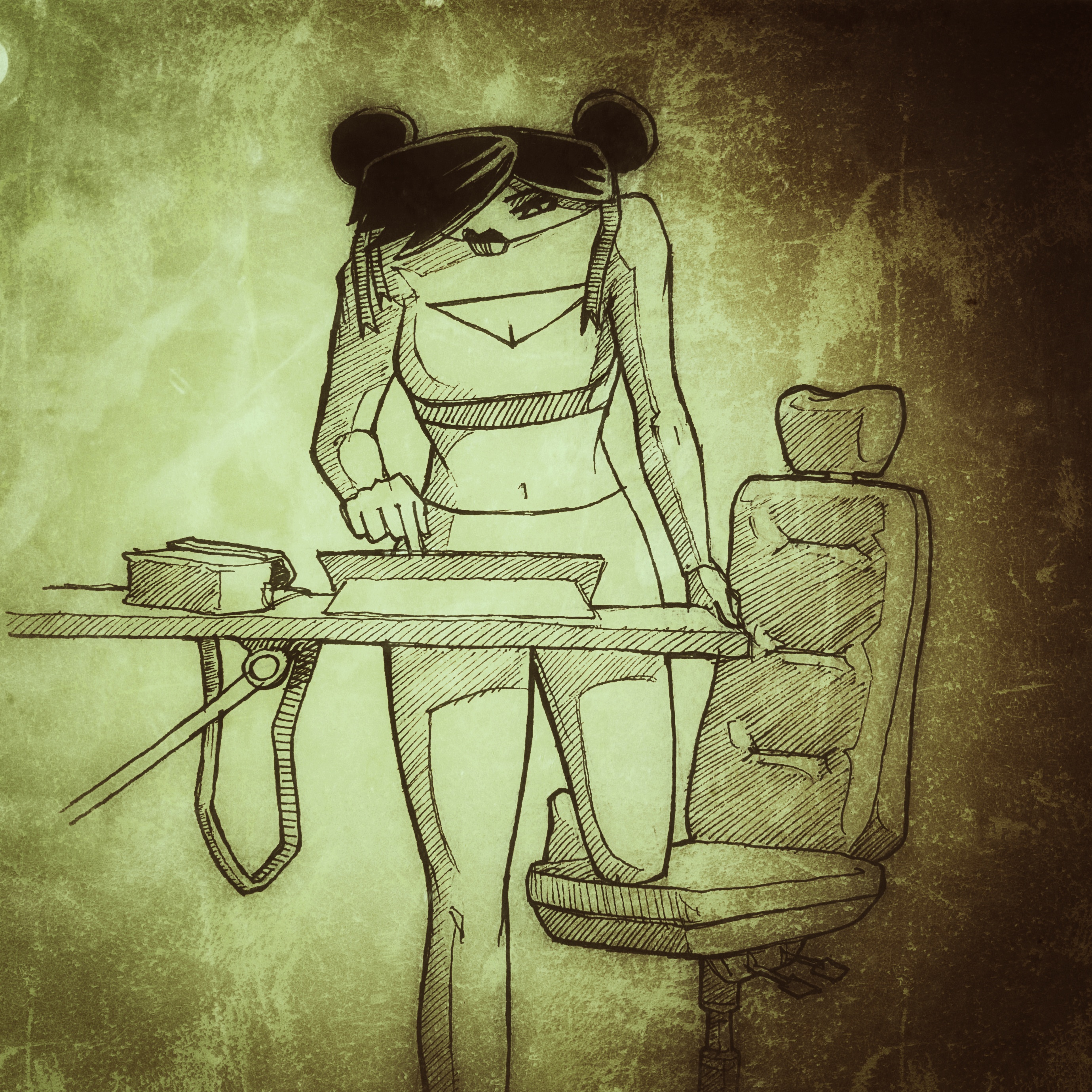
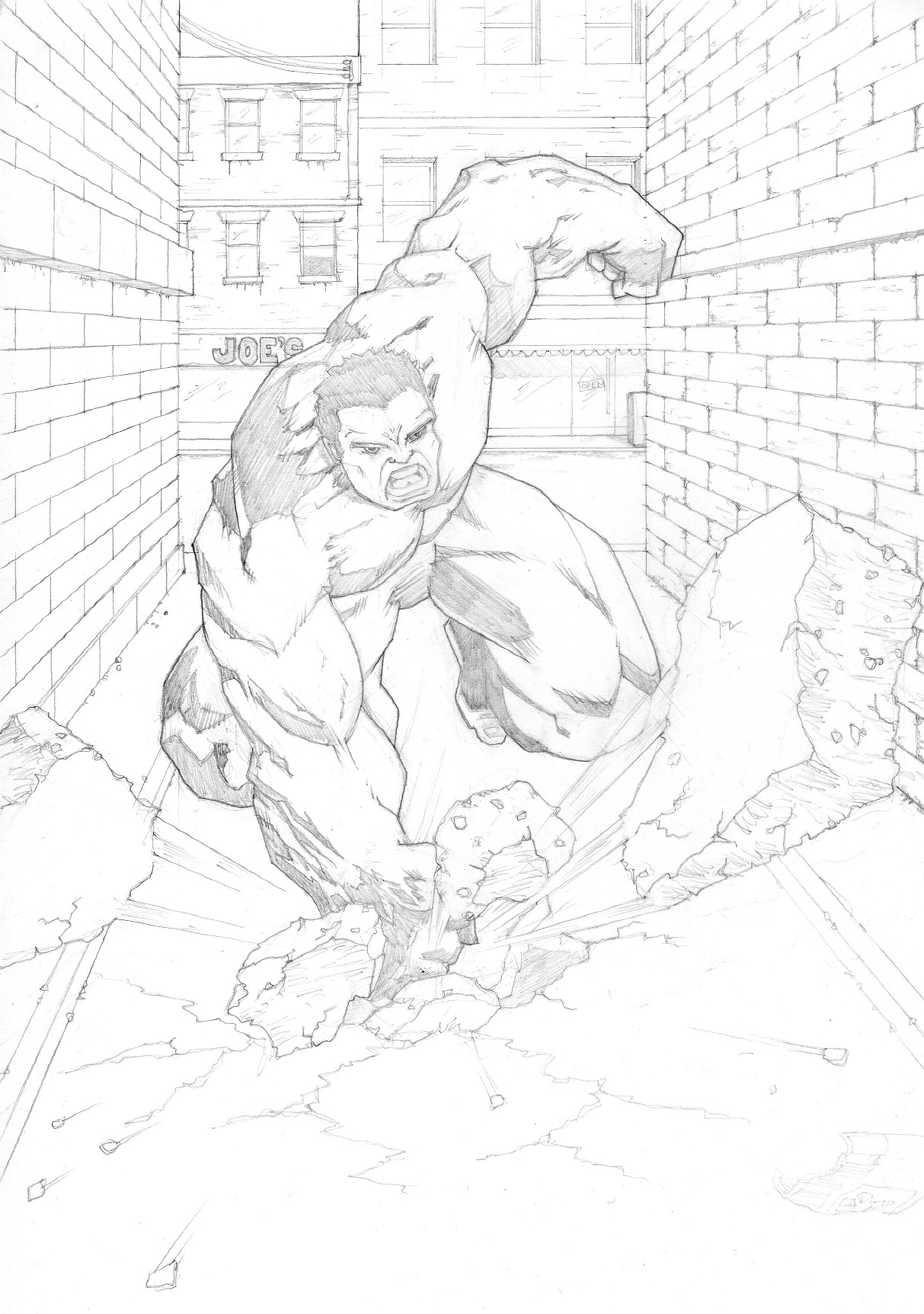
That said, it’s not like I haven’t done anything. There’s been a lot of thinking and that’s good at least. I’ve also been thinking about the art style of the book and creating characters to populate the world; I thought I’d share some here.
I’m thinking black and white. Not really because of the expense, but more because “one thing at a time”! It’s enough to deal with the artwork and the script let alone attempting the pit of despair that is colouring…
Feel free to let me know what you think about any of these btw.
If you’re interested, it’s set in the future. In a world where economics and climate change have forced almost everyone into huge cities, all humanity packed into a tinder box of overcrowded, desperate lives. Where religion used to play the lead role in survival but now has fallen to the decadence of commerce. In this world, the further up the social ladder you are, the further up you live. You have light and air and all things sweet. Below, deep below, there are things that no-one wants to see, but that make the world tick irrespective of people’s preference for not acknowledging they’re there.
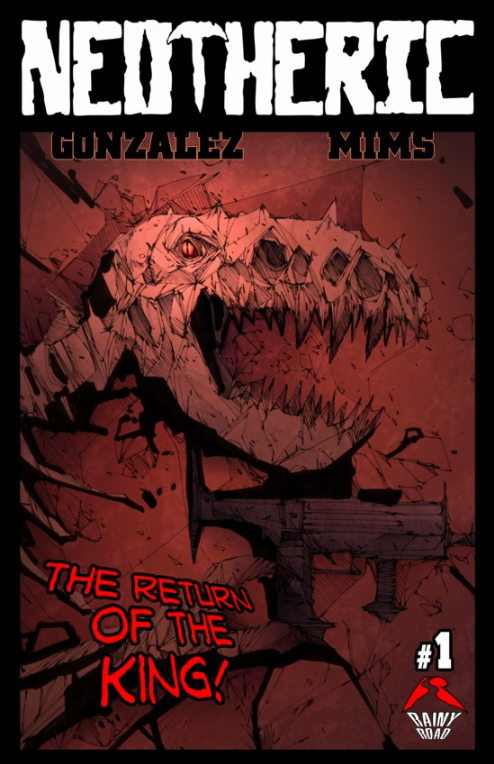
Neotheric Vol 1, #1 & #2
Story and letters: Michael T Gonzalez
Art: Dave Mims
Finally got round to installing the Comichaus app today – and instantly regretted not doing it sooner. The very first book I picked, pretty much at random, is fantastic!
First up, this is not an all-ages read – there’s violence and swearing a-plenty, so if you’re under like 10 or whatever (when do they start swearing and playing inappropriate games these days?), you shouldn’t be reading this…Seriously though, it has a “Mature” explicit rating so save it for later kids; there are plenty of cool all-ages books out there for you.
Right, on with the (no spoilers) review.
Something that used to right-royally yank my tatlocks was a cover that hooked you in and made you buy a book that was a load of old turd on the inside – I’m very happy to report that this bad boy is 100% on the button; the cover looks just like the internal art. Which, in case you’re wondering, is freakin’ awesome!
The colouring uses lots of gradients and a slightly muted, but rangy, palette that works beautifully with really fantastic linework – and this is the real strength of Mims’ work here – he does an inspired job. At first glance it looks like there are too many lines, but somehow, it works to create a strongly graphic feel with sparse backgrounds, expressive characters and great action. This is some of my favourite artwork this year; sweet!
The story is a little off-the-wall and, although you might think you can spot the backstory of the main characters pretty quickly, issue 2 ups the ante and raises an eyebrow: no spoilers, but there appears to be at least one pretty famous dude in this series… I’m digging the premise and I’m looking forward to seeing where this story goes and I’m kind of expecting it to be not where I think! The dialogue throughout is nice and tight, funny, and natural – really great work which isn’t always in evidence in indie comics and a big thumbs up to Gonzalez for this work.
Pretty quickly he’s managed to create some interesting characters who are shaping up really well – one of what appears to be the main couple of characters (right now at least – I’ve been caught like that before…) is looking to be particularly interesting and I can’t wait to see what happens to him. I have some ideas of what his arc might be, but let’s just wait and see if he can step up and crack destiny right in the chops. I hope so…
Gonzalez also does the lettering duties here and does them brilliantly. He’s come up with some neat ways of dealing with different voices and the word balloons are tidy and sized well for the panels. A big shout out to him for the use of thought balloons too – I miss them.
All in all, you want to jump on board with this immediately, like now! It’s worth the Comichaus subscription all by itself! Amazing value!
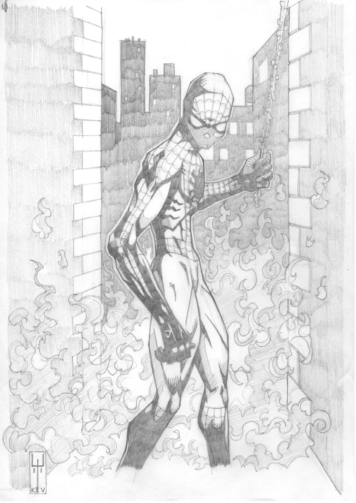
So, when you find out @MrRiktus and @Trindles_ are collaborating in some kind of holy union of arty goodness, you have to celebrate. And what better way than knocking out a little tribute sort of thing…
Ok, so not your classic looking Spiderman, but why not?
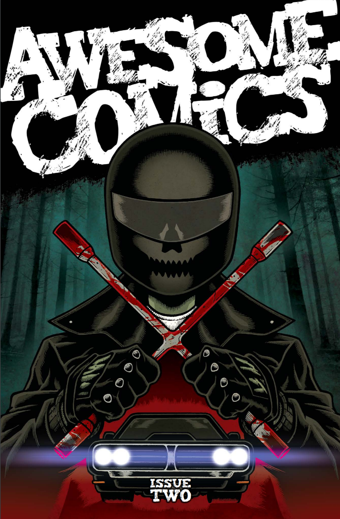
Imagine, dear reader, if you can, my unbounded delight when Tony Esmond slipped a little something into my inbox last night and I certainly had a warm fuzzy feeling (more of relief than anything) when it turned out to be a review copy of the Awesome Comics Anthology, Issue 2.
Let’s not waste any more time and crack on. As always, the review is spoiler free.
First off we have a very tasty piece of cover art by Andy Bloor (@andybloor) which focuses on Murder Road, the first story in the book, and gives us more than a subtle hint as to the darkness of issue 2 of that particular little tale…
Murder road
Story: Vincent Hunt (@jesterdiablo) and Daniel Marc Chant (@danielmarcchant)
Art / Letters: Vincent Hunt
Well, I’m happy to say that my prediction for issue two of Murder Road was cock-on: the proverbial is hitting the fan with gusto in an intense and fast moving sequence of people’s evenings ending even worse than that time Vince got mugged by his cat.
It was pretty clear that things were going to go south for a decent chunk of the cast in the last episode and I was slack jawed throughout as many met their demise in a variety of claret-soaked ways, but my particular favourite has to be desiccation inducing tyre smoke; what a cool idea!
Most of the people we see here are classic horror expendables and, as such, we don’t learn much about them. But there are a couple who we start to understand more clearly and that brings a certain level of intrigue around where they’re going to end up. We don’t get to see two of the main characters from the first episode, and it seems clear that they’ll turn up next time and say: “Well, it certainly looks like the young folks have been having one of their cockamamie parties all right!” (or something along those lines…), and I’m really looking forward to seeing who makes it as far as issue 3.
Not having read any horror comics before, I was slightly surprised at how much I enjoyed this piece of in-your-face violent story-telling. Notwithstanding the worry of being turned by the chaps, it’s clear that they’re having fun coming up with the ideas in this episode and, although the story isn’t significantly advanced, it does a great job of leaving you wide eyed and wondering what the hell just happened!
Great work boys; keep it up!
Cockney Kung Fu – The Big Old Kent Road Kick-off, Parts 3 (Bellbottoms) and 4 (She wears it well)
Story: Tony Esmond (@ezohyez)
Art / Letters: Nick Prolix (@nickprolix)
In Part 3 we pick up right where we left off with Red about to get up to her neck in a caper that hardly seems quite cricket – she might be the ‘bit of posh’ on the job, but she’s taking no crap from anyone and I have a feeling that’s going to be a theme of this story.
We meet a few new faces who make up the transit van full of low life that are going to pull off the job – I particularly like Custard; brilliant name and his dialogue is perfect! Talking of dialogue, Tony handles that really well with the mix of tone and 70’s slang hitting just the right note to sound natural.
As an aside, when writing dialogue, I often think people don’t realise how much we contract words when we speak and, for me, mishandling that always make it sound like characters are giving a speech rather than having a conversation. Seeing lots of contractions written down can look a bit odd, and I think authors sometimes remove them unnecessarily for that reason. I haven’t written much comic dialogue, but I have written a decent amount of prose and the old read-it-out-loud test can often make it clear where contractions ought to appear. Anyhow, none of that has anything to do with Cockney Kung Fu by the way, I just wanted to get it off my chest!
Part 4 focuses on the job which is definitely more akin to something out of The Sweeney than Ocean’s Eleven, but again, that’s just how it should be; gritty, rough, and a bit ugly.
There are some great references in panel backgrounds thanks to Mr Prolix (anyone remember Rumbelows?) and once again his art works a treat with the period story. Having just finished listening to the ACP talking lettering, I have to put on record how much I admire the effort Nick puts into that here (and his other work incidentally) – not only are the words in the balloons wonderfully laid out and lettering consistent, but the titles, sound effects and other text are all spot on.
At the end of Part 4 we leave the story with what I’m sure is going to be some quality action about to hit with the sting of a rushed back, sack and crack job in cheap beauty parlour – can’t wait!
Vyper
Everything: Dan Butcher (@vanguardcomic)
The opening of this episode of Vyper is so 80’s it hurts – I recall with fondness the time I got a 14” colour portable and a VCR for my room and was able to squirrel myself away for hours watching movies with characters that look exactly like these. Dan’s done a lush job of building on the great start from issue 1 in this respect.
Viperini confirms that he’s about as inappropriate as any 80’s hero you care to mention (and more so than most) pretty much as soon as he opens his mouth and Lopez, his partner, is confirmed as his moral compass which he’s temporarily lost down the sofa – although I can’t help thinking he’ll find it again before this story’s finished; at least I hope he does.
There’s a great flashback in this episode, brought on by our tight-trousered hero spotting a symbol he knows only too well from his past. We start to see something of his history which begins to explain why he’s so full of it and I hope Dan explores some more of his main character’s psyche in the rest of the story.
The one (very minor) problem I had with issue 1 was a tendency for the characters to be a little verbose but the dialogue has been nicely tightened up in this episode as Dan gets to know the characters and that really helps with the flow and pacing of the story.
We leave the story loaded with jeopardy and every chance that one of the main characters is likely to fid themselves in the deep and claggy in pretty short order. Perfect.
Once again, the artwork is Butcher through and through with some nice graphic touches which are always a pleasing addition to the look of his comics. I’m really liking this story and it feels like it has the scope to delve a little deeper into character as well as being full of kick-arse action – here’s hoping!
Extras
We’re treated to not one, but two pages of readers letters at the back of the book – each suitably irreverent and exactly what you’d expect from the listeners of the ACP (that’s the Awesome Comics Podcast in case you’ve been living in a space suit with the awesome filter turned up to max for the last 150 weeks you dickfer! That’s an 80s film reference for those of you too young to remember the glorious age of fluorescent socks the first time around…)
We also get a dose of fan art on the Board of Awesome which really shows off that at least four people read issue 1. Good work chaps!
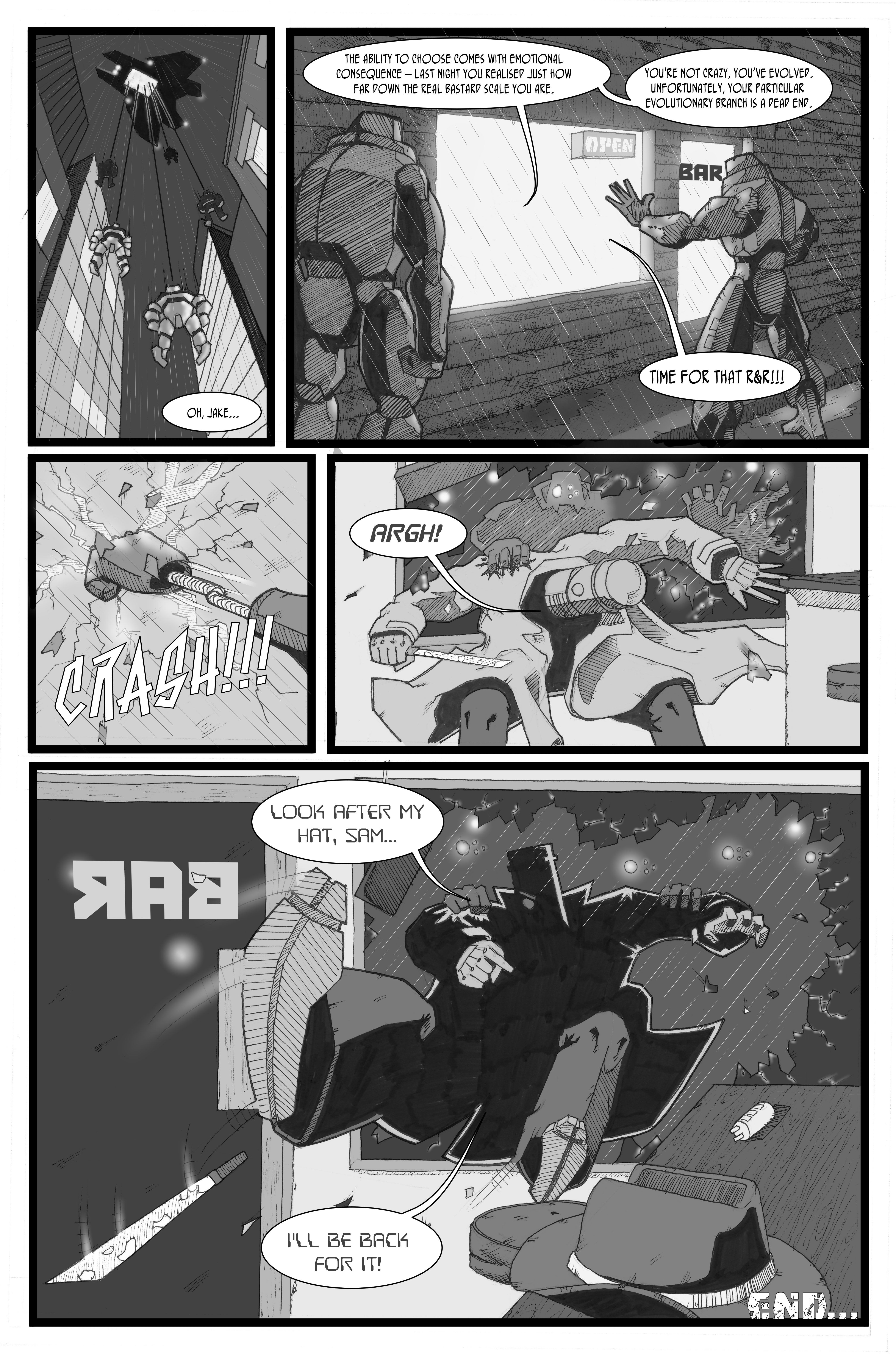
Welcome to the final page of J.AKE.
After spending years doing the wetwork of the Department of Justice, our hero has a dream in which he sees the death of innocence. The awakening makes him realise the horror of the work he has carried out with impunity, and he’s pissed. Heading straight for the Director, he visits terrible revenge on the staff of the Department of Justice. The Director decides J.AKE is expendable and, after failing to terminate him, he cuts her down and she is revealed as a cyborg, more sophisticated, but just like J.AKE. Later, she (or maybe a copy) turns up in Sam’s bar and he understands that the Department can’t be stopped so easily. The Director explains that the organic part of his brain has developed what amounts to a conscience as a consequence of being secretly fed stem cells. Let’s see how this mess ends…
Aha! At last, the truth about potholes…
I’m absolutely sure that somewhere I have an old X-Men comic with a cover showing Colossus holding a dead Storm standing on top of a pile of rubble…did I dream that?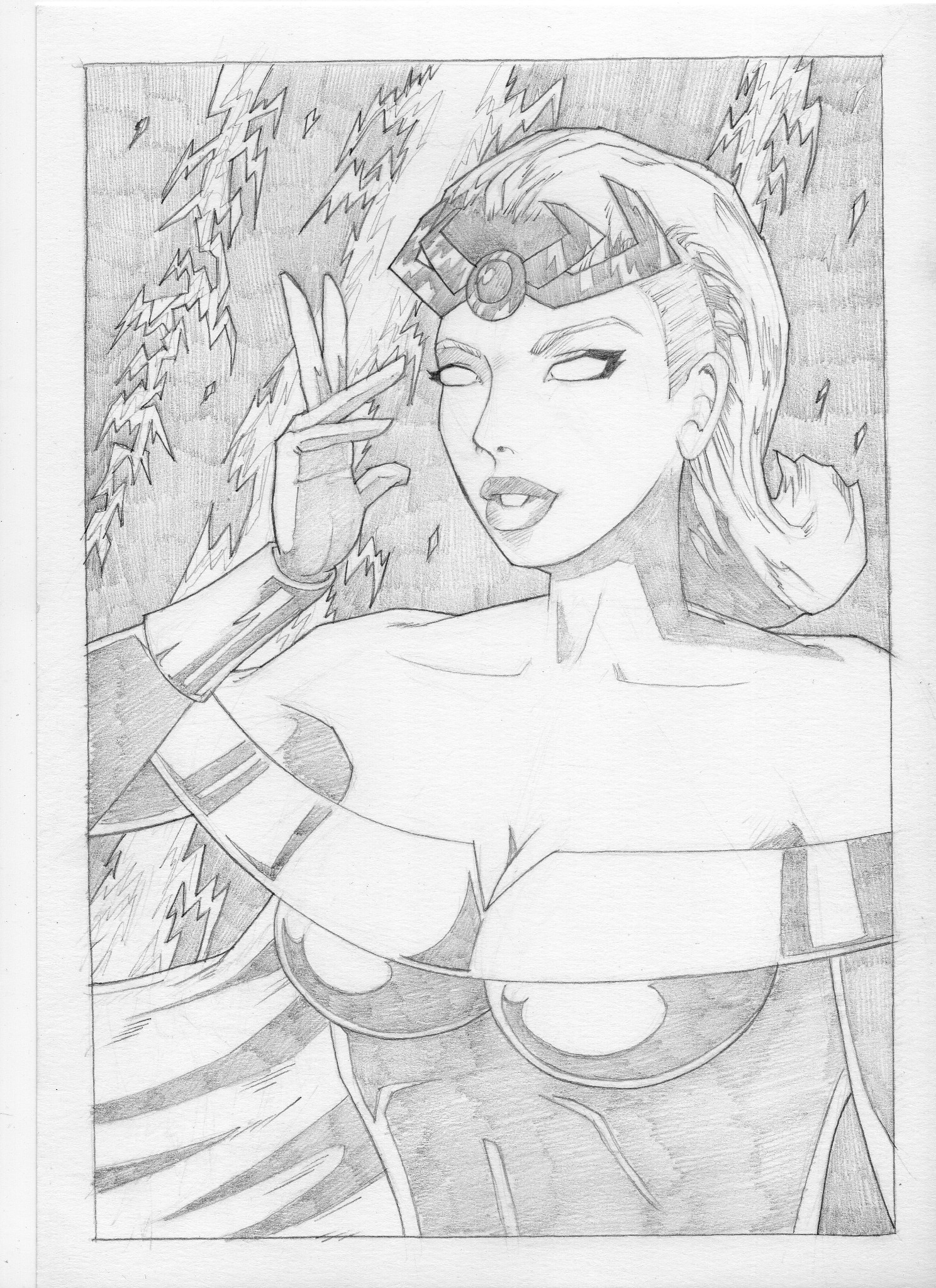
I mostly draw original characters. Not really sure why. I guess there’s a sense of freedom in that – no-one but me knows what those characters are meant to look like so I can’t be wrong, right? Well, maybe. But to continue the theme of trying (and mostly failing) not to worry what people might think of my work, I figured I’d start drawing some well known characters so that everyone can judge the hell out of my art…why not, eh?