Imagine, dear reader, if you can, my unbounded delight when Tony Esmond slipped a little something into my inbox last night and I certainly had a warm fuzzy feeling (more of relief than anything) when it turned out to be a review copy of the Awesome Comics Anthology, Issue 2.
Let’s not waste any more time and crack on. As always, the review is spoiler free.
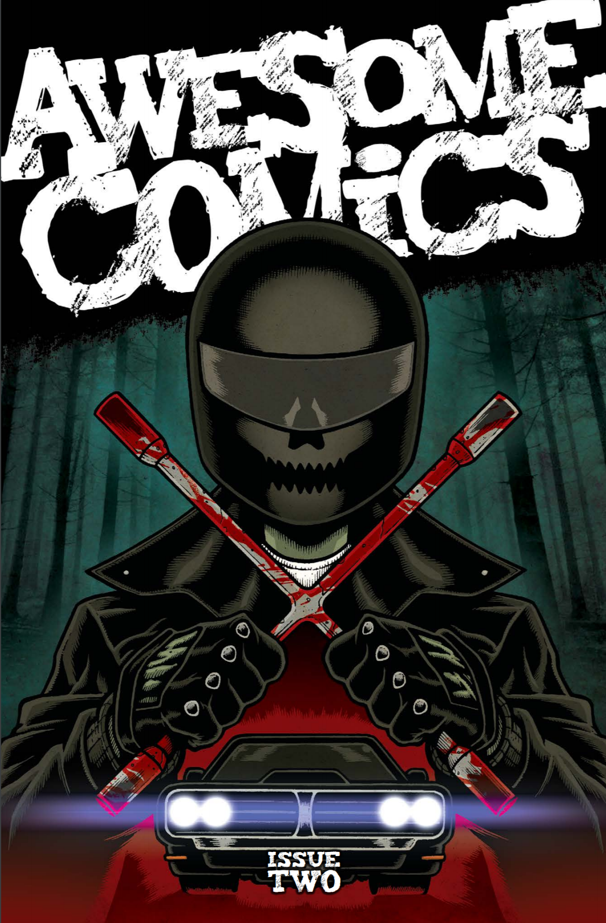
First off we have a very tasty piece of cover art by Andy Bloor (@andybloor) which focuses on Murder Road, the first story in the book, and gives us more than a subtle hint as to the darkness of issue 2 of that particular little tale…
Murder road
Story: Vincent Hunt (@jesterdiablo) and Daniel Marc Chant (@danielmarcchant)
Art / Letters: Vincent Hunt
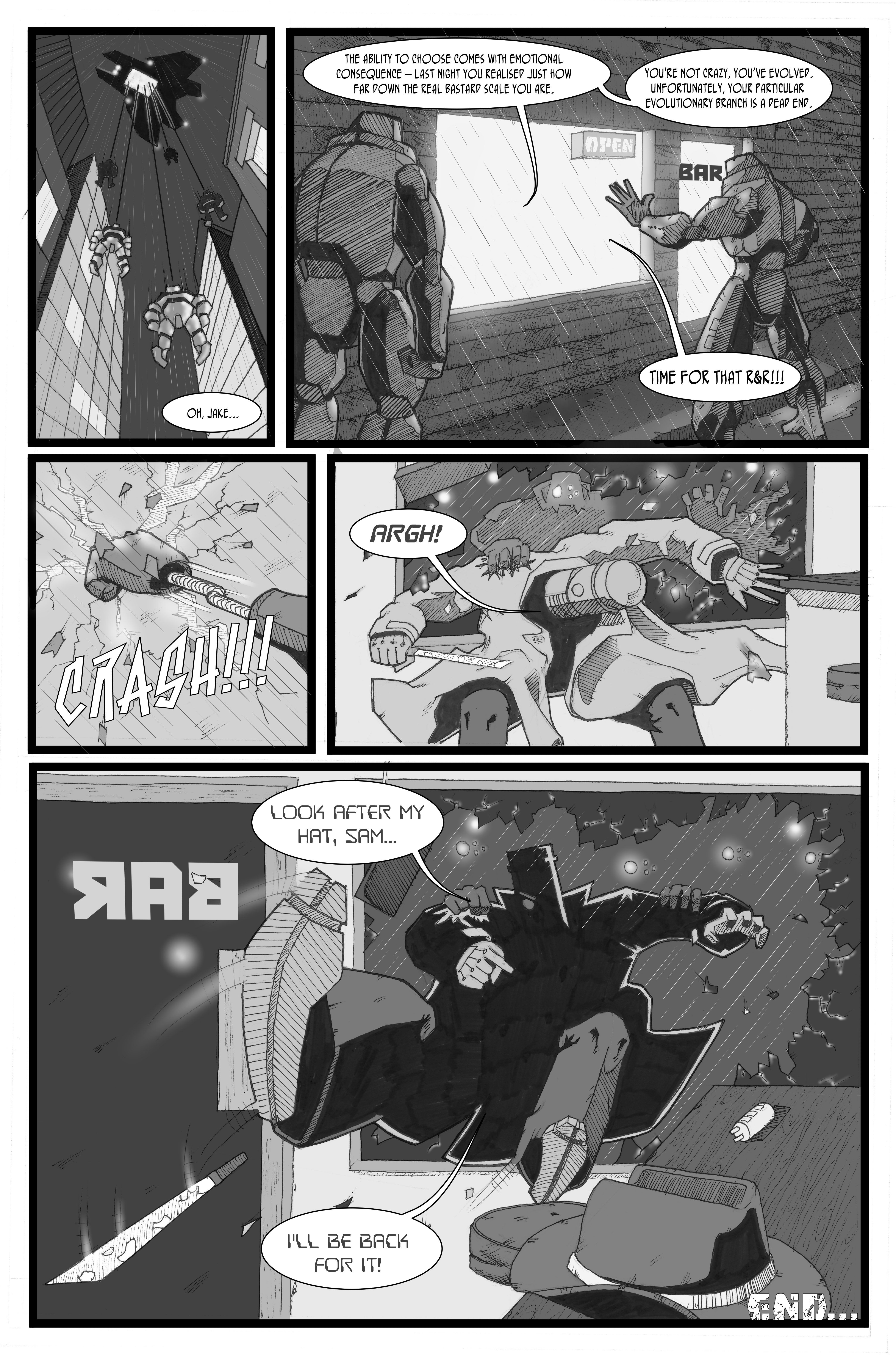
Well, I’m happy to say that my prediction for issue two of Murder Road was cock-on: the proverbial is hitting the fan with gusto in an intense and fast moving sequence of people’s evenings ending even worse than that time Vince got mugged by his cat.
It was pretty clear that things were going to go south for a decent chunk of the cast in the last episode and I was slack jawed throughout as many met their demise in a variety of claret-soaked ways, but my particular favourite has to be desiccation inducing tyre smoke; what a cool idea!
Most of the people we see here are classic horror expendables and, as such, we don’t learn much about them. But there are a couple who we start to understand more clearly and that brings a certain level of intrigue around where they’re going to end up. We don’t get to see two of the main characters from the first episode, and it seems clear that they’ll turn up next time and say: “Well, it certainly looks like the young folks have been having one of their cockamamie parties all right!” (or something along those lines…), and I’m really looking forward to seeing who makes it as far as issue 3.
Not having read any horror comics before, I was slightly surprised at how much I enjoyed this piece of in-your-face violent story-telling. Notwithstanding the worry of being turned by the chaps, it’s clear that they’re having fun coming up with the ideas in this episode and, although the story isn’t significantly advanced, it does a great job of leaving you wide eyed and wondering what the hell just happened!
Great work boys; keep it up!
Cockney Kung Fu – The Big Old Kent Road Kick-off, Parts 3 (Bellbottoms) and 4 (She wears it well)
Story: Tony Esmond (@ezohyez)
Art / Letters: Nick Prolix (@nickprolix)
In Part 3 we pick up right where we left off with Red about to get up to her neck in a caper that hardly seems quite cricket – she might be the ‘bit of posh’ on the job, but she’s taking no crap from anyone and I have a feeling that’s going to be a theme of this story.
We meet a few new faces who make up the transit van full of low life that are going to pull off the job – I particularly like Custard; brilliant name and his dialogue is perfect! Talking of dialogue, Tony handles that really well with the mix of tone and 70’s slang hitting just the right note to sound natural.
As an aside, when writing dialogue, I often think people don’t realise how much we contract words when we speak and, for me, mishandling that always make it sound like characters are giving a speech rather than having a conversation. Seeing lots of contractions written down can look a bit odd, and I think authors sometimes remove them unnecessarily for that reason. I haven’t written much comic dialogue, but I have written a decent amount of prose and the old read-it-out-loud test can often make it clear where contractions ought to appear. Anyhow, none of that has anything to do with Cockney Kung Fu by the way, I just wanted to get it off my chest!
Part 4 focuses on the job which is definitely more akin to something out of The Sweeney than Ocean’s Eleven, but again, that’s just how it should be; gritty, rough, and a bit ugly.
There are some great references in panel backgrounds thanks to Mr Prolix (anyone remember Rumbelows?) and once again his art works a treat with the period story. Having just finished listening to the ACP talking lettering, I have to put on record how much I admire the effort Nick puts into that here (and his other work incidentally) – not only are the words in the balloons wonderfully laid out and lettering consistent, but the titles, sound effects and other text are all spot on.
At the end of Part 4 we leave the story with what I’m sure is going to be some quality action about to hit with the sting of a rushed back, sack and crack job in cheap beauty parlour – can’t wait!
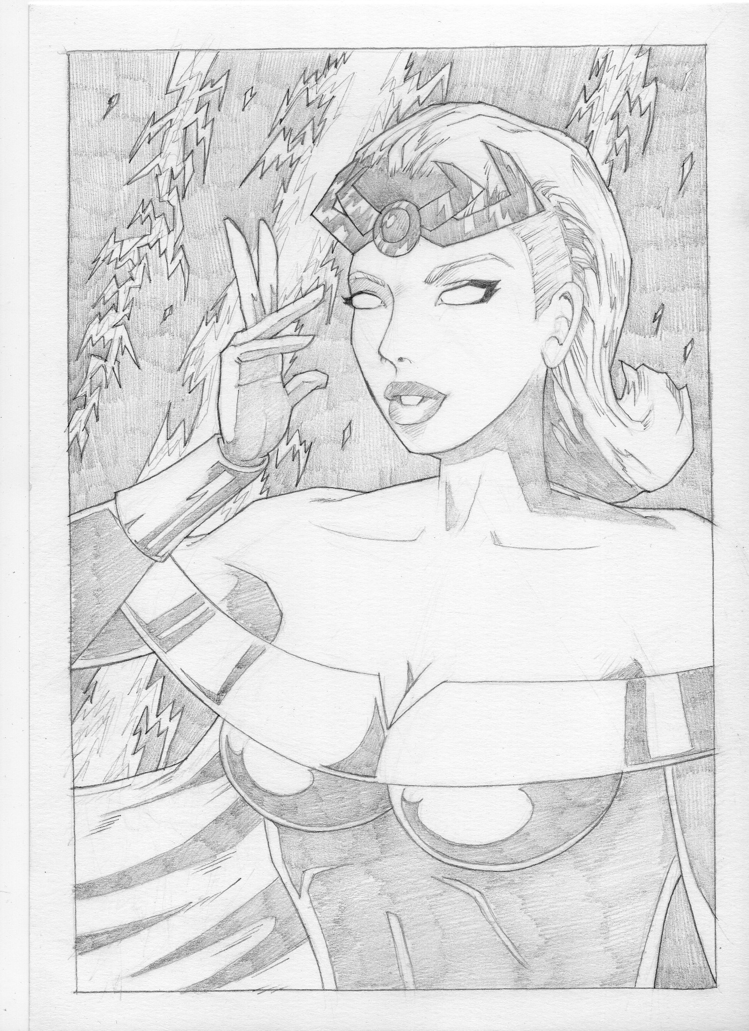
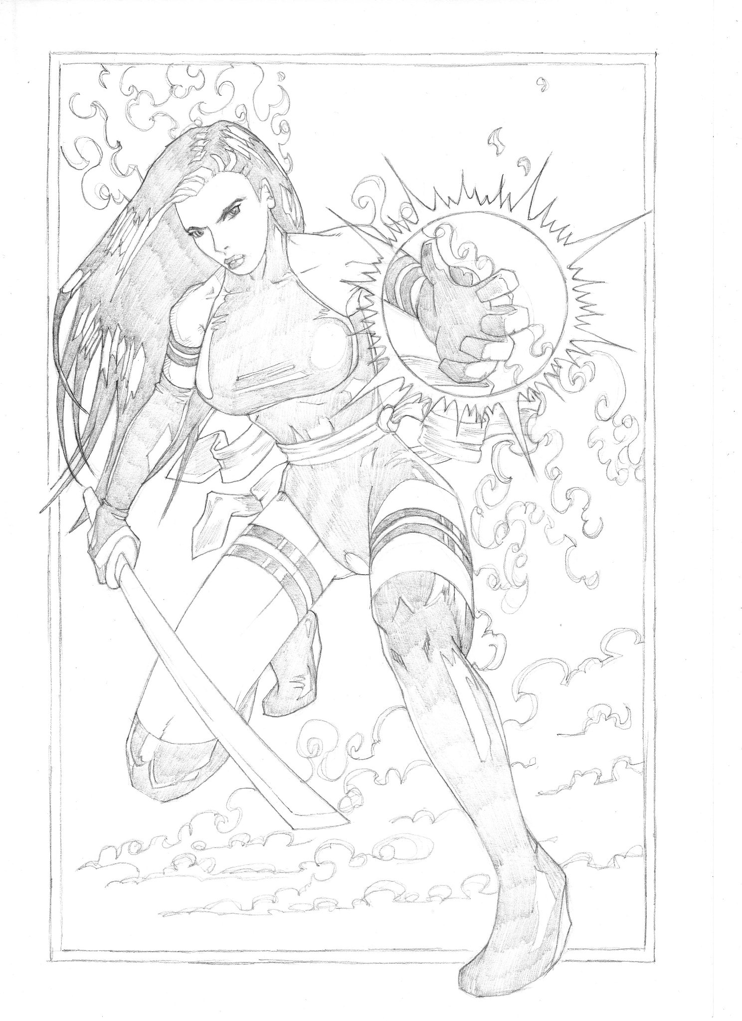
Vyper
Everything: Dan Butcher (@vanguardcomic)
The opening of this episode of Vyper is so 80’s it hurts – I recall with fondness the time I got a 14” colour portable and a VCR for my room and was able to squirrel myself away for hours watching movies with characters that look exactly like these. Dan’s done a lush job of building on the great start from issue 1 in this respect.
Viperini confirms that he’s about as inappropriate as any 80’s hero you care to mention (and more so than most) pretty much as soon as he opens his mouth and Lopez, his partner, is confirmed as his moral compass which he’s temporarily lost down the sofa – although I can’t help thinking he’ll find it again before this story’s finished; at least I hope he does.
There’s a great flashback in this episode, brought on by our tight-trousered hero spotting a symbol he knows only too well from his past. We start to see something of his history which begins to explain why he’s so full of it and I hope Dan explores some more of his main character’s psyche in the rest of the story.
The one (very minor) problem I had with issue 1 was a tendency for the characters to be a little verbose but the dialogue has been nicely tightened up in this episode as Dan gets to know the characters and that really helps with the flow and pacing of the story.
We leave the story loaded with jeopardy and every chance that one of the main characters is likely to fid themselves in the deep and claggy in pretty short order. Perfect.
Once again, the artwork is Butcher through and through with some nice graphic touches which are always a pleasing addition to the look of his comics. I’m really liking this story and it feels like it has the scope to delve a little deeper into character as well as being full of kick-arse action – here’s hoping!
Extras
We’re treated to not one, but two pages of readers letters at the back of the book – each suitably irreverent and exactly what you’d expect from the listeners of the ACP (that’s the Awesome Comics Podcast in case you’ve been living in a space suit with the awesome filter turned up to max for the last 150 weeks you dickfer! That’s an 80s film reference for those of you too young to remember the glorious age of fluorescent socks the first time around…)
We also get a dose of fan art on the Board of Awesome which really shows off that at least four people read issue 1. Good work chaps!
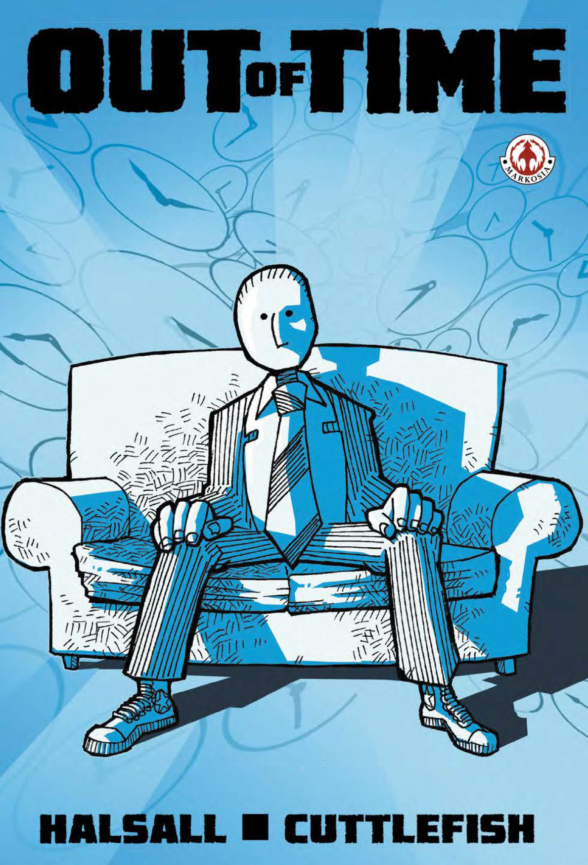 When Luke sent me the link and I downloaded Out of Time, I immediately realised that I’d seen this comic before – I still can’t remember when exactly but I thought at the time I really liked the cover, so getting to dip inside is real treat.
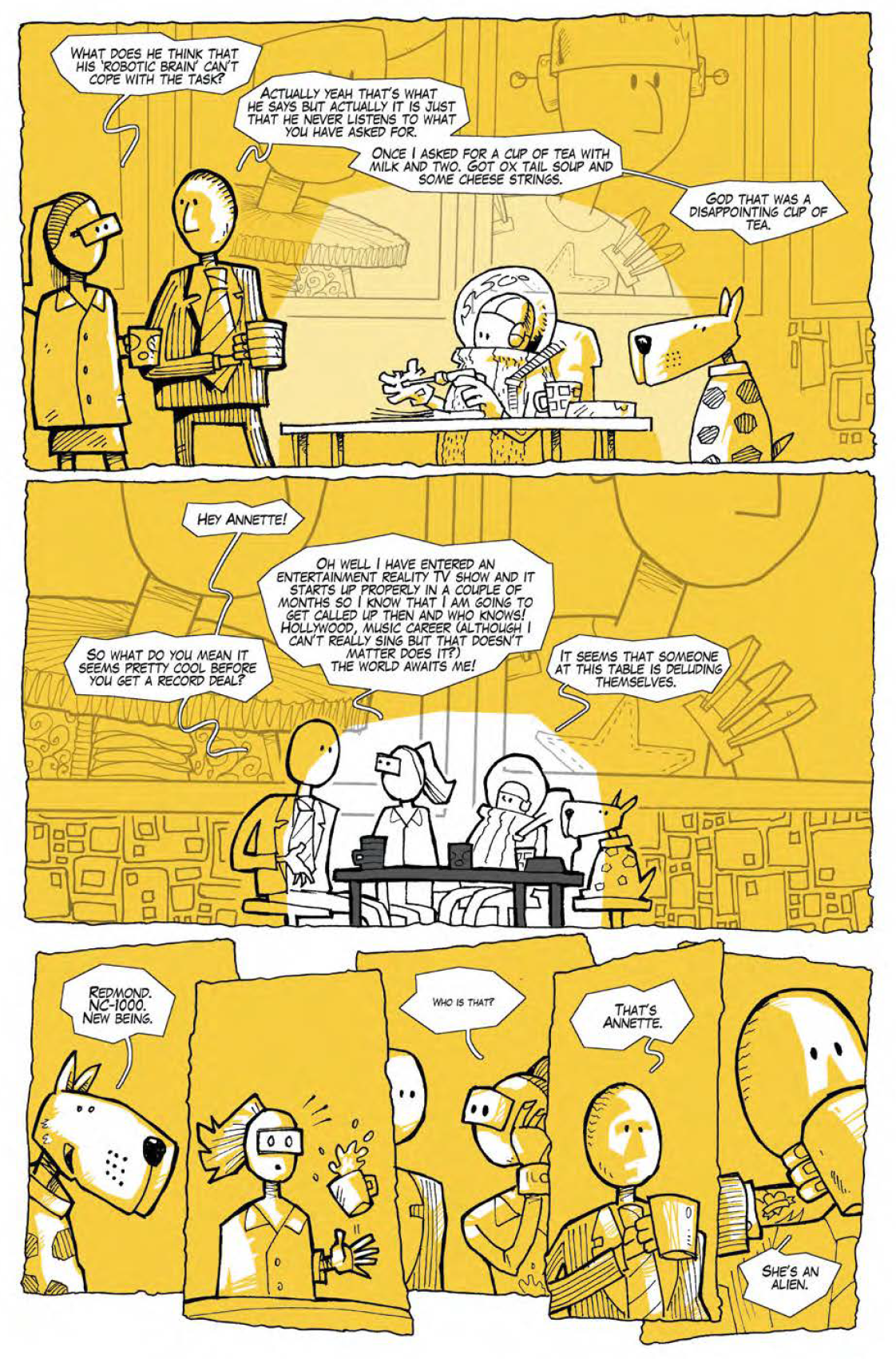 Backgrounds aren’t heavily detailed, colouring uses a really limited and largely unrealistic palette, and word balloons are funky hand drawn affairs. None of this, however unusual, is bad – every bit of it appears a consummate stylistic choice topped off by some really neat inks which are most successful when they are kept nice and simple. A slight criticism, and I’m working hard here to pull something out, is that I think both the inking and the colouring are slightly less convincing in panels where the palette gets too varied (in that you lose that really strong graphic element of shades of a single colour) or inks are too detailed (where inked shading goes further than solid blacks) – the middle section of issue one is an example, but this is pretty minor in what is otherwise really solid work from Cuttlefish. Does anyone know who this person is by the way or am I looking for a guy who squirts ink in my face if I approach too quickly from a jaunty angle at a con…?